architecture

The Architectural Evolution of the Louvre: From Fortress to Museum

Explore the Louvre’s journey from a medieval castle to a world-renowned museum, uncovering its rich history, design changes and cultural legacy.

The Louvre in Paris in the rain in the 18th century with people under umbrellas in the courtyard out front

The Louvre, known for its iconic art collection, houses more than just masterpieces within its walls — it holds centuries of a stormy history and transformation. 

Originally a medieval fortress, the Louvre has been reshaped over the ages into one of the largest and most renowned museums in the world. This journey through its architecture not only reflects changing styles but also France’s tumultuous past. Let’s step through time and experience the evolving grandeur of the Louvre.

The Louvre Castle, surrounded by a moat, before the Paris icon became a museum

Where Did the Louvre Get Its Name?

First things first: Ever wondered why one of the world’s most famous museums is called the Louvre? You’re not alone, and, like many things in history, the truth is a bit murky. There are a couple of theories, though, both equally intriguing.

The first — and perhaps the most vivid — traces the name back to the Old French word lupara, meaning wolf. Legend has it that the Louvre might have started as a hunting lodge, a place where wolves once roamed, or perhaps a refuge for those hunting them. Imagine early Parisians chasing down these wild creatures in the shadows of what would one day house the Mona Lisa.

The second theory takes us in a different direction, connecting the name to the Frankish word leovar or leower, meaning a fortified place or watchtower. And this one holds some weight, considering the Louvre began its life in the late 12th century as a defensive fortress. 

The Louvre Castle in 1190 in Paris, with horses and wagons out front

The Louvre’s Early Years: A Fortress for Kings

The year: 1190. Paris is a thriving but vulnerable medieval city. King Philip II, wary of invasion, commands the construction of a fortress to shield the city from foreign threats. 

The structure — thick stone walls, a deep moat — was built to intimidate and protect. The cold, imposing silhouette of the Louvre Castle stood firm, safeguarding the kingdom’s treasures and its people. 

Yet, as the centuries passed, Paris evolved, and so did the fortress. By the 14th century, under the reign of Charles V, the once purely defensive stronghold began its metamorphosis into a royal palace, draped in the elegance of Gothic architecture, with soaring arches and intricate stonework. The rigid fortress had turned into a symbol of royal power and opulence, reflecting the splendor of the era.

The Louvre in Paris, with its colonnade during the Renaissance, with people out front

Renaissance Transformations of the Louvre

The Renaissance breathed new life into the Louvre, reshaping it from a fortress-turned-palace into a majestic royal residence. 

Workers renovate the Louvre during the 16th century

In the 16th century, Francis I, a king passionate about art and architecture, envisioned a Louvre that would rival the finest palaces of Europe. He summoned renowned architects like Pierre Lescot to reimagine the building. Stone masons carved delicate sculptures, artisans crafted grand façades, and courtyards took shape — where once there had been utilitarian walls. 

The interior of the Louvre in the 16th century, when it was a palace

The Cour Carrée, a resplendent square courtyard, emerged as a harmonious blend of Renaissance ideals. Classical columns and elegant pediments framed the space, signaling the Louvre’s new status. No longer a fortress of war, the Louvre was becoming a beacon of French culture, preparing to house not just royals, but the world’s greatest artistic treasures.

A crowd of people in front of the Louvre, some holding flags, during the French Revolution

The Louvre as Museum

Fast forward to the throes of the French Revolution. The palace, once reserved for royalty, was swept into the tide of change. 

Interestingly, the Louvre itself wasn’t invaded or looted in the chaotic way that some other royal properties were during the Revolution. While many royal residences, like the Palace of Versailles, faced mobs and plundering, the Louvre largely escaped such direct violence.

Instead of looting, there was a process of “nationalization.” Artworks that had belonged to the monarchy, the Church and émigrés (those who fled the country) were legally confiscated and transferred to the Louvre. Revolutionary authorities essentially took over the management of the collections, treating them as public property rather than private royal possessions.

The interior of the Louvre in the 18th century, when it was first opened as an art museum

In 1793, the Louvre opened its doors to the public as a museum, a gesture that symbolized the democratization of art and culture. Citizens, for the first time, stood in front of masterpieces previously reserved for the most elite. 

Over the years, its halls would expand, as art from all over Europe poured in. 

Renovations to the interior of the Louvre during the 19th century

By the 19th century, the Louvre was undergoing a new transformation — architects like Hector Lefuel extended and renovated its galleries, crafting the museum we recognize today. 

And then came the most daring addition of all: a modern wonder amid centuries of history.

The Louvre in Paris, with I.M. Pei's glass pyramid out front

The Glass Pyramid: A Modern Icon

In 1989, I.M. Pei unveiled his controversial masterpiece: the glass pyramid. 

At first, the contrast was startling. How could this sharp, transparent structure belong in a space so rich with centuries of stone? 

Yet over time, the pyramid became a beloved symbol of the Louvre’s embrace of both past and future. Its sleek lines rise from the courtyard like a beacon, inviting visitors into the heart of the museum. The sunlight streams through its glass panels, casting an ethereal glow across the underground lobby, an unexpected harmony of ancient and modern.

The Louvre in Paris, with the pyramid lit up at twilight

Experiencing the Louvre Today

Today, the Louvre could be considered a pilgrimage site for art lovers from around the globe. Housing over 38,000 works, including the enigmatic Mona Lisa and the timeless Venus de Milo, the Louvre offers not just a glimpse into the history of art but also a walk through the very evolution of Paris and France itself. 

As you wander its grand galleries, each wing tells a different story — of kings, of revolutions, of artistic triumphs. The very stones of the Louvre whisper of the centuries they’ve witnessed.

For modern visitors, the experience begins long before entering its halls. With millions flocking to its doors, securing tickets to the Louvre in advance is essential to making the most of your time. Booking your Louvre tickets online ensures not only your entry but also your chance to explore this monumental blend of history and art at your own pace.

Standing beneath the glass pyramid, surrounded by the architectural echoes of past centuries, you’re stepping into a story that spans from medieval fortifications to modern masterpieces. And when you visit, you’ll become part of the Louvre’s ongoing story. –John Cunningham


Seville Cathedral: Its Rich History and Stunning Architecture

A complete guide to a major part of Seville history, including La Giralda, Christopher Columbus, royal weddings and the Spanish Inquisition. 

In the heart of Seville stands a cathedral that defies simple description. Built on the ruins of a mosque, this massive Gothic masterpiece reflects the ambitions of a city eager to cement its place on the world stage.

Origins and Construction of Seville Cathedral

Seville in the late 14th century: a bustling hub of commerce and culture, still echoing with the influence of its Moorish past. The city is vibrant, filled with the sounds of merchants, artisans and the ever-present calls to prayer from the towering minaret of the Great Mosque of Seville, built during the Almohad dynasty, which dominates the skyline. 

Yet, beneath the surface, there’s a growing restlessness among the Christian rulers. They dream of an awe-inspiring structure that would not only dwarf the mosque but would also stand as a testament to the power of their piety.

In 1401, that dream begins to take shape. The city leaders, fueled by both ambition and a desire to solidify Christian dominance, gather to discuss the construction of a new cathedral. During one meeting, a church elder boldly declares, “Let us build a church so beautiful and so grand that those who see it finished will think we are mad.” 

The decision was made: Seville would build the largest cathedral in the world, a Gothic masterpiece that would leave an indelible mark on history.

The Transition From Mosque to Cathedral

But before this vision could be realized, there was the matter of the mosque. Built in the late 12th century, the Great Mosque was a symbol of Muslim rule in Seville. With its elegant arches, intricate tilework and towering minaret, it was a marvel of Islamic architecture. 

In the wake of the Reconquista, when the Christian states recaptured territory ruled by the Muslim Moors, the mosque was consecrated as a church. For over a century, it served as the city’s cathedral — but it was clear to the Christian rulers that something more magnificent was needed.

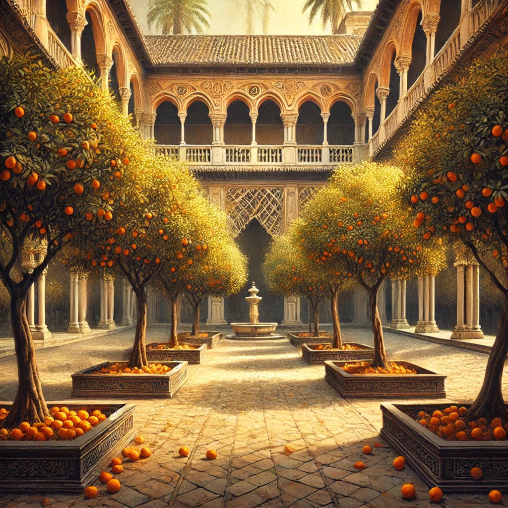
The decision was made to demolish most of the mosque, though the minaret and the Patio de los Naranjos (Courtyard of the Orange Trees) were spared, becoming integral parts of the new cathedral. This wasn’t just a practical decision but a symbolic one, blending the old with the new, and honoring the complex cultural history of Seville.

It certainly wasn’t the first time such appropriation took place. Spain in particular had a tendency to transition from mosques to churches, reflecting the shifts in power over the centuries. La Mezquita in Córdoba, with its blend of Islamic and Christian architecture, is not only one of the most striking but also the earliest example of such a transformation.  

Architectural Challenges and Triumphs

As construction began, the scale of the project quickly became apparent. The builders faced immense challenges, not least of which was the sheer size of the cathedral. 

At its peak, the construction site buzzed with hundreds of workers — stone masons, carpenters, artisans — all toiling to bring the ambitious vision to life. The air was thick with dust and the sound of chisels striking stone, as massive blocks of limestone were shaped into the soaring arches and ribbed vaults that define the Gothic style.

Charles Galter and Alonso Martínez design Seville Cathedral

Key Figures in Seville Cathedral’s Creation

Behind this monumental effort were some of the most brilliant minds of the time. Master architects like Charles Galter and Alonso Martínez, among others, brought their expertise to the project. Galter, known for his work on other Gothic cathedrals in Spain, was particularly instrumental in the design of the soaring nave and the intricate stonework that adorns the exterior.

The artisans who carved the statues, the stonemasons who shaped each block, and the laborers who worked tirelessly day after day were all part of this grand endeavor. Their collective effort created something far greater than the sum of its parts.

The Grand Unveiling and Seville Cathedral’s Legacy

The construction of Seville Cathedral, or Catedral de Sevilla, took over a century to complete, with work continuing long after the original architects had passed away. But when the cathedral was finally finished in 1528, it was clear that their bold vision had been realized. When you visit the Seville Cathedral, you can only marvel at its scale, its beauty — and its audacity.

To the average Sevillano, its sheer size would have been overwhelming, a towering monument that seemed to reach up to Heaven itself. Its intricate details — gargoyles, statues of saints and other elaborate carvings — invite closer inspection, revealing new wonders at every turn.

La Giralda: From Minaret to Bell Tower 

The mosque that once stood here was the pride of the Islamic world, and its minaret — the future Giralda — was a marvel of engineering. The city’s Muslim residents would pause in their daily routines as the call to prayer echoed across the rooftops. The minaret was a spiritual beacon, guiding the faithful and asserting the dominance of Islam in the region.

It would remain a spiritual beacon — just for those of the Catholic faith now. In the 16th century, a Renaissance-style belfry was added to the top, transforming the minaret into a bell tower. 

At the very top of the tower stands El Giraldillo, a bronze statue that functions as a weathervane. This figure, representing Faith, stands with one foot firmly planted on the tower, while the other seems to step into the air, as if ready to take flight. 

Because the statue could turn with the wind, the tower itself came to be known as La Giralda, meaning “The One That Turns” or “The Spinner.”

La Giralda also plays a part in the eerie legends of Seville Cathedral, when a scorned bride-to-be cursed the bell tower and all those who dare to be unfaithful in its vicinity.

A Stage for History: Seville Cathedral’s Role in Historic Events

Royal Weddings: The Joining of Crowns and Countries

It’s October 18, 1526. The cathedral is adorned with tapestries, lit by the flickering flames of hundreds of candles. The air is filled with anticipation, as the people of Seville gather to witness the wedding of the century: the marriage of Holy Roman Emperor Charles V and Isabella of Portugal. The union of these two powerful figures promises to shape the future of Europe.

The bride and groom exchange vows beneath the towering altar, surrounded by the highest nobility of Spain and Portugal. The grandeur of the ceremony reflects the power and wealth of the Spanish empire at its height.

But this wasn’t the only royal wedding held in Seville Cathedral. Over the centuries, the cathedral has hosted numerous royal ceremonies, each one adding to its legacy as a place where the personal and the political intersect, where the fate of nations has often been decided at the altar.

The cathedral hosted the royal weddings of Philip II and Elisabeth of Valois in 1559; Philip III and Margaret of Austria in 1599; and Philip IV and Elisabeth of France in 1615, each marking significant political alliances in European history.

The Spanish Inquisition: A Dark Chapter

However, not all of the cathedral’s historical events were moments of celebration. The Spanish Inquisition, a dark chapter in the country’s history, also left its dubious mark on Seville Cathedral. During this time, the cathedral served as a setting for the public sentencing of those accused of heresy, events known as autos-da-fé (Portuguese for “acts of faith” — a euphemism if there ever was one). 

Picture it: The cathedral, normally a place of worship and reflection, is transformed into a courtroom. The accused, dressed in penitential robes, stand before the altar, their fates hanging in the balance. The atmosphere is tense, as the Inquisitors pass judgment in the name of religious purity. 

The results were horrific: Over 700 people were burned at the stake, and more than 5,000 others faced imprisonment, forced penance and the stripping away of their social status. 

These grim proceedings unfolded in public spectacles where fear and fanaticism reigned supreme, forever marking Seville as a place where religious zealotry took its darkest form.  

A Witness to the New World: Columbus and the Age of Exploration

Seville Cathedral also played a significant role during the Age of Exploration, when Spain was at the forefront of colonizing the Americas. The cathedral was the site of numerous ceremonies celebrating the successes of explorers like Columbus, whose voyages expanded the Spanish empire and brought immense wealth and influence to the crown.

One of the most poignant moments in this history occurred in 1502, when Columbus, known locally as Cristóbal Colón, then an old man, attended a mass at Seville Cathedral before departing on his fourth and final voyage to the Americas. 

Standing in the very same spot, you can almost imagine Columbus, weary yet resolute, contemplating the journey ahead. The cathedral, with its vastness and grandeur, must have seemed like a fitting place to seek divine favor before embarking on such a perilous and uncertain journey.

Semana Santa in Seville 

During Semana Santa, or Holy Week, in Seville, the streets fill with processions led by hooded nazarenos from various brotherhoods. Dressed in long robes and creepy pointed hoods known as capirotes that cover their faces, they carry candles or crosses in solemn silence. The color of their robes — black, purple, white, red or green — reflects the symbolism of their brotherhood. Massive, ornate floats (pasos) depicting scenes from the Passion of Christ or the sorrowful Virgin Mary are carried through the streets, held up by hidden penitents called costaleros. The air is filled with the sounds of traditional music or the haunting cry of a saeta, a flamenco-style song, creating a deeply spiritual atmosphere.

The processions begin and end at the cathedral, reinforcing its status as the spiritual heart of Seville. 

A Beacon of Resilience: Surviving Earthquakes and Wars

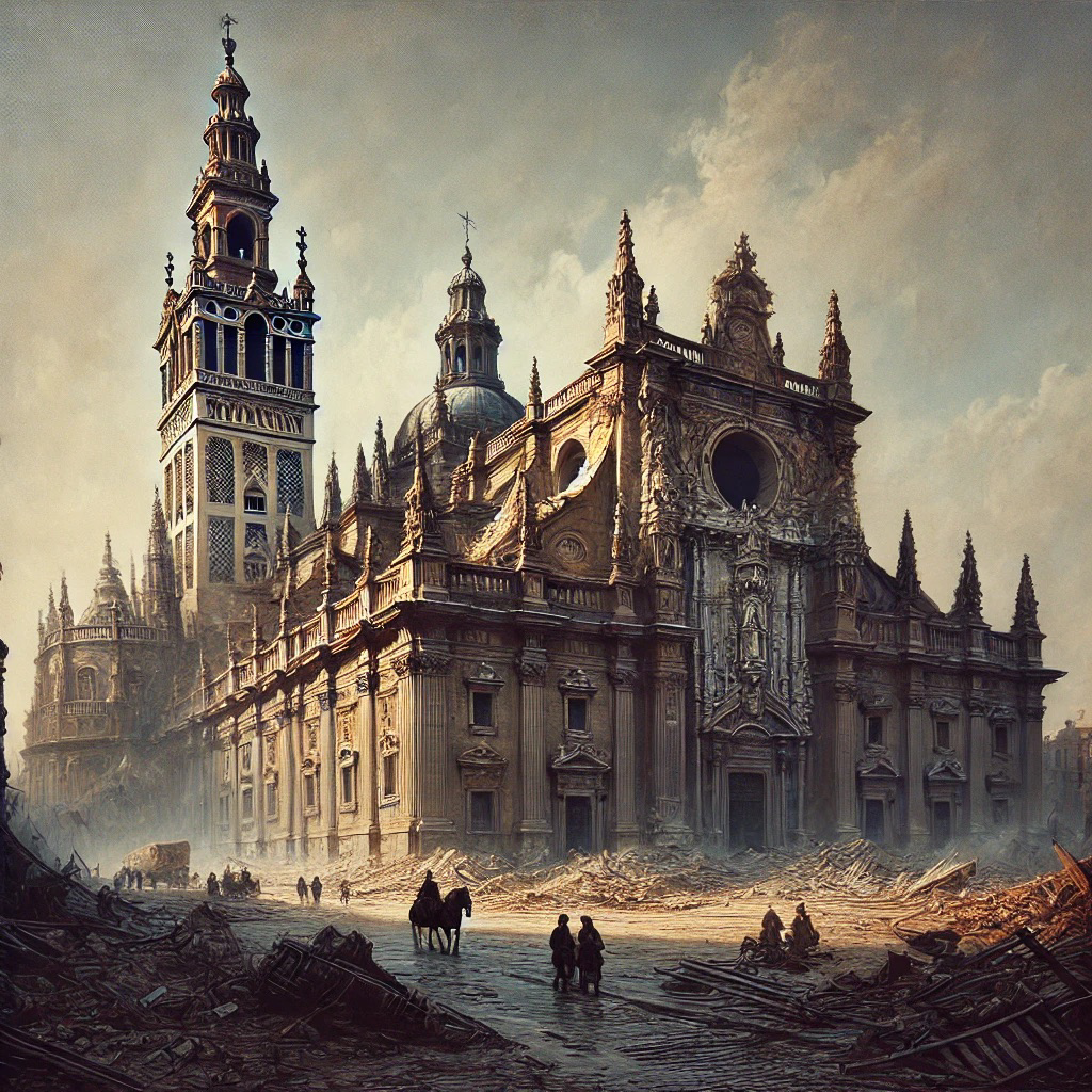
Seville Cathedral’s history is also a story of resilience. Over the centuries, it has withstood natural disasters and human conflicts that have threatened its very existence. One of the most significant of these was the 1755 Lisbon earthquake, which caused widespread devastation across Portugal and Spain. The cathedral suffered considerable damage, with sections of its roof collapsing and the Giralda tower sustaining cracks. 

Yet, the cathedral was repaired and restored, standing as a testament to the city’s determination to preserve its cultural treasures.

Then, during the Spanish Civil War, the cathedral was once again at risk. The conflict saw many religious buildings across Spain looted or destroyed — but Seville Cathedral was spared, thanks in part to the efforts of local citizens who recognized its importance to their heritage. 

A UNESCO World Heritage Site: Acknowledging Its Global Importance

In 1987, Seville Cathedral was designated as a UNESCO World Heritage Site, alongside the Alcázar palace complex and the General Archive of the Indies. This prestigious recognition is a testament to the cathedral’s global significance.

As a UNESCO site, Seville Cathedral is recognized for its architectural splendor, its historical importance and its role as a center of cultural heritage. The designation also brings with it a commitment to preservation, ensuring that future generations will be able to experience the cathedral’s beauty and history as we do today. The recognition has helped to elevate the cathedral’s status on the world stage, attracting visitors from every corner of the globe who come to marvel at its grandeur and delve into its rich history.

A Symbol of the City

Today, the cathedral stands as a symbol of the resilience and enduring spirit of Seville, a city that has weathered the storms of history, adapted while honoring its past, and emerged stronger each time. –Wally
Centre Pompidou Málaga: A Modern Art Marvel

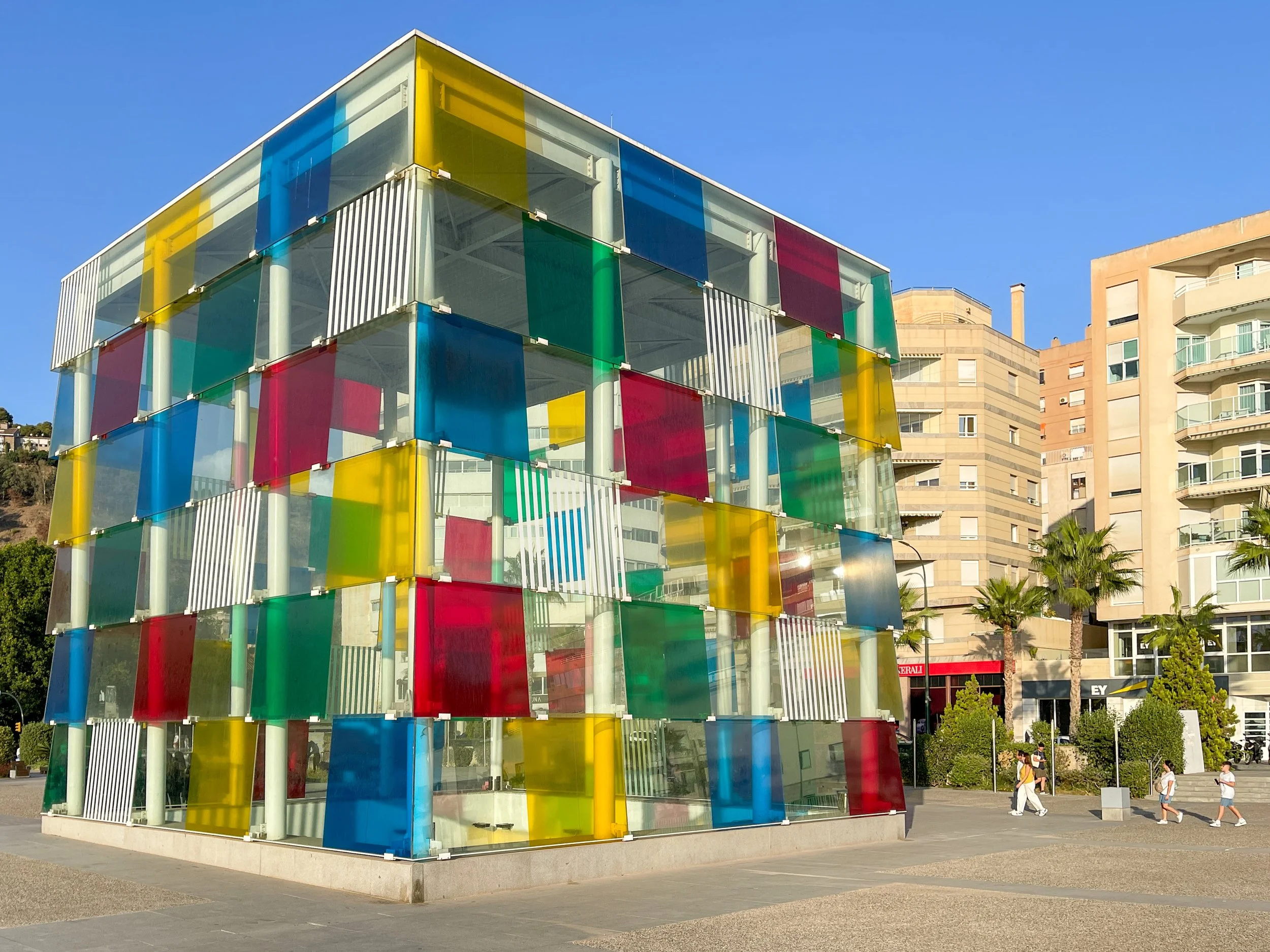
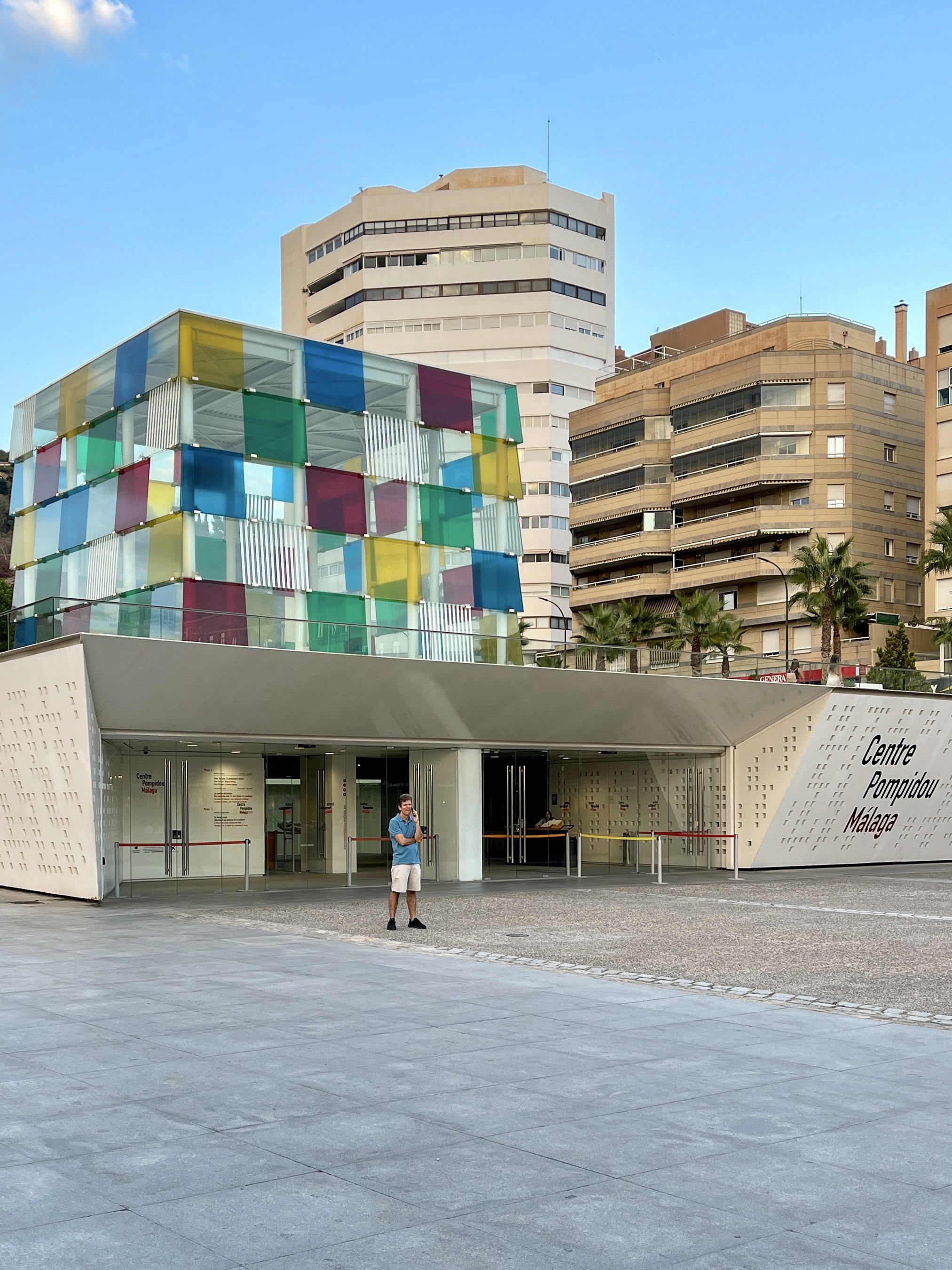
El Cubo, as locals call it, a museum located in Málaga’s vibrant port, is anything but boring. This dazzling structure, designed by Daniel Buren, houses a captivating collection of avant-garde art.

Colorful cub exterior of the Centre Pompidou Malaga

The surprising multicolored cube on Málaga’s port is a branch of the Centre Pompidou, Paris’ modern art museum.

When I was in high school, my French class took a trip to Paris, and it was there that I first laid eyes on the Centre Pompidou. The building’s exterior, with its industrial ductwork winding up like a scarlet-bellied serpent, and a pair of cherry red lips spouting water in the fountain, captivated my youthful imagination. 

But if you thought the Centre Pompidou was just that quirky building in Paris, think again. The avant-garde behemoth has spawned a sibling in Málaga, Spain; the city famous for its hometown homeboy, Picasso, and amazing Moorish landmarks like the Alcazaba and Gibralfaro, got a bit of Parisian modern art chic.

The project was initially conceived as a limited five-year venture.

It has proven so successful, Málaga has decided, with Paris’ agreement, to extend its lease until 2034.
Art installation of red wire diagonal cubes in front of the Centre Pompidou Malaga

Various sculptures are put on temporary display outside of the museum.

Why Málaga?

The project was initially conceived as a limited five-year venture between Málaga’s mayor, Francisco de la Torre, and the Centre Pompidou’s president, Serge Lasvignes. The French institution agreed to lend its brand name, curatorial expertise and artworks from its Paris HQ to the chic port city of Málaga in the South of Spain. This cultural experiment provided the perfect canvas for the Centre’s first foray outside France. It has proven so successful, Málaga has decided, with Paris’ agreement, to extend its lease until 2034.

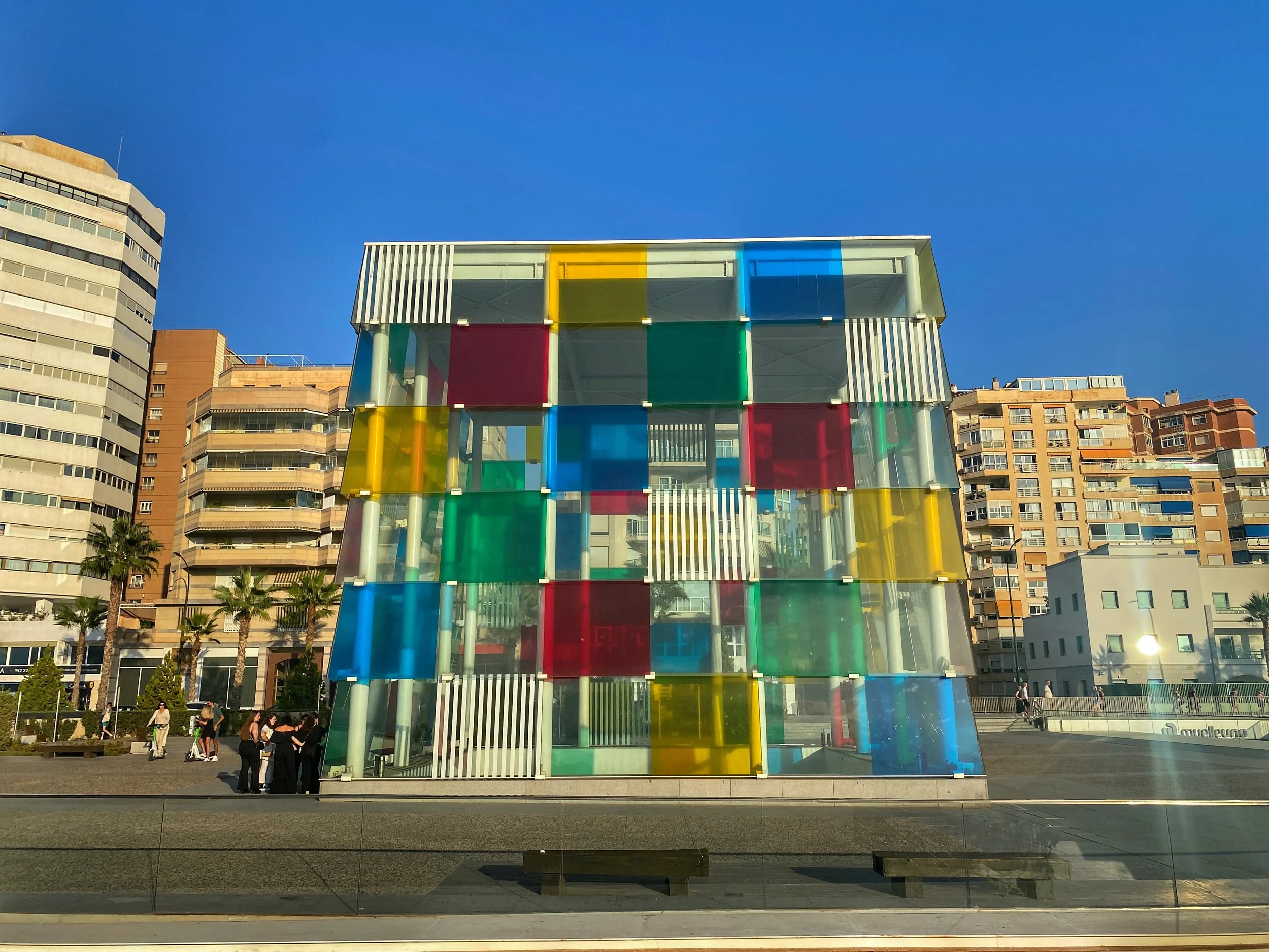
Red, yellow, blue and green transparent squares cover the cube-shaped entrance to the Centre Pompidou Malaga in the city's port

Daniel Buren came up with the whimsical design.

The Colorful Genius and Bold Design of Daniel Buren

The Centre Pompidou Malaga isn’t just a museum — it’s a statement. You can’t miss it. Its design is as bold as its Parisian parent’s. But instead of resembling a building turned inside out, the Pompidou Málaga looks like a giant Rubik’s Cube made of glass was plopped down in the city’s port. It’s the brainchild of French artist Daniel Buren, renowned for his use of bold colors and geometric patterns.

Buren takes an in situ approach, which is a fancy way of saying he integrates his pieces directly into their environments, creating site-specific art that interacts with its surroundings. And that’s certainly the case with El Cubo (the Cube), as the Málaga Pompidou is affectionately called. A transparent, multicolored structure serves as the entrance to the subterranean museum space. Its design is a sharp contrast to the traditional Spanish architecture around it, making it a standout landmark. 

Buren’s use of color and light transforms the cube into a dynamic piece of art, changing its appearance with the movement of the sun and the seasons. It’s as much a work of art as those found within. Try walking by at different times (sunrise or night, in particular) to see how light plays upon the façade.

Balls of various types and sizes in a line in front of a painting of modern buildings in the Centre Pompidou Malaga

The museum opened in 2015 for a short stint — but it has obviously done well enough to extend its agreement through 2034.

The Pompidou Málaga’s Opening Act

When it first opened in 2015, the Centre Pompidou Málaga was met with a mix of excitement…and skepticism. Art critics and the public alike were curious about how this Parisian transplant would fit into the cultural tapestry of Málaga. But The Guardian gushed, “The Centre Pompidou in Málaga represents a bold cultural experiment, bridging the artistic ethos of Paris with the vibrant spirit of southern Spain.”

Meanwhile, El País highlighted the architectural contrast: “Daniel Buren’s colorful cube stands as a beacon of modernity against Málaga’s historic skyline, symbolizing the city’s commitment to contemporary art.”

Woman in wheelchair and man look at modern painting on yellow wall in the Centre Pompidou Malaga

Wally and Duke can find modern art to be hit or miss — but the Centre Pompidou Málaga was filled with cool, thought-provoking works.

Art and Exhibitions at the Pompidou Málaga

But the Centre Pompidou in Málaga isn’t just a pretty cube — it’s a treasure trove of modern masterpieces that would make any modern art lover swoon.

The permanent collection is a curated selection of works from the vast repository of the Centre Pompidou in Paris. It spans the 20th and 21st centuries, showcasing iconic pieces from celebrated artists such as Francis Bacon, Frida Kahlo, Joan Miró — and, por supuesto, Pablo Picasso

Le Rouge à lèvres, a painting in the Centre Pompidou Malaga

Lipstick by František Kupka, 1908

Bal au Moulin de la Galette, a painting at the Centre Pompidou Malaga

Bal au Moulin de la Galette by Raoul Dufy, circa 1943

Enfants aux lampions, a painting at the Centre Pompidou Malaga

Children and Lanterns by Tadé Makowski, 1929

These works are arranged thematically rather than chronologically, providing visitors with a fresh perspective on modern art movements and their interconnectedness. The themes often explore major artistic movements and their cultural contexts. You might find rooms dedicated to Cubism, Surrealism or Abstract Expressionism. This approach not only highlights the evolution of styles but also the ongoing dialogue between artists across different periods and geographies.

Sommeil hollywoodien, a painting at the Centre Pompidou Malaga

Hollywood Sleep by Jean Cocteau, 1953

Soudain l'été dernier, a work of art at the Centre Pompidou Malaga

Suddenly Last Summer by Martial Raysse, 1936

During our visit, we caught the temporary exhibition Un Tiempo Propio (or Time for Yourself for those of you who don’t speak Spanish), a spirited rebuke of the relentless demands imposed by our digital calendars. Showcasing the works of 90 artists, the exhibit delved into the theme of leisure, encouraging a pause from the daily grind. It served as a refreshing reminder to reclaim our time and disconnect, if only momentarily, from the buzz of notifications and schedules — a true celebration of the art of relaxation and the simple joys of free time.

We stopped just here at the time, an installation of hanging sacs at the Centre Pompidou Malaga

We Stopped Just Here at the Time by Ernesto Neto, 2002

One of our favorite exhibits in Un Tiempo Proprio was by Ernesto Neto, the Brazilian maestro of the bizarre: We Stopped Just Here at the Time. This artwork was a captivating display of suspended bags filled with aromatic herbs like rosemary, parsley and thyme. The installation reminded me of a forest of hanging testicles (paging Doctor Freud!), creating a whimsical and immersive environment that invited visitors to bask in the earthy fragrances and stare, mesmerized, at the organic forms swaying gently.

Chaise à tapis volant, a red retro chaise longue at the Centre Pompidou Malaga

Ettore Sottsass’ Flying Carpet Armchair

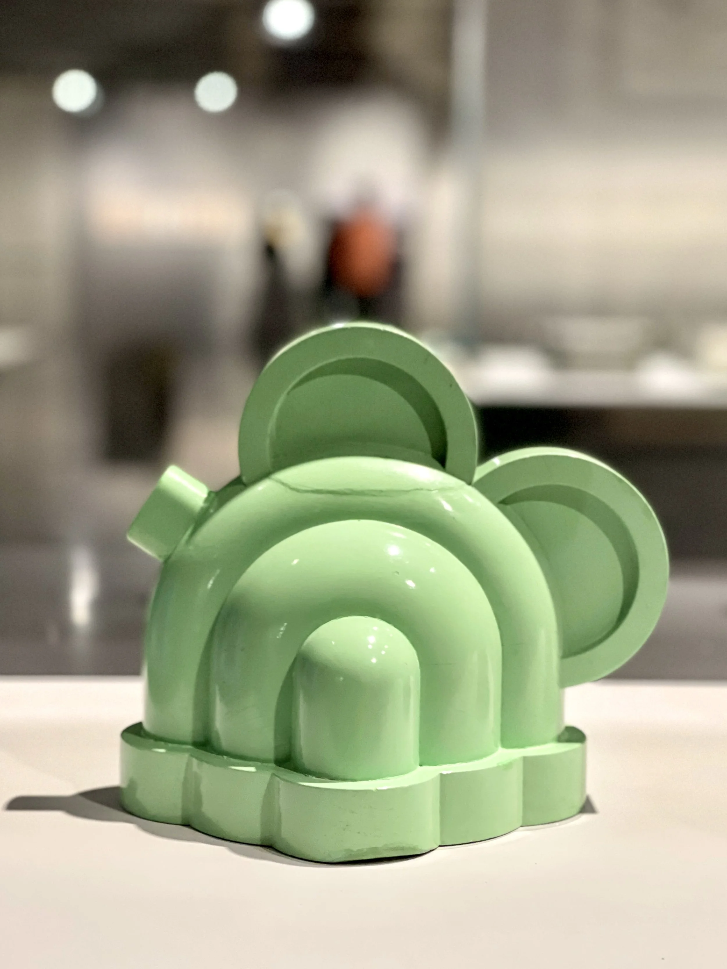
Mint green cabinet by Sottsass at the Centre Pompidou Malaga

Sottsass’ designs are somehow retro and modern at the same time, like this minimal mint green cabinet.

We also enjoyed the Ettore Sottsass: Magical Thinking exhibition, which showcased over 100 pieces of Sottsass’ groundbreaking work. These retro-futuristic items in bright colors reminded me of Fisher-Price children’s toys, highlighting the designer’s playful approach. Sottsass was a key figure in the Memphis movement of the 1980s, which revolutionized design with its bold use of color, geometric shapes and whimsical patterns. The postmodern movement rejected minimalism in favor of a more expressive, emotionally engaging style. The exhibit captured this ethos, blending fun and sophistication in a way that made each piece feel both nostalgic and cutting-edge​. 

Théière Basilico, a mint green teapot made of curves by Sottsass at the Centre Pompidou Malaga

The Basilico Teapot

Théière Cerise, a teapot that looks like a child's retro toy, by Sottsass at the Centre Pompidou Malaga

Cherry Model Teapot

A video showiong a red-faced clown lying down, playing at the Centre Pompidou Malaga

it wouldn’t be a modern art museum without a creepy clown.

Discovering the Unexpected at the Pompidou Málaga

Duke and I were thoroughly impressed with the Centre Pompidou Málaga, where we encountered a captivating variety of art that was both thought-provoking and immersive. We spent a delightful couple of hours there, exploring the museum’s strange and intriguing pieces, each offering a unique perspective on modern art. The experience exceeded our expectations and was a refreshing contrast to what we consider the less inspiring exhibitions that the Museum of Contemporary Art in Chicago has featured in recent years. 

The variety of exhibits at the Centre Pompidou Málaga ensures that whether you’re a seasoned art critic or a curious traveler, there’s something that will capture your imagination and perhaps even challenge your understanding of what art can be. So, the next time you find yourself in Málaga, make sure to descend into El Cubo — you just might discover your new favorite artist or a whole new way of looking at the world. –Wally

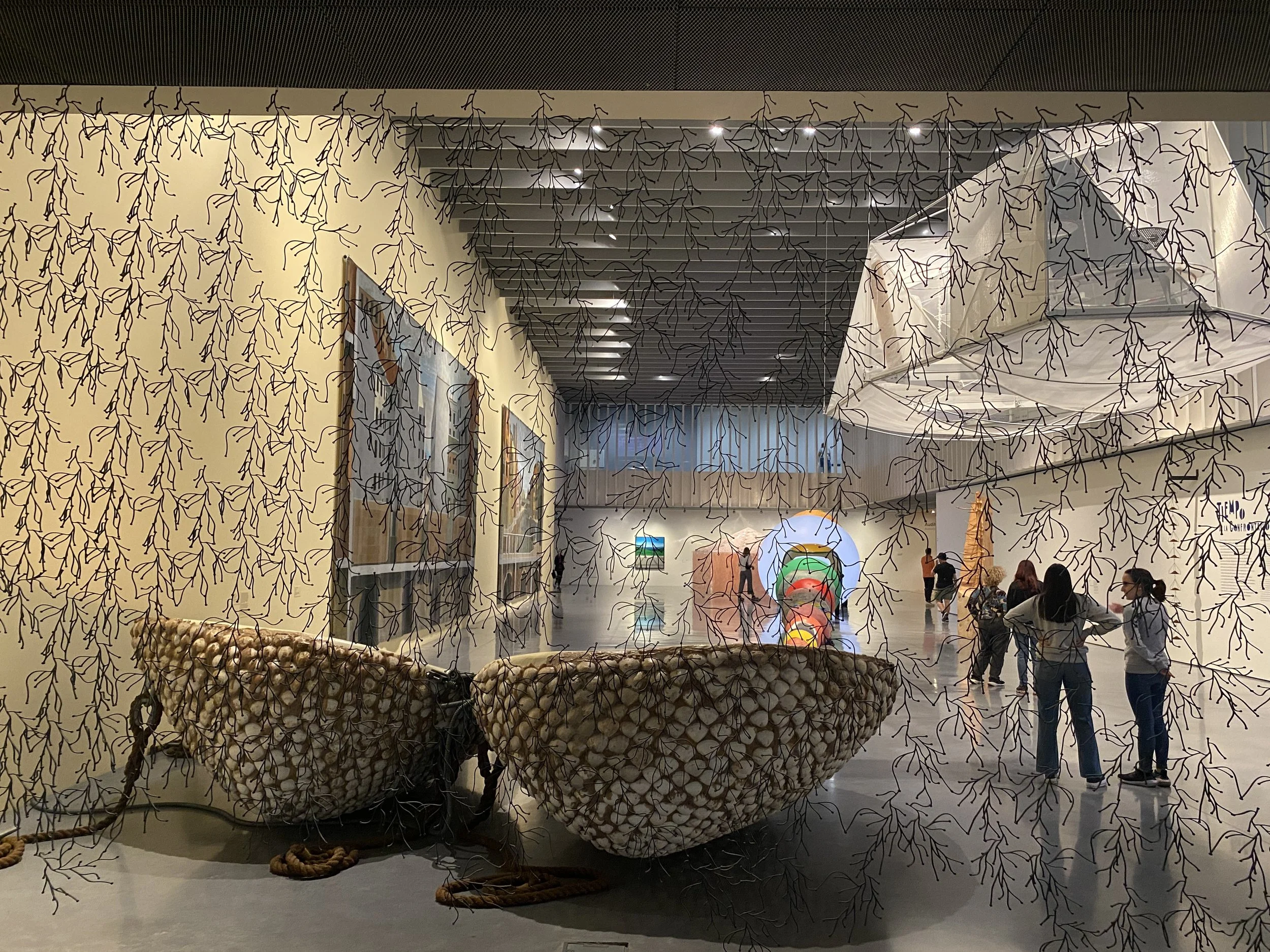
Modern art exhibits seen through a gauzy curtain at the Centre Pompidou Malaga

There are lots of different areas to explore at the Centre Pompidou Málaga, but they can all be done in a couple of hours.

The lowdown

The Centre Pompidou in Malaga is located in the city’s vibrant port area, making it easily accessible. 

Hours of operation

Monday, Wednesday, Thursday, Friday: 9:30 a.m. to 8 p.m.

Saturday and Sunday: 9:30 a.m. to 8:30 p.m.

Tuesday: Closed (except on public holidays)

Holidays: Open with extended hours; always check the official website for up-to-date holiday hours.

Admission costs

General admission: €9

Reduced admission: €5.50 (available for seniors over 65, students under 26 and large families)

Free admission: For children under 18, unemployed individuals and visitors with disabilities (with one companion)

Special free hours: On Sundays from 4 p.m. to closing, and all day on certain designated dates (such as International Museum Day)

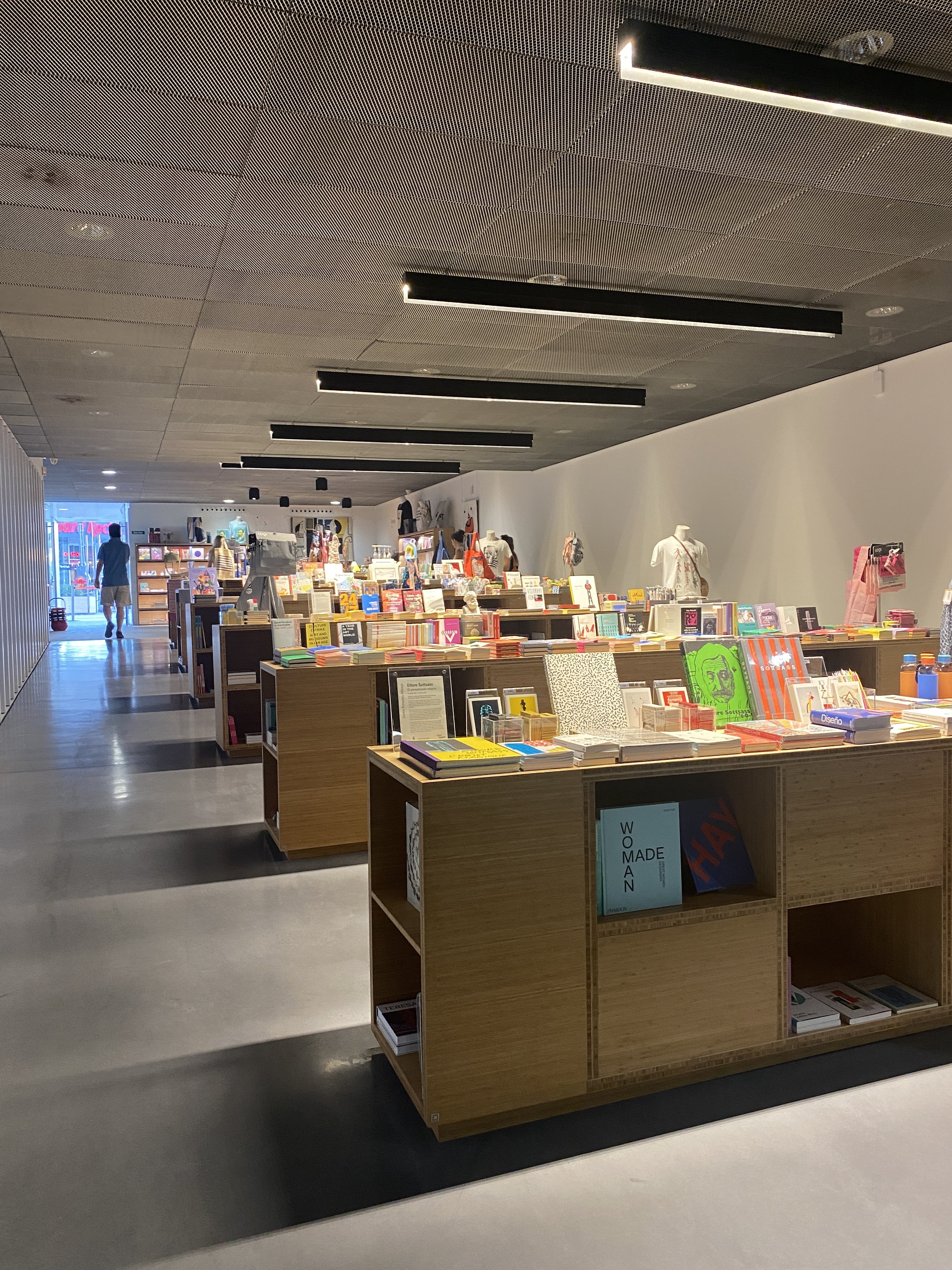
Gift shop at the Centre Pompidou Malaga

Exit through the gift shop.

Tips for visitors

Advance tickets: It’s a good idea to purchase tickets online in advance to avoid long lines, especially on weekends and holidays.

Guided tours: Consider booking a guided tour to get the most out of your visit. Tours are available in multiple languages and offer deeper insights into the exhibitions.

Accessibility: The Centre Pompidou is fully accessible to visitors with disabilities. Elevators and ramps are available, and wheelchairs can be borrowed at the information desk.

Photography: Photography without flash is allowed in most areas.

Coat/bag check: Leave your bags and coats to make it easier to enjoy the exhibits unburdened.

Gift shop: Exit through the gift shop, where you can pick up some cool souvenirs or gifts.

Entrance to the Centre Pompidou Malaga

Centre Pompidou Málaga

Pasaje Doctor Carrillo Casaux
Muelle Uno
Puerto de Málaga
29001 Málaga
Spain


Plaza de España: Where History Meets Artistry

Discover the stunning tile alcoves in this iconic landmark from the 1929 Ibero-American Exposition (and a Star Wars movie).

Man leans against pillar and looks at the Plaza de España, with its beautiful building and arching bridges, filled with tourists

There’s talk that city officials might actually start charging admission because of overtourism in the Plaza de España.

It was love at first sight. Wally and I were instantly captivated by the cuisine, history and diverse architecture of Andalucía, the southernmost region of Spain. On our first trip there, we spent a couple of idyllic days with our friend Dan in Sevilla. We both agreed that when we returned, we’d plan to spend more time in the capital city of Andalusia.

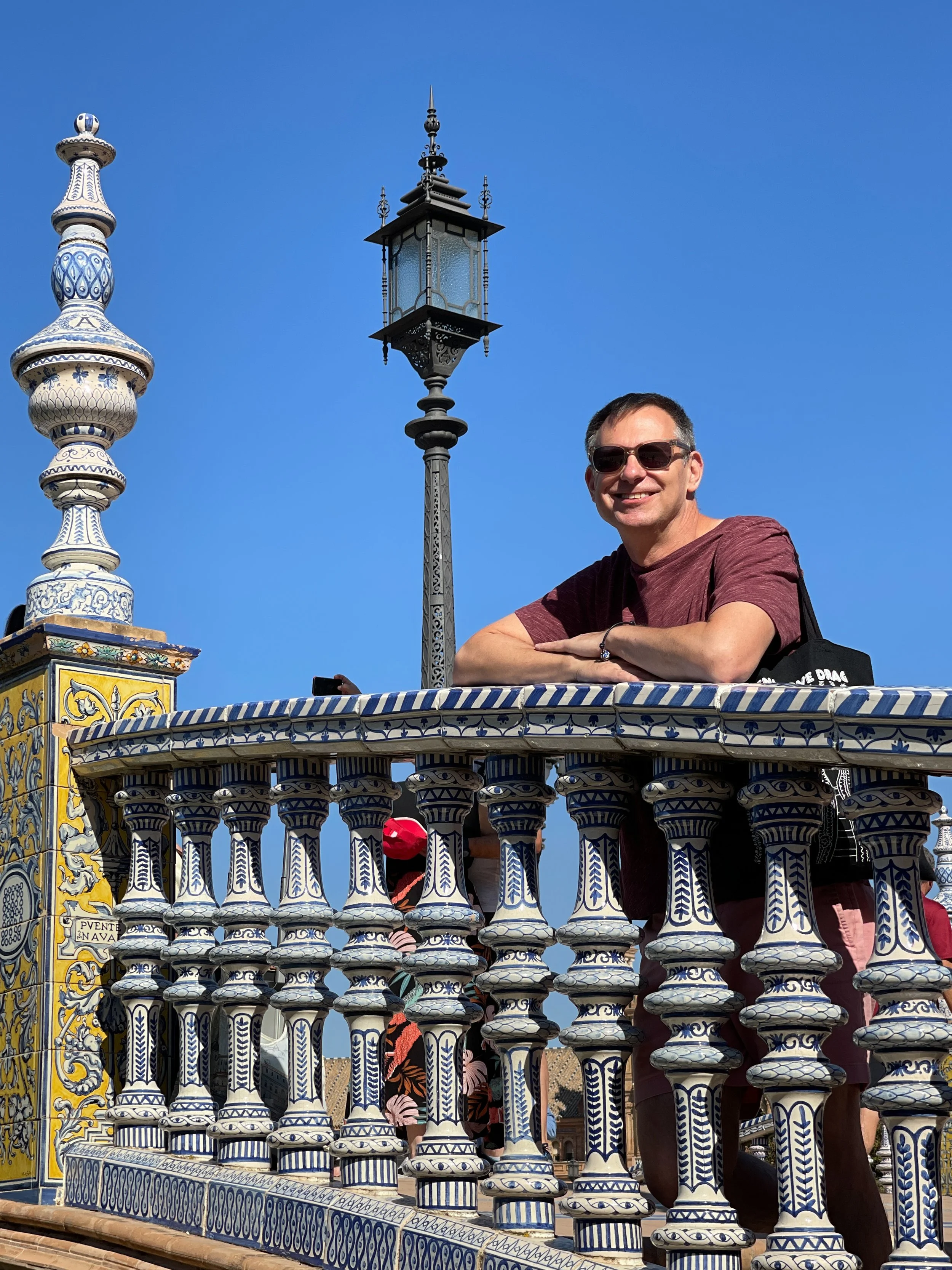
Man in t-shirt and sunglasses leans on blue and white railing of a bridge in the Plaza de España with one of the towers behind him

Even the railings of the bridges are gorgeous in the Plaza de España.

Earlier this year, we got our chance and stayed at an incredible Airbnb in Seville close to the Casco Viejo, or Old Quarter, with a rooftop view of the Catedral de Sevilla. One of the places we wanted to revisit was the Plaza de España, which was within walking distance from our accommodation. The city is quite walkable, flat and easy to navigate. Of course, this will depend on your level of mobility and whether you’re willing to walk (we always are).

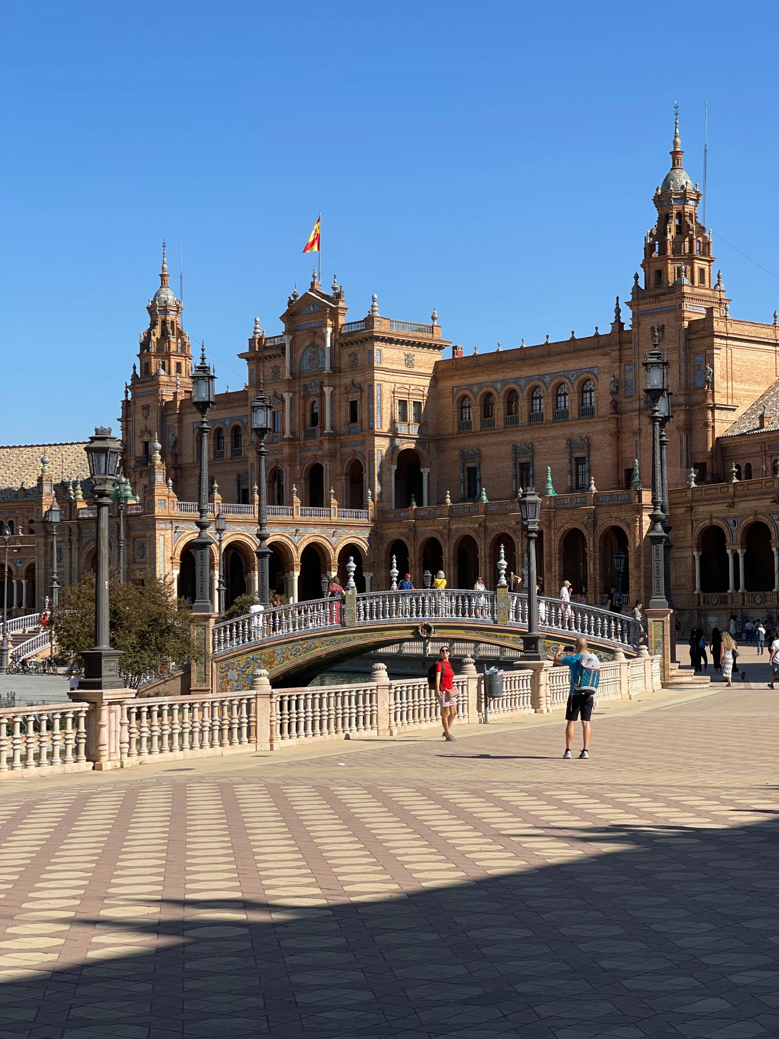
Building and bridge in the Plaza de España, where a tourist poses for a photo

Unlike other expositions, where most structures were temporary and torn down after the event, the elaborate Andalusia Pavilion was built to be permanent and was constructed using traditional materials such as brick, ceramic, iron and wood.

A Brief History of the Plaza de España

The Plaza de España includes the Pabellón de Andalucía (Pavilion of Andalusia), which was built to showcase Spain’s industrial and technological achievements at the 1929 Exposición Ibero-Americana (Ibero-American Exposition). 

This popular destination is nestled among the trees and flowers of Parque María de Luisa, which was formerly the private gardens of the Palacio de San Telmo. The land, donated to the city in 1893 by Infanta María Luisa Fernanda de Bourbon, Duchess of Montpensier, now serves as the city’s primary green space.

Portrait medallion bas relief carving of Alfonso el Sabio between arches in the Plaza de España in Sevilla

One of 48 portrait medallions from ceramicist Pedro Navía’s Triana studio depicting illustrious figures from Spain’s history, including this one of King Alfonso X “el Sabio” aka the Wise, who ruled from 1252-1284. 

The idea of hosting a fair in Sevilla was first proposed by civil engineer Luis Rodríguez Caso in 1908 as part of an extensive urban development project designed to boost economic growth and improve trade relations with Spain’s former Latin American colonies. 

Construction began in 1914 under the supervision of prominent architect Aníbal González. Unfortunately, World War I interrupted these plans, and delays were further exacerbated in 1918 by a particularly virulent strain of the H1N1 virus, estimated to have claimed 260,000 lives in Spain before waning a year later.

The plaza currently houses numerous administrative offices. Our friend Jo, an expat from the U.K. living in Spain, admitted to us that while the space is gorgeous, it also reminds her of the hours she spent in a bureaucratic nightmare of immigration red tape.

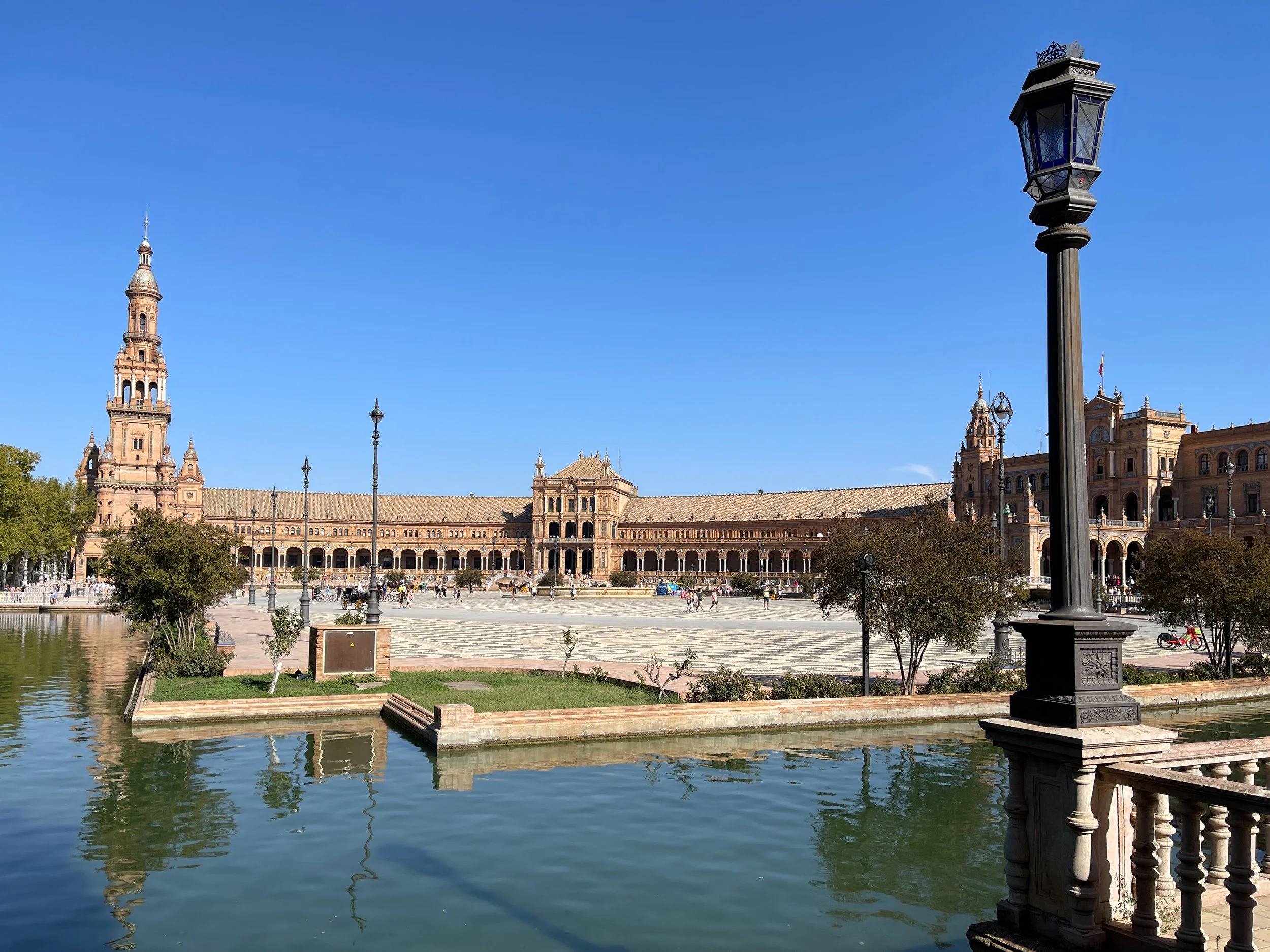
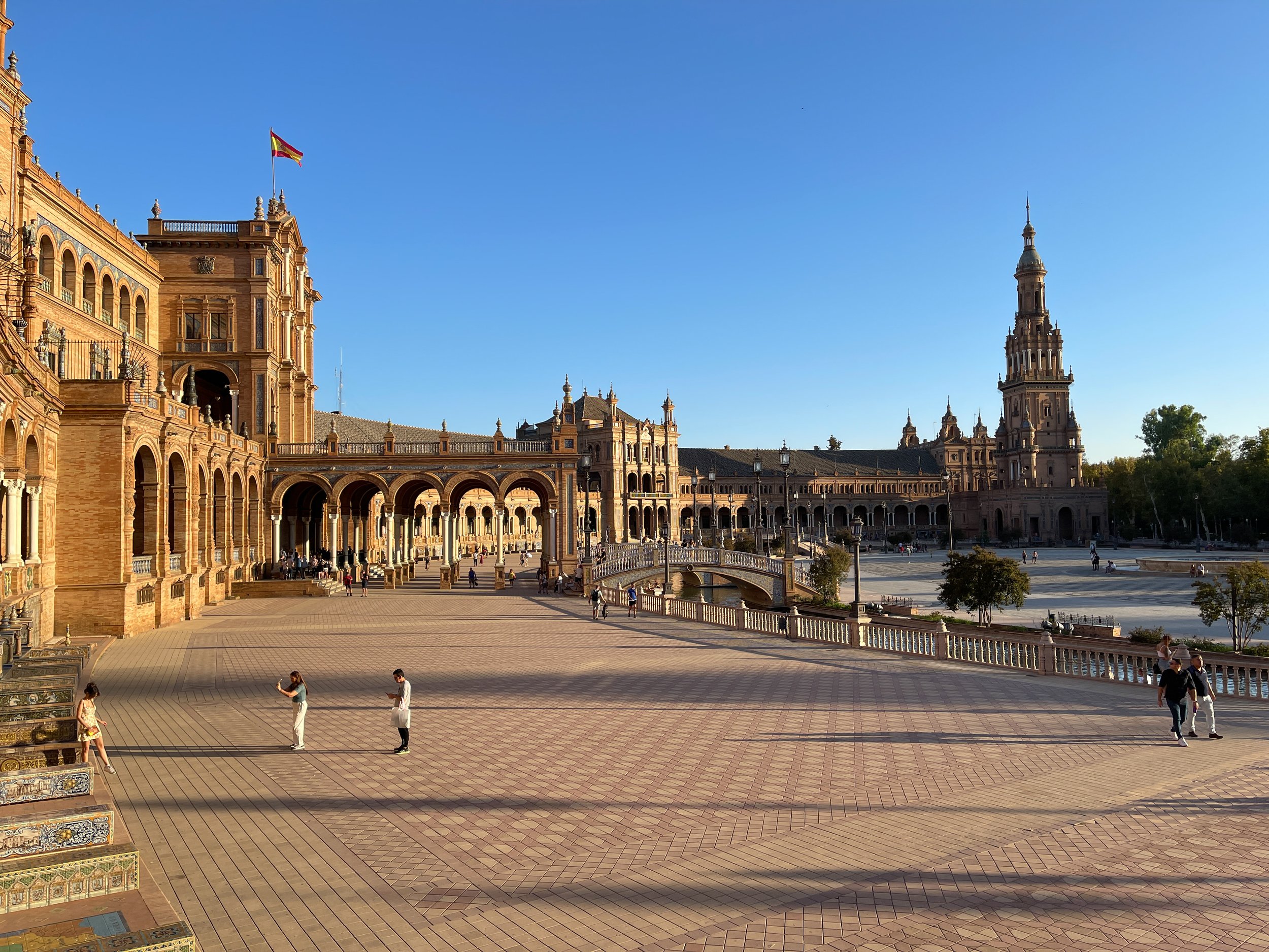
Curving building of the Plaza de España in Seville, with the moat and a lamppost

Stunning architecture and rich history come together at the iconic Plaza de España in Sevilla.

Visiting the Plaza de España

The Plaza and Fountain

The monumental structure, covering 538,196 square feet (50,000 square meters), was designed by González in the Regionalist style, which combines elements of Baroque, Mudéjar and Renaissance Revival. The grand fountain, added by architect Vicente Traver y Tomás, rises from the center of the plaza courtyard and was inspired by the Montjuïc fountain in Barcelona. (It was off during our visit due to a severe drought that had lasted for most of the year.) 

Pillared arcade with tourists at the Plaza de España in Sevilla

The porte-cochère acts as the grand entrance of the Plaza de España, now home to administrative offices.

Flamenco dancer in black and red performs in the Plaza de España while tourists watch

Flamenco dancers often perform beneath the columned central portico of the Pabellón de Andalucía at the Plaza de España.

A couple walks through the upper tier of the Plaza de España

Head to the upper gallery for a shaded walk and a great way to see the beauty of the plaza unfold below.

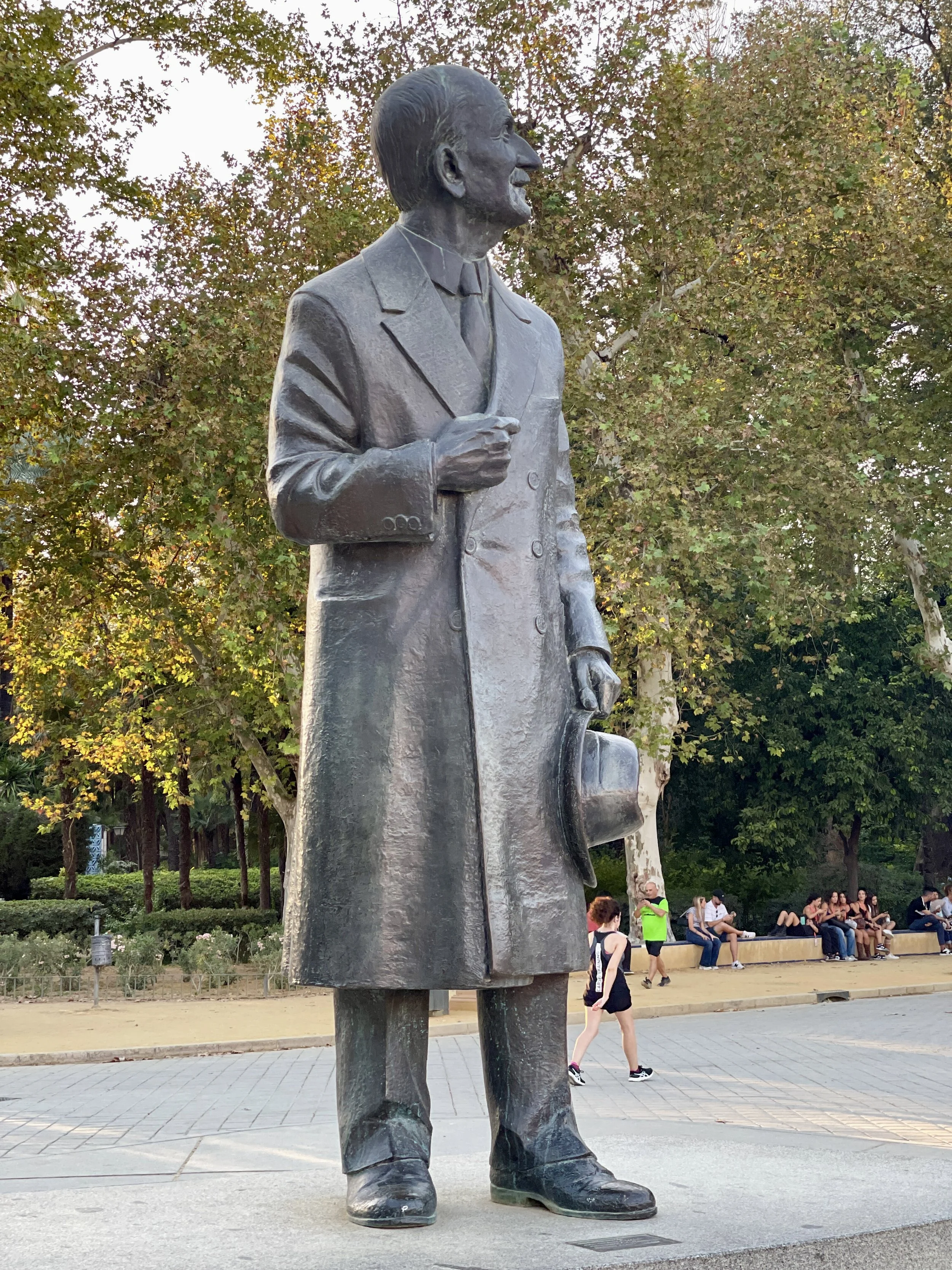
The original plans for the plaza didn’t include a fountain, but town officials insisted on adding one, much to González’s dismay. And according to local lore, that’s why the statue of González, standing at the axis of the pavilion’s crescent, faces away from the fountain.

Statue of Aníbal González Álvarez-Ossorio in the Plaza de España

Local lore has it that the likeness of architect Aníbal González is turned away from the fountain —added by Vicente Traver y Tomás — because he wasn’t a fan of the feature.

The main structure is capped by a pair of domed towers that were originally planned to be much taller. However, concerns arose that they would end up dwarfing La Giralda, the iconic bell tower of the Seville Cathedral. To ensure this wouldn’t happen, they were shortened to 243 feet (74 meters) high — 77 feet less than La Giralda.

One of the towers on the moat of the Plaza de España in Sevilla, Spain

The South Tower of the Plaza de España stands about 243 feet (74 meters) tall.

Between 2007 and 2010, the plaza underwent a meticulous 14 million euro renovation, which included the installation of ceramic lamp posts and railings around the canal, restoring the landmark to its former glory. About €5 million was used to replace the pipes and update the canal’s water supply system. While the building’s various government offices aren’t open for tours, you can still admire the interior colonnade and access the upper floor balconies to take in a view of the plaza from above.

Azulejo tile niche of Córdoba in the Plaza de España in Seville

In the Córdoba alcove, the hand-painted azulejo mural portrays the moment the city surrendered to King Ferdinand III of Castile. The Torre Campanario of the Mezquita-Catedral de Córdoba is visible on the left, while the Torre de la Malmuerta stands on the right.

The Tiled Alcoves

As you walk around the central plaza, vibrant color is everywhere — every possible variation and combination of greens and blues, ranging from the aquamarine of the shallow shore to the cerulean blue of the deep ocean, with a visual jolt of cadmium yellow.

The outer rim of the plaza’s pavilion has 48 alcoves with plinth-style benches, clad in azulejos, glazed ceramic tiles produced in Triana, a neighborhood renowned for its ceramic artists, across the river from Sevilla’s historic center. 

Among the four dozen tile and ceramic murals representing the provinces of Spain in Seville’s Plaza de España, the painted tiles from Ciudad Real show Don Quixote in armor, as the noble knight he imagined himself to be, preparing to battle windmills alongside his squire, Sancho Panza.

Each shrine-like space is dedicated to a different Spanish province, and includes a tile map of its territory, its coat of arms and a tableau depicting a historical event or cultural scene from the region.

Pillared shelves topped with pináculos, ceramic finials, flank the alcoves. Initially, I assumed these shelves might have been for holding votive candles, but I learned that they once held pamphlets with information about each province during the exposition. 

The Badajoz Bench with its beautiful azulejo tiles in the Plaza de España

This vibrant alcove at the Plaza de España features a colorful tableau for Badajoz, depicting King Alfonso IX of León’s recapture of the city from the Muslims in 1230 CE.

Beautiful details cover almost every inch of the plaza, many of which are the work of ceramicist and sculptor Pedro Navía y Campos. His craftsmanship can be seen in the 40 portrait medallions honoring prominent figures from Spain’s history that adorn the spandrels of the porticoed gallery.

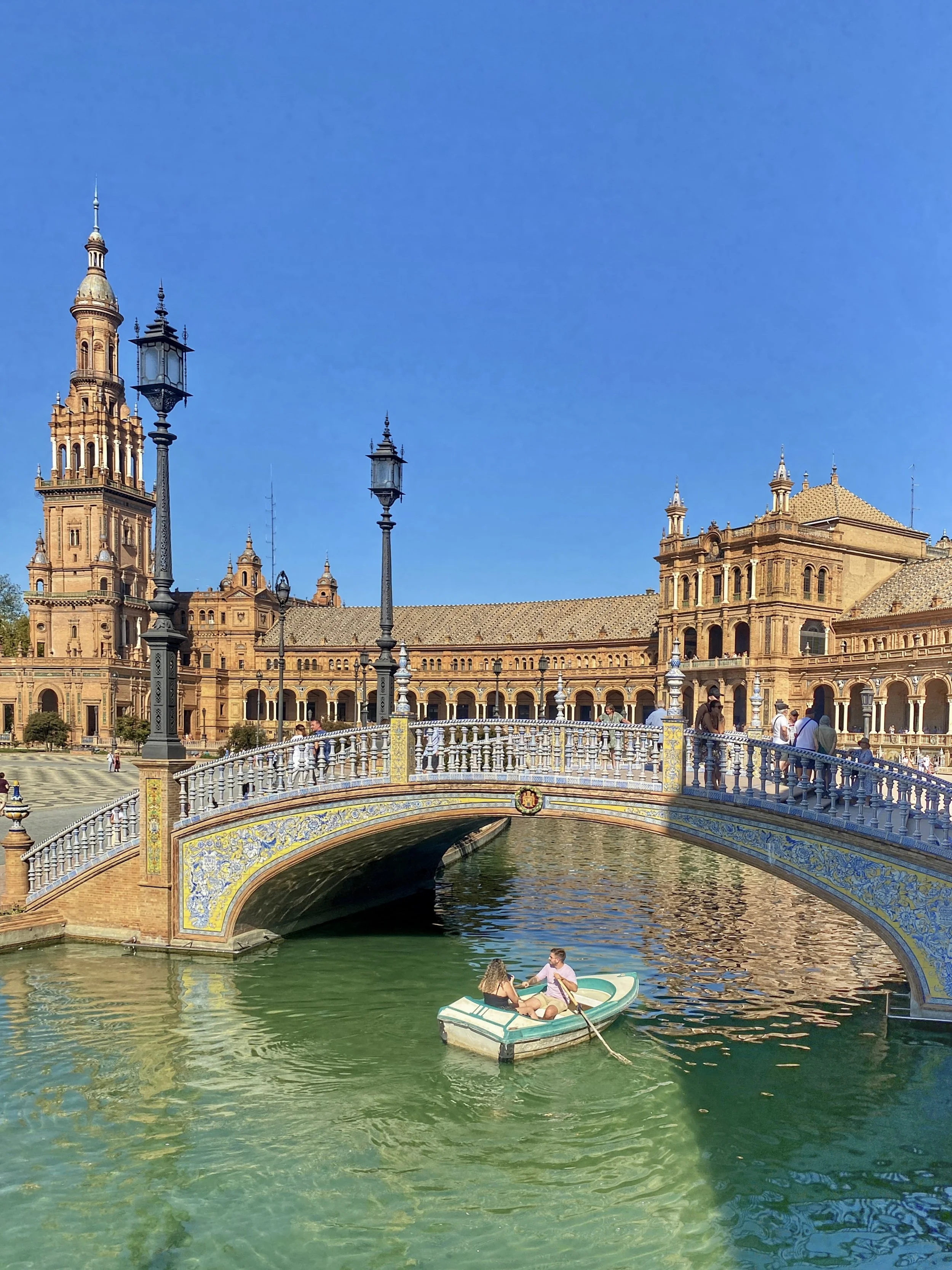
A man rows a boat with a woman in it in the moat of the Plaza de España, heading under a curved bridge

Charming rowboats glide across the canal, offering a unique and serene way to experience the beauty of Plaza de España.

The Bridges

The Venetian-style footbridges that gracefully arch over the canal add a picturesque charm to the plaza and beautifully complement the symmetry of the pavilion.

Man leans forward on blue and white bridge railing in the Plaza de España in Sevilla

Elegant bridges span the canal, blending Moorish, Renaissance and Spanish architectural styles.

They’re named after the four historical kingdoms of Spain: Castile, León, Navarre and Aragón. These bridges connect the open courtyard to the main building and galleries. Their blue and white balustrades were crafted by ceramist Manuel García Montalván. The administrative building is surrounded by a 1,690-foot-wide (515-meter) moat, where visitors can rent rowboats and leisurely paddle around. Wally and I haven’t done so yet — but we plan to in the future. 

Princess Amidala, R2D2 and Anakin Skywalker in the Plaza de España in the movie Star Works: Attack of the Clones

Star Wars fans will particularly love visiting the Plaza de España, as it was a filming location for Theed Palace in Naboo where Anakin and Padmé fall in love during Star Wars II: Attack of the Clones.

Movies Filmed at Plaza de España

The Plaza de España has been used as a filming location for a few well-known movies, including Lawrence of Arabia (1962), where it served as a backdrop for Cairo, Egypt, and Star Wars Episode II: Attack of the Clones (2002), when Anakin and Padme, followed by R2D2, arrive on Naboo and walk through the colonnade of the Palace of Theed. Most recently, it appeared as the palatial complex of an eccentric autocrat in The Dictator (2012) by Sacha Baron Cohen.

Plaza de España in Seville, Spain

Plaza de España, a stunning architectural marvel in Sevilla, boasts a grand semicircular building, vibrant ceramic tile decorations and a serene canal, making it a captivating symbol of Spain’s artistic and cultural heritage.

The Lowdown

While we were exploring, we witnessed a wannabe influencer who clearly expected everyone to move aside as she directed her husband to take a photo of her standing on the stairs as if she were the only one there. When the crowds didn’t clear for her to get “the perfect shot,” she had a meltdown and stormed off, leaving her husband with their baby and stroller to chase after her.

Influencer in white dress tries to pose while people walk down the stairs at the Plaza de España

Don’t be this woman. She threw a tantrum when other tourists refused to step aside so she could get her perfect shot.

The Plaza de España is located near the entrance of Maria Luisa Park across from the Universidad de Sevilla (University of Seville) and is about a five-minute walk following Avenida de Isabel la Católica. 

Squares of tiles in wood on the hall ceiling at the Plaza de España
Tiles of winged person on pillar in the Plaza de España, Sevilla
Man sits on tile-covered steps in the Plaza de España

Even the staircases of Plaza de España are adorned with exquisite tilework.

If you’re planning on visiting during the daytime be sure to wear sunscreen to prevent sunburn and bring bottled water to stay hydrated, as the majority of the plaza is open and exposed. 

There aren’t any public bathrooms within the main pavilion, but there are pay toilets in a compact building at the front of the plaza, which cost 60 céntimos to use.

Paseo de Isabel La Católica near the Plaza de España

Paseo de Isabel la Católica offers a peaceful stroll amid lush greenery, with Plaza de España on one side and Parque de María Luisa on the other.

The Plaza de España is currently free to enter, but concerns about managing overtourism and the costs of preserving the historic site have prompted city officials to consider imposing an entry fee for non-citizens. 
Whatever the outcome may be, we suggest spending a lazy afternoon admiring this special place. –Duke


Las Setas de Sevilla FAQ: Seville’s Wooden Wonderland

Everything you need to know about the futuristic mushroom marvel Metropol Parasol in Plaza de la Encarnación.

Las Setas in Seville

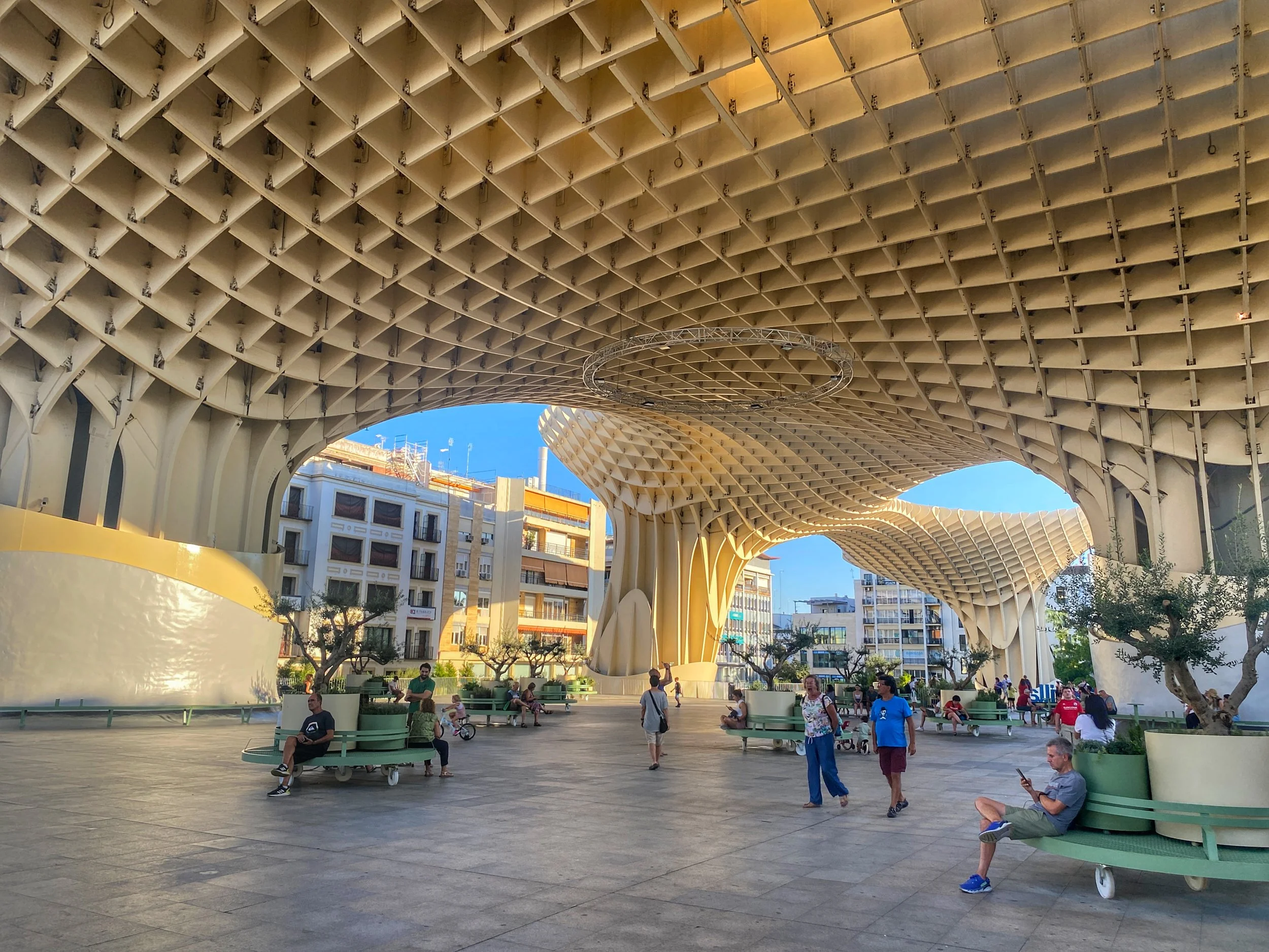
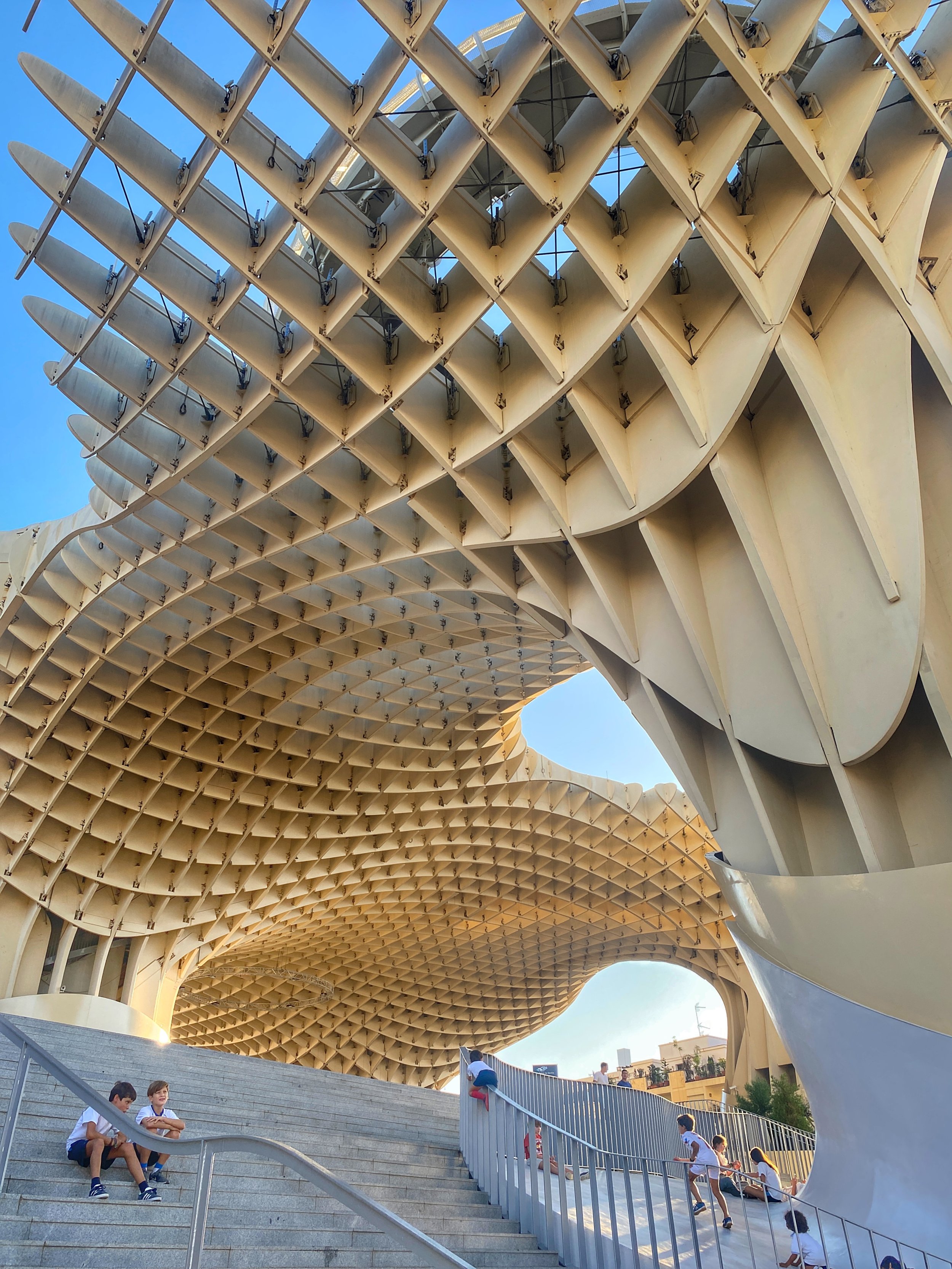
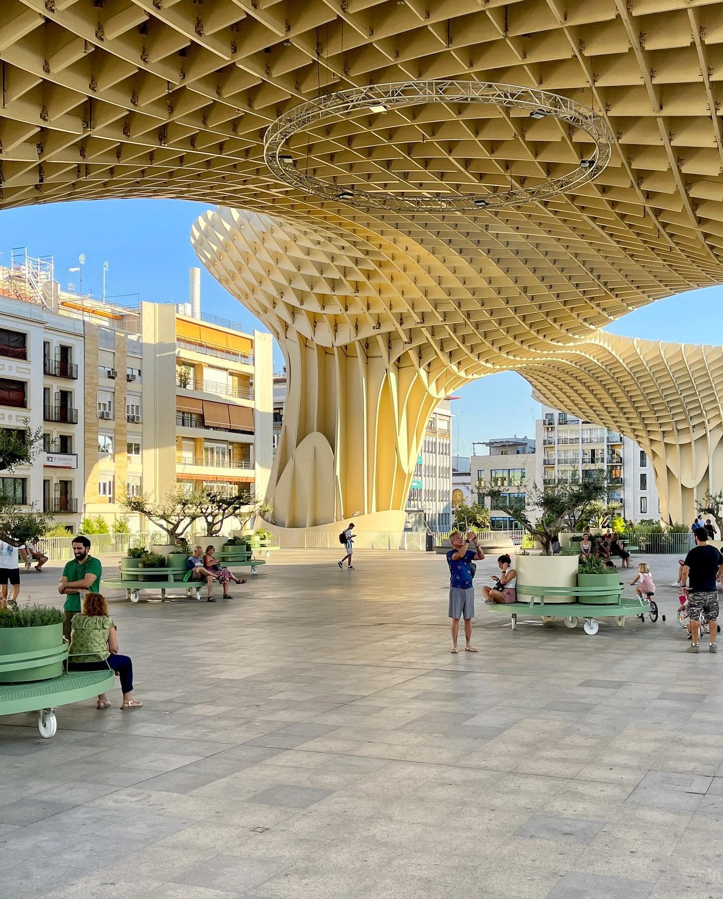
One minute you’re walking down one of the shopping thoroughfares of Sevilla, Spain, and the next you come upon a plaza with mesmerizing, undulating woven wooden structures that look like a grove of gigantic mushrooms. It’s as if you’ve stepped into a fairy tale (or a Dr. Seuss book).

That’s exactly why this quirky sculpture, officially named Metropol Parasol, will always be known as Las Setas, or the Mushrooms, to locals and tourists alike. (Sort of like how no one calls the iconic silver sculpture in Chicago by its real name, Cloud Gate — it’s the Bean.)

It’s as if you’ve stepped into a fairy tale (or a Dr. Seuss book).

Here are some of the most frequently asked questions about Las Setas.

People gather and hang out under the Setas in Seville

Why is Las Setas called Metropol Parasol?

Las Setas (aka Setas de Sevilla) is officially named Metropol Parasol. “Metropol” highlights the sculpture’s urban significance and integration into Sevilla’s cityscape, while “Parasol” refers to its umbrella-like structure, which provides much-needed shade in the scorching Andalusian climate.

People walk and sit on benches under Las Setas in Seville

What is the history of Las Setas in Seville?

The history of Las Setas de Sevilla begins with the need to renovate la Plaza de la Encarnación, which had become neglected. (You’d never know it now, as it’s surrounded by boutique shops and restaurants.) 

In 2004, an international competition was held to redesign the square, and German architect Jürgen Mayer’s innovative wooden structure took the prize. 

The project, completed in 2011, aimed to revitalize the area by combining modern architecture with the preservation of historic Roman ruins found during construction.

Las Setas de Sevilla is more than just an architectural wonder; it’s a lesson in urban transformation. It’s about taking risks, breaking molds and creating spaces that blend the old with the mind-bogglingly new. Sevilla’s got its historical charms — but Las Setas shows it’s also got its finger on the pulse of modern innovation. The once-sleepy Plaza de la Encarnación is now wide awake. 

A column of Las Setas in Seville, with people underneath

When was Las Setas built? How long did it take to build?

From groundbreaking in 2005 to its grand opening in 2011, Las Setas’ journey was more of a marathon than a sprint. What accounted for the delays? Blame it on the unexpected yet fascinating archaeological finds beneath its feet. Turns out, building over centuries-old ruins isn’t exactly a walk in the park.

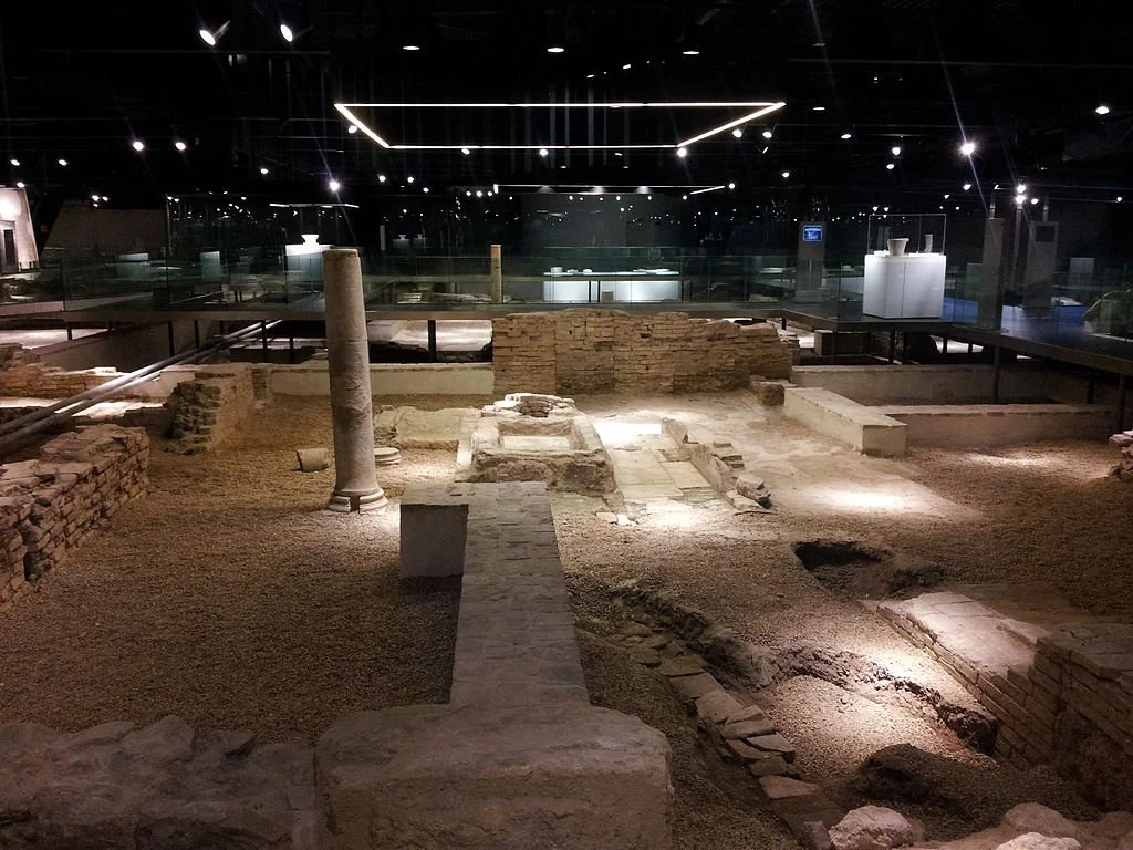
Some of the ruins in the Antiquarium under Las Setas in Sevilla

What are the architectural ruins below Las Setas de Sevilla?

Beneath the whimsical wooden canopy of Las Setas lies a treasure trove of ancient history. As the construction for this modern marvel began, builders unearthed significant archaeological ruins, revealing Sevilla’s layered past. 

This subterranean wonderland, known as the Antiquarium, showcases remnants from the Roman Empire, including mosaics, pottery and foundations of buildings dating back to the 1st century CE. Visitors can also glimpse traces of a 12th century Islamic Almohad house, bridging Sevilla’s Roman and Moorish eras.

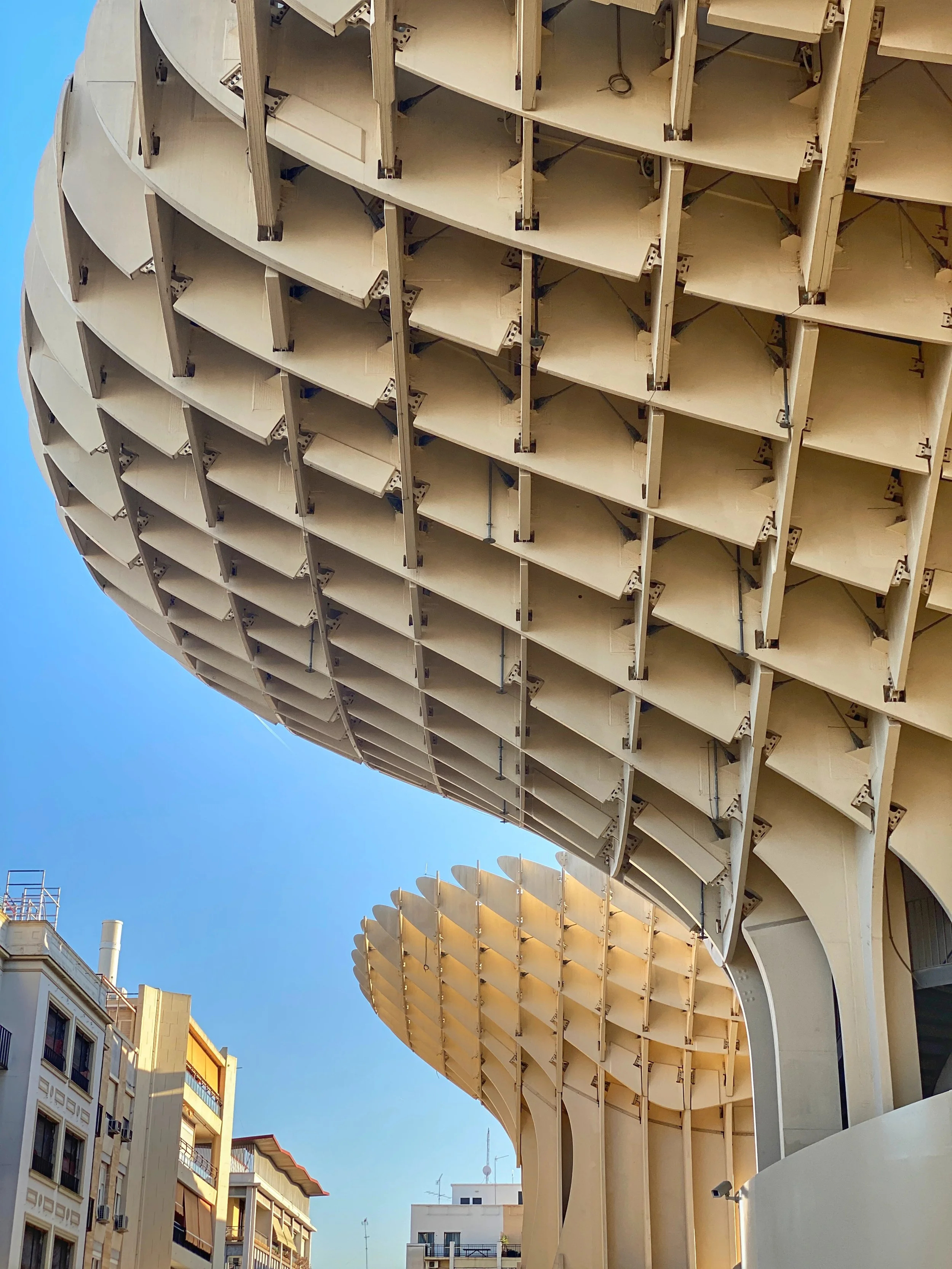
Two rounded outcroppings of Las Setas in Sevilla and the plaza

What inspired the design of Las Setas?

Imagine what would happen if the vaults of the Seville Cathedral and local ficus trees had a baby. That’s Las Setas for you — a unique design that not only catches the eye but also connects nature to urban life.

Mayer wanted the sculpture to be not only striking but functional. “How do you approach a space that’s supposed to become the revitalized heart of a city?” he asked in 032c magazine. “The biggest asset that one can have, for three quarters of the year, is shade. So we tried out different geometric ideas, and in the end we decided on these circular elements that counter and respond to the variables of the square in a flexible way. It doesn’t seem rigid.”

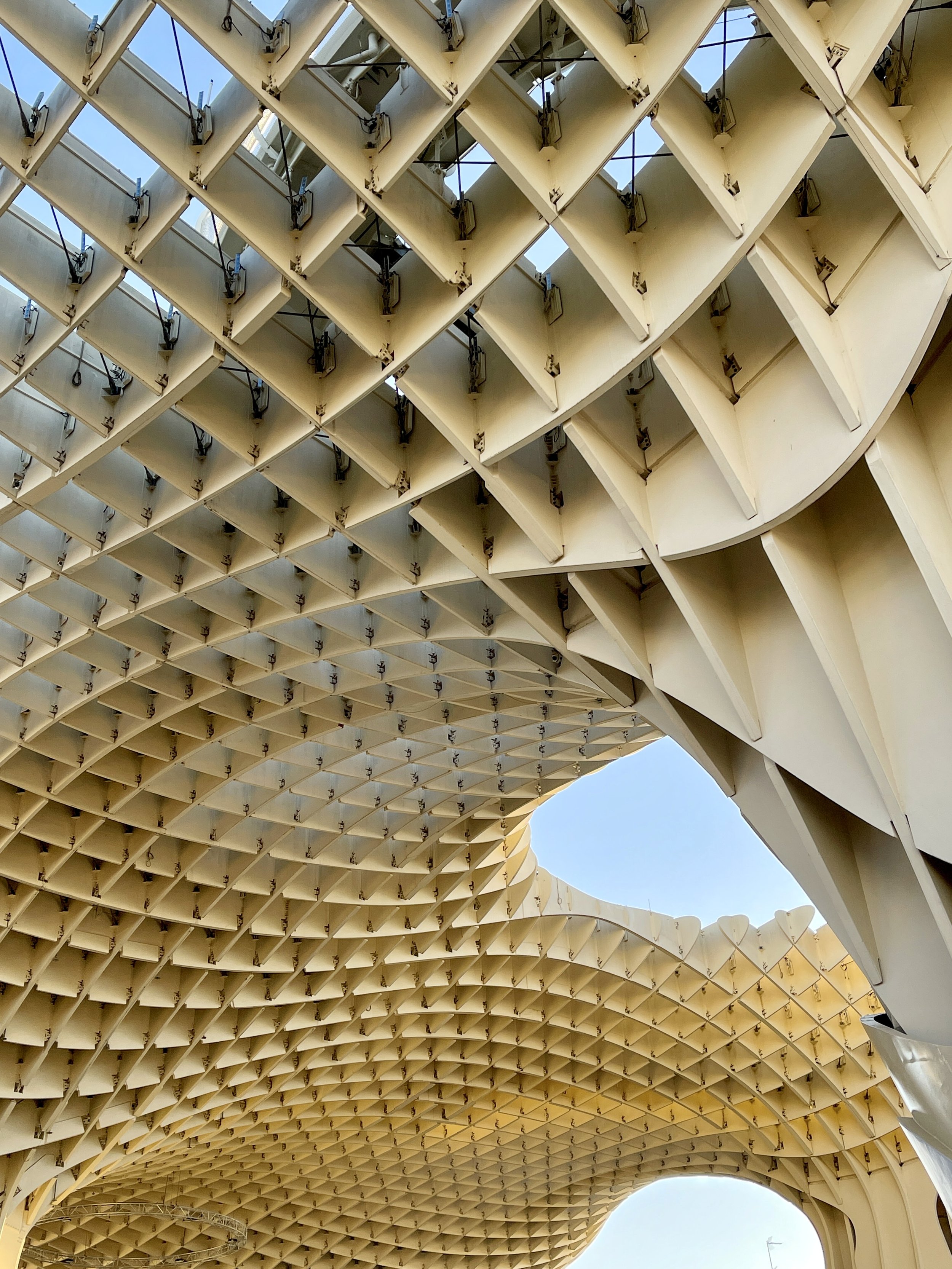
Closeup of the crisscrossed woodwork of Las Setas in Sevilla

What is Las Setas made of?

Las Setas de Sevilla is made of laminated timber. It holds the honor of being the world’s largest wooden structure, crafted of pine from Finland and coated with polyurethane for durability. 

The intricate honeycomb design consists of wooden lattices draped over columns. More than 3,400 wooden and concrete pieces were fit together like a gigantic jigsaw puzzle.

Who knew a bunch of wood planks could look so cool?

How much did Las Setas cost to build?

The construction of Las Setas de Sevilla cost about 100 million euros — ballooning significantly from its original €86 million budget. This substantial investment covered the innovative design, the use of high-quality laminated timber and the various facilities housed within the structure, including an archaeological museum, a market and event spaces.

The top walkway of Las Setas de Sevilla lit up purple at night

Can you go to the top of Las Setas in Seville?

Yes, you can go to the top of Las Setas.

An elevated 380-yard (350-meter) walkway allows you to saunter around and through the parasols, offering dizzying views of Sevilla’s classic rooftops and plazas. The walkway culminates at the topmost mushroom cap, almost 80 feet (24 meters) high, featuring a viewing platform where you can pretend you’re royalty surveying your kingdom below.

Visitors can access this area via elevators housed in the concrete columns of the structure.

Two boys sit on the steps of Las Setas in Sevilla

How can I buy tickets for Las Setas de Sevilla?

Ready to explore this mushroom wonderland? Tickets to visit the top of Las Setas start at €5 (free for kids under 6), with options to add a sprinkle of virtual reality or a dash of audio guide to your experience for €3 each. 

You can buy them online, or onsite in the lower level.

Las Setas de Sevilla lit up purple, blue and green at night

What are the opening hours of Las Setas?

Las Setas de Sevilla is open from 10 a.m. to 11 p.m., making it the perfect spot for both early birds and night owls. Just keep in mind it’s closed on major holidays — because even mushrooms need a day off.

People dine outside in the plaza by Las Setas in Sevilla

Where to eat at Las Setas?

The dining options at and near Las Setas de Sevilla are as eclectic and exciting as the structure itself. Here’s a rundown of some spots that range from casual bites to more refined dining:

1. La Mala Brunch: Located right under Las Setas, this gem serves up Mediterranean and healthy bites for a casual brunch or tapas session. Think avocado toast (with oversized wooden mushrooms).

2. Ibericos Vera: Right inside the Mercado de la Encarnación, this stall offers traditional Spanish tapas. Good for a quick, delicious bite.

3. Cervecería La Sureña: Serving up cuisine from the South of Spain, this bar is great for an affordable lunch or evening drinks with a killer view.

4. Tropiqual: Tired of tapas? If you’re craving sushi or steak, this upscale option works for when you’re feeling a bit fancy.

5. La Gorda de Las Setas: Offering Mediterranean and Spanish dishes, this spot is perfect for enjoying tapas with a side of architectural awe.

6. LaSanta: A short walk from Las Setas, this spot serves international and Mediterranean dishes in a casual setting.

7. Burro Canaglia Bar & Resto: Dishes up Italian food in a stylish atmosphere. Perfect for when you’re wanting pizza or pasta.

8. Patio San Eloy: A casual bar serving tapas. Great for a budget-friendly yet tasty meal.

9. Doña Encarna: This chic spot offers traditional local fare that’s even better than your abuelita makes.

10. Virgen Coffee: The best place to grab a quick coffee break, making some of the best lattes in Seville.

11. Tablao Flamenco Las Setas: Combine your meal with a show. Enjoy live flamenco performances along with signature cocktails and traditional Andalusian flavors for an immersive cultural experience.

The children's play area under Las Setas in Sevilla

What’s there to do at Las Setas besides enjoying the view?

Really, Las Setas de Sevilla is a cool urban square to hang out in, people-watch or read on a bench. Children ride bikes and clamber about the small playlot. 

But beyond its spectacular views, Las Setas is a treasure trove of history with the Antiquarium, where ancient Roman and Moorish artifacts are displayed. Tickets are €2.

And don’t miss the light show — a nightly spectacle that turns the structure into a glowing piece of rainbow-hued art.

People hang out under Las Setas in Sevilla

Where is Las Setas located in Seville?

Las Setas is in the Plaza de la Encarnación, a central square in Sevilla. It’s about a 10-minute walk due north of the cathedral. 

What events are held at Las Setas in Seville?

Las Setas hosts a variety of events throughout the year, including cultural performances, art exhibitions, concerts and markets. The elevated plaza and the shaded areas below are versatile spaces used for different types of public and private events, making it a vibrant community hub in Sevilla.

People under Las Setas in Sevilla, including a woman in a flowing skirt and a little girl on a pink bike

Why was Las Setas controversial?

Las Setas didn’t sprout superfans overnight — it also grew a fair share of controversy. Critics argued that its modern design clashed with Sevilla’s historic aesthetic. Plus, the project’s high cost — rumored to hit the €100 million mark — didn’t sit well in a country there the economy was taking a siesta. 

And the local Muslim community thought the Mushrooms looked a bit too phallic for their tastes. 

Despite the initial pushback, Las Setas has ripened into a beloved icon of the city, showing that even the most divisive fungi can find their fan base. 

The undulating, waffle-like Las Setas in Sevilla

Las Setas: Sevilla’s Fungal Fantasia

So, there you have it — Las Setas in a nutshell. It’s weird, wonderful and unapologetically Sevilla. Whether you’re a history buff, an architecture enthusiast or just someone in search of the perfect Instagram backdrop, Las Setas is a can’t-miss spectacle. –Wally
 

Palacio de Viana’s Secret Gardens

Filled with flowers, fountains and fruit trees, each patio at this overlooked gem in Córdoba, Spain has a story waiting to be discovered.

The Palacio de Viana dates back to the 15th century and grew to include a dozen courtyard gardens, many of which are abundant with climbing vines complemented by a distinctive shade of blue.

Suppose you have a brief stay in Córdoba, Spain, and you can only see two of this charming town’s sights. One, of course, has to be the Mezquita. But the second might be a bit surprising: We think you should head a bit off the beaten path to explore the gorgeous plant-filled patios of the Palacio de Viana. 

We might not have even visited the palace (think of it more as a museum and garden where a series of marquises lived) if we hadn’t had a bit of extra time in Córdoba and asked our friend Jo for a recommendation. She told us that it was impressive, but we were absolutely astounded by the variety and number of courtyards. There are 12 in total, not to mention the massive garden, with each taking you on a journey through the home’s extraordinary history.

Entrance to the Palacio de Viana with statues and carvings above

The striking entrance onto the Plaza Don Gome was added by Luis Gómez de Figueroa y Córdoba, the 2nd Lord of Villaseca.

Visiting Palacio de Viana

As we set off from our lodgings at los Patios del Pañuelo, it was yet another blazingly hot afternoon in Córdoba, even though it was early October. You’re mostly sheltered from the sun by the narrow winding labyrinthine passageways of the historic center. However, after a 15-minute walk en route to the palacio, the intense heat washed over us as if an oven door had opened. The heat builds up throughout the course of the day, and somehow feels hottest around 5 p.m.

Before entering the historic landmark, Duke and I decided to pop into Taberna de Viana, a no-frills café across the street. We were drawn in by a sign advertising their hot pink dragon fruit smoothies.

The seamless blending of indoor and outdoor spaces gives the palace a beautiful harmony.

Refreshed and hydrated, we crossed the Plaza de Don Gome, the small square in front of the palacio. Because we visited during typical siesta hours, our admission was free. (You’ll find this happens a lot in Andalusia, or that the admission is remarkably cheap.)

Looking through an arch into the lush Reception Courtyard at Viana, with its large palm in the center

The courtyards of Córdoba are a testament to the city’s rich history, influenced by various cultural groups, including the Romans, Visigoths, Muslims and Christians over thousands of years.

A Brief History of Cordoban Courtyards

As with most things in town, it started with the Romans. They loved to sip their watered-down wine while lounging in their interior courtyards, a practice that left its mark on Córdoba and has become a symbol of the city. 

The Muslims introduced courtyard gardens that aspired to paradise. Enter ornate tiles, gurgling fountains, reflecting pools and greenery that evokes a desert oasis. 

And when the Christians conquered Córdoba, the courtyards got another makeover, adopting the in-vogue Renaissance style (a bit of a snooze comparatively, in my humble opinion).

Fountain, colonnade and tree with magenta flowers and potted plants in the Courtyard of the Columns at Palacio de Viana

The Courtyard of the Columns is actually the newest of all the patios at Viana.

As time marched on, it wasn’t all sunshine and sangria, and some of the patios fell into a state of disrepair. But there’s nothing like a little friendly rivalry to encourage people to whip their courtyards into shape. Competitions were held, leading to the Fiesta de los Patios — an annual event in May that transforms the entire town into a courtyard carnival. This tradition has been recognized and honored by UNESCO since 2012.

Fountain in cobblestone Courtyard of the Gate at Palacio de Viana, with photos of bald women cancer survivors and potted plants

The entrance to the palace is through this charming courtyard, which had large photos of bald women cancer survivors when we visited.

A Tour of the Palacio de Viana

Courtyard of the Gate

This courtyard was the entrance to houses once owned by neighbors, the Torres Cabreras, until it was incorporated into the Palacio de Viana in the 19th century. I particularly liked the cobbled floor. A stone pillar, probably of Roman origin and currently repurposed as a planter, was formerly used as a trough for horses and other animals.

It’s come full circle, since the patio is now used as the entrance to the visitor reception center. We left the palace through this patio, which was exhibiting photos of female cancer survivors.

Main plants: bush lilies, Lady Banks’ roses, calla lilies, bougainvillea, centaurea and geraniums

Massive palm tree in the center of the Reception Courtyard at Palacio de Viana

A date palm surrounded by an arcade of 16 Tuscan columns stands at the center of the Reception Courtyard.

Reception Courtyard

Originally an enclosed courtyard, its present incarnation as the entrance to the Patio de Recibo dates back to the 1500s. This transformation took place when Luis Gómez de Figueroa y Córdoba, the 2nd Lord of Villaseca, married María de Guzmán y Argote, a Cordoban noblewoman. Motivated by the union and elevated social status, he constructed the corner façade opening out onto the Plaza de Don Gome. It was designed to impress and highlight the status and wealth of its noble occupants. Some plants were chosen to maintain their greenery throughout the year, while others flowered in different seasons.

A date palm stands at its center, surrounded by an arcade of 16 Tuscan columns supporting a two-story structure, whose window frames are painted in the palace’s signature color, Viana blue. Its trapezoidal shape (think of a triangle with the top shaved off) is a reflection of the plot of land available at the time.

Lush plants, pots, columns and arches, geometric patterned cobblestones, white walls and blue windows at Palacio de Viana's Reception Courtyard

A tour of Viana starts off with a bang, with the large, dramatic Reception Courtyard.

Back in the day, the lord would have his carriage in the stables and enter under one of the arches, while horses would drink water from a Visigothic baptismal font used as a trough. The corner, where two rows of columned arches meet, was where the carriages came and went.

Main plants: plumbago, date palm, Lady Banks’ roses, bush lilies, night blooming jasmine and bougainvillea. 

Red geraniums in pots covering a wall in the Courtyard of the Cats at Viana

Walls lined with potted geraniums are a common sight in Córdoba, and the Courtyard of the Cats was no exception.

Courtyard of the Cats

The adjoining courtyard belonged to the Puentezuela de Tres Caños houses, which were purchased in 1545 by Gómez de Figueroa y Córdoba, the 1st Lord of Villaseca. In keeping with medieval tradition, they were cut off from the rest of the palace and used as rental properties. Families that once lived in these homes used the stone troughs in the courtyard gallery for laundry and drew water from the well.

Potted plants on the wall and a bench in the Courtyard of the Cats at the Palacio de Viana

This courtyard once belonged to the Puentezuela de Tres Caños houses and served as rental properties until the second half of the 18th century.

In the second half of the 1700s, it was integrated into the palace and used as offices for the palace’s administrators. But, OK, where are the cats?! It might be a disambiguation of uñas de gato, or cats claws, a leafy vine with sharp three-pronged tendrils resembling a cat’s claws that help it climb and flourish in the courtyard. 

Then again, it’s easy to imagine it was a favorite spot for kitties looking for food scraps after the Viana family took ownership of the palace in 1873 and installed kitchens in the adjoining buildings. 

Main plants: pink trumpet vines, ivy geraniums, geraniums, carnations, marguerites and purple carpet creeping thyme

Green orange on tree with blue window in background in Courtyard of the Orange Trees at Viana

The Courtyard of the Orange Trees is filled with centuries-old orange trees.

Courtyard of the Orange Trees

Before the Reception Courtyard was built, this was the entrance to the palace in the 15th century. 

Inspired by Muslim orchard gardens, this courtyard is filled with centuries-old orange trees, surrounded by rounded hedges. These were private spaces where one could sit and think, perhaps pondering the meaning of life. They were designed to mimic desert oases, with water being a prominent feature, referred to in the Quran as “divine mercy” — not surprising considering the arid nature of much of the Islamic world.

Orange tree in the Courtyard of the Orange Trees at Viana

The patio was inspired by traditional Muslim orchard gardens.

If you close your eyes and focus on your senses, you might smell the delicate scent of orange blossoms or heliotrope followed by the gentle sound of gurgling water. Remember the original purpose of such an intimate, tranquil space: introspection, communion with the divine and contemplation of nature.

Fountain bubbling in pool with lily pads in plant-filled Courtyard of the Orange Trees at Viana

How dapper! The last marquis of Viana would pick a flower from the courtyard every day to put in his jacket’s buttonhole.

But I don’t recommend following the tradition of the last marquis of Viana who lived here. Every morning he’d come to the Courtyard of the Orange Trees to pick a heliotrope flower for the buttonhole of his jacket — I’m pretty sure that picking the flowers is now discouraged.

Main plants: bitter orange trees, white water lilies, calla lilies, Chinese wisteria, pig squeak and plumbago. 

Steps with flower pots on stone floor with blue window in the Courtyard of the Bars at Palacio de Viana

The Marchioness of Viana had these tiered steps built to display her pots of cineraria during the passing of the Virgin of Anguish on Holy Thursday.

Courtyard of the Bars

Courtyards are typically private spaces hidden from the casual passerby, but the Patio de las Rejas, or Courtyard of the Bars, breaks with that tradition. Created by the 3rd Lord of Villaseca, Gómez de Figueroa de Córdoba, it features three Mannerist-style openings with wrought iron railings. These “bars” gave the courtyard its name and offered the public a view of the home’s beauty from Rejas de Don Gome Street. If this seems like a means for nobility to flaunt their status and wealth, you're right. 

Cordoban courtyard gardens liberally use potted plants for decoration, something we hadn’t seen anywhere else.

To ensure greenery throughout the year (important since this courtyard was on public display), the gardeners put citrus trees on trellises along the walls, training them to grow vertically. Tiered steps were built following orders from Sofía Amelia de Lancaster y Bleck (1904-1982), 3rd Marchioness of Viana to display her pots of cineraria during the passing of the Virgen de las Angustias (Virgin of Anguish) on Holy Thursday. 

Additionally, she chose to have her bedroom window face the courtyard from the second floor, ensuring that she’d have the best view of the courtyard.

Main plants: citrus trees, geraniums, cineraria, centaura and calla lilies. 

That’s Madama — the water nymph who gave the courtyard its name.

Madama Courtyard 

Created as part of the renovations that took place during the 18th century, the Patio de la Madama was designed to be admired from inside the palace. Cypress trees frame the fountain at its center, which features a naiad, or water nymph, pouring water from a jug, much like the star sign Aquarius. Calla lilies sprout from pots submerged in the basin. 

The naiad, the madama of the courtyard’s name, gazes toward the windows of the Admiral’s Bedroom (so called because the last Marquis of Viana, who served as an Admiral of the Navy, used it as a guest room when his military buddies came to stay). The Neoclassical style of this intimate courtyard is enhanced by the wrought iron balcony and the Viana blue windows and doors.

If you visit during the summer, jasmine will be in full bloom, covering one of the walls and filling the air with its heady fragrance.

Main plants: mandarins, sweet violets, heartsease, bougainvillea, velvet groundsel and jasmine. 

Large round fountain in the garden at Palacio de Viana, with hedges and a church tower in the background

The large garden at Viana was inspired by those in France. It’s composed of symmetrical, meticulously trimmed hedges designs.

The Garden

In an effort to keep up with the Joneses, or at least the rest of the nobility, the 7th Marquis of Villaseca, Diego Rafael Cabrera (1767-1816), added a French-inspired garden to the palace. The marquis purchased the homes of his neighbors, the counts of Torres Cabrera, and subsequently demolished them to create this expansive green space, covering over 13,000 square feet or 1,200 square meters. The garden includes some of the oldest botanical specimens at Viana, such as the towering white oak that stands over 82 feet (25 meters) high, believed to be about four centuries old.

A rounded hut made of rock, or grotesque-style gazebo at the garden at Palacio de Viana

The grotesque-style gazebo on one side of the garden struck us as a bit ominous.

Well-manicured box hedges form geometric shapes that divide the garden, with a circular pathway surrounding the central fountain. To the far right as you enter the garden is a peculiar structure covered in ivy. We saw other visitors crouching inside it, and I wouldn’t argue with its designation as a “grotesque-style” gazebo.

Main plants: citrus trees, white oaks, Delavay’s magnolias, oleanders, pomegranates, roses, velvet groundsel and German irises. 

The small rectangular pool surrounded by potted plants in the Courtyard of the Pool at Palacio de Viana

Traditional Islamic gardens had pools to aerate and oxygenate the water.

Courtyard of the Pool

At the back of the garden is the Patio de la Alberca, or Courtyard of the Pool, a service area where gardeners work their magic behind the scenes. A greenhouse from the 1960s stands where, in the past, stuffed deer heads once hung — relics from hunts with King Alfonso XIII.

The pool is a more recent addition, transferred to its current location from the nearby Courtyard of the Well in the 1980s. Pools have essential roles in Arabic gardens, aside from offering picturesque reflections: Sunlight aerates and oxygenates the water, which, at Viana comes from the well, before it’s used in irrigation.

Main plants: citrus trees, centaurea, geraniums, carnations, white lantana and corals

Hexagon-shaped whitewashed well with iron bars arching over it, pink bougainvillea and potted plants in the Courtyard of the Well at Viana

The well at Viana connects to an underground stream. It supplies all the water at the palace, nourishing the numerous plants and feeding its fountains.

Courtyard of the Well

An additional service area, the Patio del Pozo, or the Courtyard of the Well, is the water source of the complex. The ancient well, a whitewashed hexagon with brick trim and an iron arch, connects to the Colodro stream, which flows underground and supplies enough water for the entire palace, including its fountains.

A square stone carved with a mustachioed man with a water spout where his mouth is on a courtyard in the Palacio de Viana

The Fuente de Doña Leonor, named for one of the daughters of the 2nd Marquis of Viana. 

Old earthenware jugs used as plant pots dot the courtyard amid bougainvillea and other plants. Look for the mustachioed face jutting out from one of the palace’s walls. It’s the Fuente de Doña Leonor, named for one of the daughters of the 2nd Marquis of Viana. 

Main plants: bougainvillea, chrysanthemums, jasmine, petunias, lantanas and redflush

Small fountain by plumbago-covered wall with blue flowers in the Courtyard of the Gardeners at Palacio de Viana

Plumbago has been trained to grow up the wall in the Courtyard of the Gardeners.

Courtyard of the Gardeners

Rounding out the trio of service courtyards, this one gets its name from being where the gardeners store their tools. (Originally, it was called the Courtyard of the Dogs, for, one imagines, obvious reasons.) Its most noteworthy feature is the wall that forms a vertical garden of plumbago. A window that peers into the Courtyard of the Well, bordered in pretty geometric zellij tiles. In fact, this patio has the most tilework of any at the palace — see how many you can find.

Wally on the Courtyard of the Gardeners

This courtyard reflects a tradition of the middle class: a delightful mishmash of items placed around the patio. Unable to afford statues, the average Córdoban would scatter antiques, archeological finds, furniture, ceramics, plinths and more. Look closely and you’ll spot a church lintel. 

Main plants: plumbago, centaurea, roses, petunias and geraniums 

Small fountain spouting water surrounded by ferns in front of a colonnade in the Courtyard of the Chapel at Palacio de Viana

There’s a sense of quietude when you enter the Courtyard of the Chapel. It’s meant to be a place for introspection before worshiping in the small chapel.

Courtyard of the Chapel

Repetition. Harmony. Tranquility. These are the themes of the stately Patio de la Capilla, or Courtyard of the Chapel, designed to inspire introspection among the shadows of the citrus trees. If it feels a bit solemn, that’s the point: It leads to the private chapel, so silence is encouraged.

Back when this section of the palace was still owned by the counts of Torres Cabrera, this was their main courtyard. Created in the 17th century, it was incorporated into the Palacio de Viana 200 years later.

Statue of person by elaborately carved wooden door on the outskirts of the Courtyard of the Chapel at Viana

Archeological artifacts decorate the courtyard — evidence of a fad spurred on in part by the discovery of King Tut’s tomb in Egypt.

Chapel altar with numerous gold candlesticks at the Palacio de Viana in Cordoba, Spain

The altar of the family chapel

Archeology gained mainstream appeal in the late 19th and early 20th centuries, spurred on by the discoveries of Pompeii and King Tut’s tomb. Placing archeological pieces around your patio came into vogue. This courtyard reflects that trend, with some museum-worthy items placed about, including marble flooring and small statues from Ancient Rome, as well as pieces of columns. 

Main plants: citrus trees, bush lilies, primrose and mind-your-own-business

Blue and yellow tiled fountain with greenery in the Courtyard of the Archives at Palacio de Viana

A beautiful blue and yellow zellij tiled fountain is the centerpiece of the Courtyard of the Archive.

Courtyard of the Archive

Built by the 6th Marchioness of Villaseca in the 1700s, this courtyard is an example of Cordoban Baroque (not the gilded excess found in Baroque churches you might be thinking of). The Baroque aspect is more about a line of vision leading into the Courtyard of the Bars.

This is actually one of the more minimal patios, with hedges along the edges and a blue and yellow tiled fountain in the center. The idea is not to compete with the whitewashed walls of the home and the iconic doors and windows in Viana blue. 
A tree and bushes by the white Palacio de Viana in Cordoba, with blue doors and windows

The archives are on the second floor, containing over 300,000 documents.

The second floor is where the palace’s archives are kept, giving the courtyard its name. Over 300,000 documents, dating back to the 12th century, are stored there.

Main plants: mandarins, sweet violets, bush lilies, calla lilies, ivy geraniums and night blooming jasmine

The gorgeous Courtyard of the Columns was created as an event space.

Courtyard of the Columns

The largest and newest of the complex, the Patio de las Columnas was added in the 1980s as a space to host events — everything from poetry readings to theatrical performances, from awards ceremonies to art exhibitions.

Man in yellow shorts mimics cutout of gypsy woman holding up scarf on the Courtyard of the Columns at the Palacio de Viana

Duke dances gaily with the Romany cutout.

Man in striped shirt imitates cutout of little boy in traditional Spanish costume with hand on hips in the Courtyard of the Columns at the Palacio de Viana

Wally strikes a pose with a sassy niño.
Sunlight illuminates the two-tone cobblestone patterns covering the ground, and a long, narrow pool with a chevron-patterned bottom anchors the center of the courtyard. On the left, 11 columns are linked by arches, while the tower of the Church of San Agustín rises just beyond the façade of a house supported by four columns. 

Main plants: jasmine, centaurea, bougainvillea and geraniums 


Note: Much of this information comes from Courtyards of Viana, a visual guide you can purchase in the gift shop.

Tapestry of deer with large horns, green couch, gold chairs and table inside the Palacio de Viana

There are a couple of rooms you can peer into or wander through at the palace, to see the furnishings of the noble families who lived here.

A Glimpse Into the Lives of Nobility

Throughout our visit, we saw interior rooms filled with gorgeous furniture, objects and works of art, amassed over the five centuries it was inhabited by nobility.

Baroque clock with old man holding scythe with toddler and another toddler straddling a head with greenery crown in the Palacio de Viana

This whimsical Baroque clock was one of the more distinctive pieces we saw at the Palacio de Viana.

The house has been open to the public since 1980. Whether you love gardens, architecture or both, the Palacio de Viana, rooted in local history and filled with flowers, is a must-see for all who visit Córdoba. –Wally
Palacio de Viana

Plaza de don Gome, 2
14001 Córdoba
Spain


The Mezquita: Córdoba’s Mesmerizing Mosque-Cathedral Hybrid

The Great Mosque of Córdoba, a UNESCO World Heritage site in Andalusia, endures as a monument to Spain’s cross-cultural harmony. 

Repeating red and white arches and columns at the Mezquita in Córdoba, Spain

Ancient Rome, Islamic Spain and Catholicism all come together in the breathtaking Mezquita in Córdoba.

It’s all about those arches. They seem to multiply into infinity, creating a seeming mirror maze of red and white latticework. It’s one of the iconic images that make Córdoba a must-visit stop on any trip to the south of Spain. 

The Mezquita in Córdoba is the perfect symbol of what Duke and I love about Andalusia. You have Roman influences, Islamic stylings and a Roman Catholic overlay. It’s a magical part of the world, where these three cultures blend together into architecture that can’t be found anywhere else but southern Spain. 

Case in point: Córdoba’s Great Mosque, known as the Mezquita, perpetually rising from its ashes like a phoenix over 10 centuries through a fascinating interplay of Roman, Islamic and Christian construction. 

King Carlos I lamented his decision to allow the construction of the cathedral, saying, “They have taken something unique in all the world and destroyed it to build something commonplace.”

That’s a bit harsh.
Islamic gate on the exterior of the Mezquita in Córdoba, Spain

Parts of the massive structure’s exterior retain their Islamic architecture.

Abd ar-Rahman and the Start of the Mezquita

To understand Córdoba and the history of this amazing structure, we must travel to the Middle East and meet Abd ar-Rahman I, a member of the Umayyad dynasty in Damascus, Syria. Things aren’t going so well for the prince. His family was massacred by the Abbasids, rivals for Islamic rule, and Abd ar-Rahman fled, hiding out in the farthest corner of the Muslim world. That is, the south of Spain. 

He ended up in Córdoba. After wresting control of the city from the Visigoths, Abd ar-Rahman began eyeing the church of San Vicente, the largest in town. Not surprisingly, it had been been built upon the ruins of a Roman temple (you’ll notice a trend). Abd ar-Rahman purchased half of the church from the Christians to start, before eventually buying the rest. 

Then, in 786 CE, he tore down the church to construct his most important project: a massive cathedral mosque. 

Aisle lined by pink marble columns and red and white arches in the Mezquita in Córdoba, Spain

The History of the Mezquita

The designers ran with those mesmerizing horseshoe arches, a style borrowed from the Visigoths, placing them atop recycled columns from the original Roman ruins. The distinctive red and white is a result of alternating brick and stone. The repetition of the arches was an attempt to evoke the infinite nature of Allah. I’d say they succeeded. 

“The aesthetics of the new Cordoban mosque, to which Muslims from far and wide throughout history would forever write odes, was typically Anadusian from the start: part adaptation of local, vernacular forms and part homage to Umayyad Syria, forever the source of hereditary legitimacy,” María Rosa Menocal writes in The Ornament of the World

“The Cordoba mosque continued to be built, and added to, for the next 200 years, until nearly the year 1000, but the characteristic look of the place, the horseshoe arches that sit piggybacked on each other, themselves dizzyingly doubled in alternations of red and white, were established from the start,” she continues.

Abd ar-Rahman II, great-grandson of his namesake (792-852), expanded the Great Mosque and added a new mihrab, a niche where Muslims face to pray. 

Then, Abd ar-Rahman III (891-961) enlarged the patio and built a new minaret, which stood 130 feet (40 meters) tall. 

Blue marble columns support red and white striped arches that repeat in the Mezquita in Córdoba, Spain

All those red and white arches, designed to mimic infinity, are truly hypnotic.

His son, Al-Hakam (915-976), continued his father’s work — in fact, he’s responsible for the most impressive renovation of the space. He had new columns built, alternating pink and blue marble. Domes were added to let in light, while painted wood beams decorated the ceiling. The 11 naves were extended, and a larger qibla wall built (this is supposed to be the cue to facing Mecca, but more on that later). Oh, and there was a secret passage for the caliph to enter the mosque from his adjoining palace. 

Elaborated painted wood beam ceiling in Islamic geometric patterns in the Mezquita in Córdoba, Spain

Gorgeously painted wooden ceiling beams

At the end of the 10th century, Córdoba had become a bustling city. To accommodate the growing population, Almanzor (938-1002) made the courtyard bigger and added eight naves. These are the most austere of the bunch. Ultimately, the Mezquita could hold 40,000 worshippers. It was the largest mosque in the world at the time. 

It wasn’t just used for prayer, though; it was the center of Cordoban life. Judges made rulings near the mihrab. Teachers taught children under the arches. And traveling pilgrims were allowed to sleep there. 

Gilded Baroque altar with circular painting of Mary at the top above Jesus on the cross in the Mezquita in Córdoba, Spain

Religious Reversal: From Mosque to Cathedral

In 1236, King Ferdinand III conquered Córdoba, returning the city to Christian rule. The mosque transitioned to the cathedral of Santa María, even as many Islamic elements endured. The Main Chapel is located under the skylight. 

King Henry II built the Royal Chapel to provide tombs for Castilian monarchs. This was done in the Mudéjar style, a delightful blend of Gothic and Islamic, using Muslim architects and carpenters. 

An area with pointed arches was built to give light and height for the choir as well as the church bigwigs. 

The area where mass is held in the Mezquita in Córdoba, Spain
Bench with religious paintings above in the Mezquita in Córdoba, Spain
Religious statue atop strange orange fountain and crownlike structure
Painting of Jesus, God, cherubs, and the globe in a niche at the Mezquita in Córdoba, Spain
Crucifix under scalloped arch with historic stone pieces on the wall in the Mezquita in Córdoba, Spain
Statue of female saint with sword through her breast in niche of the Mezquita in Córdoba, Spain
Pink marble columns on either side of gold statue of Mary holding baby Jesus  with places to kneel in the Mezquita in Córdoba, Spain
Statue of saint and other religious items at the Mezquita in Córdoba, Spain
Statue of male saint with arm raised next to tapestry in the Mezquita in Córdoba, Spain

The structure remained largely the same until 1528, when King Carlos I gave permission to tear out the center of the mosque to build a proper cathedral, much to the dismay of many in Córdoba. Turns out he ended up agreeing with them. When the king visited, he lamented his decision, saying something along the lines of, “They have taken something unique in all the world and destroyed it to build something commonplace.” 

That might be a bit too harsh. This is still one impressive place of worship.

The choir stalls were built in the Baroque style of mahogany wood from Cuba. As in many Catholic churches, naves line the walls, containing small chapels. 

(FYI: Much of this history comes from a kid’s book we bought in town: La Mezquita de Córdoba by Manuel González Mestre, with fun illustrations by Jacobo Muñiz López.)

Ancient mihrab at the Mezquita in Córdoba, Spain

The Mihrab: Where Intricate Beauty Meets Spiritual Significance

While wandering the Mezquita, look for the mihrab. Among the monument’s ornate riches, none capture the cross-cultural transformation quite like the exquisite mihrab, located along the back wall on the right side. It’s considered the most sacred part of a mosque. 

Strangely enough, though, this qibla doesn’t actually indicate Mecca. Instead, it faces south. One theory is that it was a reference to the direction where Mecca would be from Abd ar-Rahman’s hometown of Damascus. Then again, it’s also thought that the streetscape didn’t allow for the qibla to face east as it should have, and instead was chosen to align with the Guadalquivir River.

When Córdoba was conquered by the Christians, they not only repurposed the mosque, they also recognized the mihrab’s beauty and spiritual importance — and actually preserved it! It’s a surprising moment where two faiths coexist within the same sacred space.

Intricate mosaics, geometric patterns and calligraphy intertwine to create a tapestry of colors and shapes that leaves visitors in awe. 

Islamic portion that remains at the Mezquita in Córdoba, Spain, with calligraphy and gorgeous green-tinted dome
Palm trees and a view of the Mezquita in Córdoba, Spain, in the Patio de los Naranjos

The Patio de los Naranjos: An Oasis of Tranquility

Chances are you’ll begin your exploration of the Mezquita in the Patio de los Naranjos, the Courtyard of the Orange Trees. For one thing, it’s where you line up to buy tickets. 

This tranquil oasis, with its fragrant blossoms and centuries of history, offers a contrast to the architectural wonders inside. And it’s not just orange trees — there are also olive trees, palms and cypresses. 

Gate and trees in the Patio de los Naranjos at the Mezquita in Córdoba, Spain
Orange trees lined up in the Patio de los Naranjos at the Mezquita in Córdoba, Spain

In its long history, this courtyard been a place for reflection, prayer and community gatherings. And there was a section where Muslims would perform their ablutions, or ritual cleansings, before entering the mosque. 

Visiting the Mezquita

Recognizing the Mezquita’s cultural and historical importance, UNESCO designated it a World Heritage Site in 1984. This status is a testament to the ongoing efforts to protect and preserve the architectural marvel, ensuring that future generations can continue to be inspired by its grandeur.

Pro tip: The early bird gets the arch. 

We went early in the morning to see the Mezquita before mass was held. It’s free, so you don’t need to bother with tickets. (If you don’t go at this time, be sure to get your tickets as soon as possible. They cost 13 euros. I think it’s a good idea to book a day in advance if you have the time, but most travel sites say you don’t need to worry about it selling out. Call me paranoid.)

We figured the pre-mass time was a good way to escape the massive tour groups that would invade the space later in the day. To do so, you don’t go through the Patio de los Naranjos as you normally would. You enter through the Puerta de Santa Catalina. The one downside is that you don’t have a lot of time to explore. Get there right at 8:30, cuz security guards will kick you out around 9:20 so mass can begin. 

This trick is considered the worst-kept secret in Córdoba, so keep in mind that word has gotten out. But it’s still supposed to be better than most other times. If you can’t make it early, or want more time, try booking the end of the day.

Scalloped red and white arches above crucifix at the Mezquita in Córdoba, Spain

More Metamorphoses: Temple to Church to Mosque to Cathedral 

Like the ceaselessly repurposed structures within its walls, the Mezquita represents the fluid nature of Spain’s cultural and religious history. As both mosque and church, this house of worship symbolizes Andalusia’s legacy as a place where Ancient Rome, Islam and Catholicism converge. For over 10 centuries, the awe-inspiring Mezquita has shifted shapes and uses but has endured. That’s typical of this wondrous part of Spain. –Wally

The Richardson Hotel: A Night in a Former Insane Asylum

The hotel brings new life to a Buffalo, New York landmark. But does it deliver? 

I knew we had to stay at this iconic Buffalo building, an architectural landmark dating back to the late 1800s. 

I can still remember the clusters of vacant but majestic buildings of the Buffalo Psychiatric Center, bordering my alma mater. When I was an art student at Buffalo State College in the late 1980s, it had become a daily ritual for me. After parking my car, I would gaze beyond the chain-link fence at the fortress-like structures, imagining the possibilities of their reuse. That was over three decades ago.

In recent years, my dream of exploring the historic national landmark has finally come true. The grounds of the former mental asylum have been reintegrated into the city’s urban fabric and are now known as the Richardson Olmsted Campus

When I shared that we were staying in a former mental asylum with my friends, they quipped, “Aren’t you worried it’s haunted?”

As a Buffalo native returning to visit family in Ellicottville, New York, I wanted Wally and me to add an extra day to revisit my old stomping grounds and stay overnight at the Richardson Hotel. In its previous iteration, it operated as the upscale Hotel Henry, which opened in 2017 but, due to the impact of the COVID-19 pandemic, closed its doors four years later in 2021. 

The 88-room hotel occupies the central administration building and two adjacent wards, which are dwarfed by a pair of twin, verdigris roofed towers, a hue somewhere between green and blue. Additionally, it’s within walking distance of Elmwood Avenue and three world-class museums: the Buffalo AKG Art Museum, the Burchfield Penney Art Center and the Buffalo History Museum, the only remaining building from Buffalo’s 1901 Pan-American Exposition. 

The original campus was 203 acres but is now 42. The largest reduction in size occurred in 1927, when half of the land was used to develop Buffalo State College, Duke’s alma mater.

The Architecture of Madness

But first, here’s a bit about the landmark’s backstory. In June 1871, construction began on a grand new civic project: the Buffalo State Asylum for the Insane. Architect Henry Hobson Richardson designed the innovative facility away from the city center, on 203 acres of farmland, which eventually grew to include 11 buildings. Its parklike grounds were planned by the foremost landscape architects of the nation, Frederick Law Olmsted and Calvert Vaux, whose Greensward Plan won them the commission to design New York City’s Central Park.

The monumental Richardsonian Romanesque asylum looked more like a stately manor than a state hospital. It’s anchored by a large central administrative building with two symmetrical sets of wards extending horizontally in an orderly V-shaped formation, like a flock of geese in flight. Its general layout was determined by Joseph Gray, head of the existing State Lunatic Asylum in Utica, New York, and based on the Kirkbride Plan, a geometric system of asylum architecture developed by 19th century American psychiatrist Thomas Story Kirkbride. 

Patients were segregated by gender and condition: one ward for male patients and the other for females. Those who required the most care were placed at the farthest ends of the institution’s wards. This was done to ensure that patients received the most appropriate care based upon the nature and seriousness of their illness. 

Olmsted applied his skills as a landscape architect to establish a buffer between the asylum and the outside world, aligning with Kirkbride’s philosophy of “moral treatment,” which advocated for a more humane approach to mental health care. He suggested to Richardson that the buildings should be oriented to face southeast, which would enable the spacious corridors to be  filled with natural light. You see, the asylum opened on November 15, 1880 — two years before the commercial introduction of electricity. 

Additionally, Olmsted surrounded the buildings with expansive lawns and trees, fostering a connection between the facility’s interior and its surrounding landscape, both of which were considered crucial for patients’ recovery.

Duke loves his detail shots — and this one is of the Minton tile inside the south entrance portico, the original entrance to the central building. 

A New Legacy 

Although the building was designated a National Historic Landmark in 1986, it wasn’t until two decades later that the nonprofit Richardson Center Corporation (RCC) was formed and subsequently intervened. Their objective was to own and redevelop the architectural treasure. The RCC raised funds to adapt a portion of the site, and the state of New York contributed $76 million to help jumpstart the ambitious project.

Following a seven-year conservation process, the public-private partnership focused on phase one, to reimagine the centuries-old complex by regreening the nine-acre South Lawn and adaptively reusing the central pavilion and two adjoining wings of the Medina sandstone building. TenBerke of NYC, Flynn Battaglia Architects of Buffalo, and Goody Clancy of Boston teamed up to undertake the overhaul, resulting in a boutique hotel, conference center and permanent home for the Lipsey Architecture Center, named for the late Stanford Lipsey, the former publisher of the Buffalo News and a champion for the city’s architectural revival. 

A key aspect of the redesign involved moving the main entrance to the north side of the four-story central administrative building, and enclosing it within a contemporary transparent steel and glass box. 

Fun fact: During renovation, the addition attached to the north side of the central building was demolished, revealing the original terracotta-colored grout between the blocks of muddy pink Medina sandstone. Don’t forget to pause and admire this before entering the hotel. 

When I shared my excitement about staying at the Richardson with my friends, they quipped, “Aren’t you worried it’s haunted?” In reality, the only apparitions I found were some of the aesthetic “improvements” made by the hotel’s new owners. 

The hallways at the Richardson feature warm globe lights and distinctive carpeting that evokes the decay of the abandoned wards.

Staying at the Richardson 

After the closure of Hotel Henry, Douglas Development purchased the property and rebranded it as the Richardson Hotel (which reopened on March 3, 2023). While I can appreciate the new owners’ intentions to establish their own identity, they had acquired a timeless and restrained turnkey property. Why junk it up?

For me, the addition of the porte-cochère was disappointing and feels out of place. It detracts from the commanding lines of the sandstone façade and obstructs artist Dániel Shafer’s graceful, rounded Spirit of Community sculpture. Incidentally, the addition of a herd of Buffalo statues doesn’t help. It’s not surprising, then, that the outdoor terrace that used to be above the atrium was dismantled — after all, who would want to overlook a canopy covered in corrugated steel? 

I’ll say it: I’m not a fan of the porte-cochère, which feels more appropriate for a gas station than a boutique hotel. 

As we entered the atrium, I noticed that the elegant, low-slung seating areas outside of the Lipsey Architecture Center were strangely cordoned, as if to say, “Keep off.” And when I looked up at the modern double glass and metal staircases leading to reception, I was overwhelmed by the number of vinyl decals indicating the check-in location. (Note: This abundance of signage was a recurring theme throughout the hotel). 

I saw the sign…and then some! The overabundance of wayfinding signage at the Richardson made it feel cheap.

I was eager to appreciate the scale and volume of Richardson’s design, but what I discovered were walls covered with oversized canvas photo prints of Buffalo landmarks. There were so many that my eyes didn’t know where to focus. The refurbished grand staircase should have been the centerpiece of the lobby, but instead, had to contend with the decorative stencil work uncovered during renovation and the aforementioned wall art. 

During renovation, Douglas Development uncovered decorative stencil work and replicated it throughout the hotel.

The reception desk is tucked under this impressive staircase.

I can get behind the idea of celebrating Buffalo and its architectural legacy, and I have no issue with historically accurate stenciling — but perhaps they should have considered choosing one or the other, not both. If the goal is to pay homage to the city’s landmarks, condensing it into a gallery wall could serve as a more fitting approach. 

The richly patterned and colored tile flooring in this curved connector passage was made by Minton, Hollins & Co. in Staffordshire, England. 

Considering the national reputation of nearby art galleries, such as the Burchfield Penney and AKG, I found myself wishing Douglas Development continued the rotating art program that Hotel Henry established with Resource:Art. This would encourage visitors to explore the hotel’s public spaces, serve as an additional draw and solidify the hotel’s presence within the city’s museum corridor. 

At least the former asylum’s lofty corridors retain their grand scale. The palatial hallways are anchored with wall-to-wall carpeting in a palette of blues and greens. This color scheme could be a nod to Buffalo’s heyday as a Great Lakes port or the peeling paint of the wards that have yet to be restored. I particularly liked the elegant yet simple circular pendants with milk glass globes suspended from the ceiling. 

Just what the doctor ordered: Our room was cozy, uncluttered and bright.

Our Room: A Cozy Queen for a Couple of Queens

We stayed in a Cozy Queen room on the second floor. I had read that most of the hotel's guest rooms were created by merging three single-occupancy rooms, which were only 11 x 9 feet wide. And staying true to its name, our room was compact and uncluttered, with a queen-size bed, two nightstands, a desk and en-suite bathroom. Given the limited space, a built-in stainless steel rack and cheerful bright yellow ball coat hooks efficiently served in lieu of a full-size dresser. 

The wall art above the upholstered headboard was the focal point of the room, featuring a striking black and white architectural detail of the landmark. Not only was it cool but it also served a practical purpose. The panels are constructed from an eco-friendly noise-reducing wool and wood fiber material. 

Café Calvert was the perfect place to start our day. They offer caffeinated and non-caffeinated beverages, as well as an assortment of delicious sweet and savory baked goods. Tell Jenna we say hi!

Onsite Dining at the Richardson Hotel

Visitors can get their caffeine fix and a bite at Café Calvert, which is exactly what Wally and I did after we dropped our bags off in our room. The café sources its beans from local roaster Overwinter Coffee. In addition to an iced latte, Wally and I shared a peach and blueberry muffin and a cheddar and bacon scone, both of which were delicious. Jenna, the barista who served us, was friendly and helpful. When I asked her for a local lunch spot to go the following afternoon, she suggested Remedy House in the hip Five Corners neighborhood, a highlight of our trip. 

We also checked out Bar Vaux, the cocktail lounge located next to Café Calvert. I had the Across the Pacific and Wally, the Hobson Sour. We also shared a tasty thin-crust mushroom pizza. Despite its high ceilings, the space feels intimate. 

Mushroom pizza on table at Bar Vaux in the Richardson Hotel in Buffalo, New York

Get a pizza (and great cocktails) at Bar Vaux.

Overall, our stay was pleasant but fell short of my expectations for a luxury boutique hotel. There was no welcome book, TV guide or menus for the hotel restaurants in our room. Additionally, only one of us could use the hotel WiFi; if both of us had wanted to, we would have incurred an additional fee. 

The building features rounded passages between buildings — originally designed to deter putting beds in the hallways.

The upstairs lounge is a nice spot to hang out.

With that said, the hotel has been open for six months and celebrated its grand opening on September 19. It’s my hope that Douglas Development has plans to address cosmetic changes using a more discerning eye and introduce in-room amenities in the future, to fully meet the expectations of a four-star hotel experience. 

Buildings aren’t made like this anymore — let alone converted into hotels. So it’s well worth a stop for food and drinks at Bar Vaux or a visit to the Buffalo Architecture Center to see this gem up close, even if you can’t experience an overnight stay. –Duke 

The Richardson Hotel

444 Forest Avenue 
Buffalo, New York 14213
USA


Frank Lloyd Wright and Edgar J. Kaufmann: The Collaboration That Became Fallingwater

Dive into the fascinating story behind Fallingwater, from its geological origins to its current status as a UNESCO World Heritage Site.

The Kaufmanns of Fallingwater (E.J., Junior and Liliane)

The Kaufmanns on one of the balconies at Fallingwater: E.J., Junior and Liliane

Unlike our visit to Graycliff, another Frank Lloyd Wright-designed home, where the weather forecast called for rain but miraculously cleared up by the time we arrived, the conditions at Fallingwater were not so kind. But the steady mist-like drizzle coming down on the rooftop covering the Visitors Center boardwalk didn’t dampen our anticipation for the afternoon In-Depth Guided Tour of Fallingwater. The nonprofit Western Pennsylvania Conservancy (WPC) offers various tours, which include a one-hour guided house tour, two-hour in-depth tour, brunch tour and sunset tour.

Pro tip: Book your tickets at least two weeks prior to guarantee admission to this popular attraction. Weekends fill up quickly. We booked ours about a month in advance.

Our group gathered in the Visitors Center around our docent, who welcomed us to the UNESCO World Heritage Site and introduced himself as Rod. He asked where everyone was from and if anyone had been to any Wright-designed homes or buildings before. As we shared our stories, it became clear that we were among other individuals who held a reverence for the architect’s prolific and unmistakable style. 

Vintage postcard of Kaufmann's Department Store, "the Big Store" in Pittsburgh, a massive stone building

Kaufmann’s was once a legendary (and massive) department store in Pittsburgh. It’s now a Target.

Brought to You by Pittsburgh’s Big Department Store

Edgar J. Kaufmann and his wife, Liliane, the couple who commissioned Fallingwater, were also the owners of a popular Pittsburgh department store located at the corner of 5th Avenue and Smithfield Street. Like Marshall Field’s in Chicago, Kaufmann’s was a regional destination for shoppers to discover the latest in fashion, art and design.

In 2005, Federated acquired the store and continued to operate as Macy’s until 2015, when it closed its doors for good. The first floor has since been transformed into a Target, which opened in the summer of 2022. 

The Kaufmanns were wealthy, but they were also beloved in southwestern Pennsylvania. Their department store brought good taste and good design to the area at prices that people could actually afford. They were popular for their business model: They’d rather sell a hundred items at a penny profit each than sell one item for a dollar profit.

Black and white photo of the construction of the famous Frank Lloyd Wright house Fallingwater, with wooden supports under concrete balconies over the waterfall

The dramatic cantilevers at Fallingwater are Wright’s way of mirroring the sandstone outcroppings in the area.

From Sea to Timeworn Sandstone: A Brief Geological History of the Site 

Rod offered us green umbrellas to take with us on our journey. “From experience,” he added, “make sure it works. Our umbrellas lead a pretty tough life here.” The color of the umbrellas complemented the natural surroundings, a detail that Wright himself would have undoubtedly appreciated. As we followed Rod down the gravel path leading to Fallingwater, he spoke about the geologic history of the site.

He stopped and gestured to the lush, hilly landscape before us. “As we walk down towards the house, I’d like to provide a brief timeline for you,” he began. “We’re standing at 1,400 feet above sea level due to a cataclysmic event that occurred over 400 million years ago.” He continued, “The tremendous pressure of the continental plates colliding caused the Earth’s surface to fold and buckle, creating the long, winding ridges of the Appalachian Mountains.

“However, 600 million years ago, this region was at the bottom of a sandy, shallow inland sea. Over millions of years, the inland sea drained, and the mountains were worn down by wind, weather and water,” Rod said. “The sedimentary deposit that was left behind was compacted and compressed to form Pottsville sandstone.”

Wright first visited the site of Fallingwater with Edgar Kaufmann Sr. to examine the natural landscape. He saw the weathered, horizontal lines of the sandstone outcroppings and referred to this as the “earth line” — and it became the inspiration for the layered stone walls and cantilevered terraces that mirror the natural environment.

Cantilever, you ask? It’s something that projects horizontally beyond its support, like a diving board, firmly anchored at one end and floating free at the other. You’ll see they feature prominently in the home’s design. 

One of the original wood cabins on the Fallingwater property in western Pennsylvania in the woods

One of the original wood cabins at what became Camp Kaufmann

Setting Up Camp at Bear Run

The Kaufmanns would flee Pittsburgh’s sweltering summers and infamously smoky air for the rolling hills and clear streams of Fayette County, Pennsylvania. In 1916, E.J. Kaufmann, as Edgar Sr. was known, began leasing a parcel of land at Bear Run from the Pittsburgh Freemasons. The grounds included the former Syria Country Club lodge, which E.J. renamed Camp Kaufmann.

Every summer, a third of Kaufmann’s department store employees would visit and stay in one of the many cabins that dotted the property. The camp was a place for employees to relax and enjoy the outdoors. They would hike, swim, fish and play games.

Vintage photo of employees from Kaufmann Department Store swimming by the waterfall on what's now the Fallingwater property

Not a bad perk: Employees of Kaufmann’s department store could go to the camp in the woods and swim under the waterfall.

Used with permission from the Western Pennsylvania Conservancy

In 1926, Kaufmann’s department store purchased the land and cabins from the Freemasons. However, the Great Depression forced it to quickly get out of the camp business. So, in 1933, E.J. assumed ownership of the land with the intent of building a modern weekend home. That same year, he showered his mistress Josephine Bennett Waxman with a quarter-million dollars’ worth of diamond and platinum jewels. The affair fizzled, but made headlines when E.J. attempted to return the jewelry to rival department store Horne’s, which sued him for non-payment.

Edgar Kaufmann jr. with Frank Lloyd Wright and another man at Taliesin in Wisconsin

Edgar jr. (left) worked for Wright (center) at Taliesin in Wisconsin. He introduced the architect to his father — and a beautiful partnership was begun.

As fate would have it, his artistically inclined son, Edgar jr., was studying with Wright at the Taliesin Fellowship in Spring Green, Wisconsin. During that time, Junior introduced his parents to the architect, and E.J. and Liliane decided to hire Wright to design their new home.

Edgar Kaufmann leans over his desk in his Frank Lloyd Wright-designed corporate office

When Wright was hired to design Fallingwater, E.J. also commissioned him to create his executive office on the top floor of the flagship department store in Pittsburgh. It’s now on display at the Victoria and Albert Museum in London. 

Used with permission from the Western Pennsylvania Conservancy

A Patronage of Epic Scale 

The Kaufmanns and Wright were kindred spirits. They shared Wright’s conviction that good design could transform the lives of those it touched and believed that architecture should be in harmony with the natural world. Wright was a passionate advocate for organic architecture. He believed that buildings should be designed to complement their natural surroundings, and he often used local materials and natural forms in his designs. He once said, “I believe in God, only I spell it Nature.”

By the time E.J. met the architect, Wright was 67 years old and had not completed a major project in a decade. He was widely considered a has-been by architectural critics — but Fallingwater would mark a turning point in his career.

Time magazine cover featuring illustration of Frank Lloyd Wright and Fallingwater

Talk about a comeback: Wright and Fallingwater on the cover of Time

The woodland retreat in rural southwestern Pennsylvania had already gained international prominence before it was even completed. In January 1938, photographs taken by John McAndrew were exhibited at the Museum of Modern Art (MoMA) in New York City and subsequently published in Architectural Forum magazine. Additionally, Wright was featured on the cover of Time with his drawing of Fallingwater behind him, proclaiming it to be his most beautiful work.

After the success of Fallingwater, Wright’s career took off again. He went on to design over 400 projects, including the Guggenheim Museum in New York. Of these, approximately 200 were built, and about 79 have since been demolished or destroyed by fire. Wright died in 1959 at the age of 91.

Wright and E.J. maintained a lifelong friendship and collaborated on many projects, although only three of them were ever realized: Fallingwater, the guest house and Edgar’s executive office.

Portrait of Liliane Kaufmann with long-haired dachshund puppy

Not without my dachshund! Liliane liked to bring her six dogs on weekends at Fallingwater.

The Kaufmanns’ main home, La Tourelle, was an Anglo-Norman style country estate in Fox Chapel, an affluent suburb of Pittsburgh. The family had two options to reach their weekend home. They could take a train from Pittsburgh to the depot at the bottom of Bear Run, where the creek flows into the Youghiogheny River. (The last time the B&O line stopped here was in 1975). Or they could be chauffeured by car. Liliane preferred the latter because she liked to travel with her six long-haired show dachshunds.

Edgar Kaufmann jr. entrusts the Fallingwater property to a group from the Western Pennsylvania Conservancy

Before his death, Edgar jr. entrusted Fallingwater to the Western Pennsylvania Conservancy so it would always remain open to the public for all time.

Fallingwater: A Landmark Legacy

The house that has become an architectural legend was home to tragedy, though. On September 7, 1952, Liliane died of a sleeping pill overdose at Fallingwater at the age of 64. Three years later, E.J. died of bone cancer at 69. Their son, Edgar jr., inherited Fallingwater. 

Liliane and Edgar Kaufmann in coats and hats

The Kaufmanns didn’t have the best marriage. Edgar’s infidelities may have led Liliane to take her own life by overdoing on pills at Fallingwater.

Junior worked at MoMA from 1941 to 1955 and was an adjunct professor of architecture and art history at Columbia University in New York. 

In 1963, he entrusted the house and surrounding 5,100 acres of property, along with a $500,000 endowment, to the WPC to protect, conserve and, most importantly, assure that the home remains open to the public in perpetuity. 

Junior was gay and had a long-term relationship with Paul Mayén, a Spanish architect and industrial designer. Mayén's influence can be seen throughout the sunburst-shaped visitors pavilion, which was built under his supervision in 1980 by the Pittsburgh-based architectural firm Curry, Martin & Highberger. The complex complements its natural surroundings and makes great use of materials such as cedar, glass and concrete. I think Wright would have approved.

Paul Mayen, Edgar Kaufmann jr. and a woman friend hang out on one of the balconies at Fallingwater by a Buddha head sculpture

Paul Mayén, Edgar jr. and friend on the west terrace at Fallingwater. The men had a relationship for over 30 years.

Used with permission from the Western Pennsylvania Conservancy. 

Edgar jr. loved Fallingwater and when he visited Pittsburgh, he would often come and secretly lead tours. At the end of each, Rod told us, Junior would shock the group by asking, “Well, what do you think of my house?” –Duke


RELATED: Frida, Diego and Fallingwater

Frida Kahlo visited Fallingwater (and seduced a fellow guest there!).

Learn more about her and Diego Rivera’s connection to the Kaufmanns and their iconic home.

The Charnley-Persky House in Chicago: America’s First Modern Home?

Louis Sullivan and Frank Lloyd Wright collaborated on this sleek, minimal home that defied the ostentatiousness of the Gilded Age. Step back in time and tour this innovative but little-known architectural gem.

Facade of the limestone and brick Charnley-Persky House in Chicago, designed by Louis Sullivan and Frank Lloyd Wright

Imagine what people thought of a home like this — sleek, modern, horizontal — at a time when Victorians were all the rage. Photo by Leslie Schwartz

When dealing with such legendary icons of the architectural world as Louis Sullivan and Frank Lloyd Wright, it’s not surprising that towering egos and intense rivalry come into play. But with the iconic Charnley-Persky House in Chicago’s Gold Coast neighborhood, who actually deserves the accolades?

Wright wrote that he had designed the Charnley-Persky House entirely on his own.

The claim couldn’t be refuted, as Sullivan had passed away, and the firm’s records had burned in a fire.
Helen Charnley in dark dress sitting at table with book

Helen Charnley

The Charnleys Want a “Country” Home

Let’s start at the beginning to try to unravel this mystery. In 1891, Sullivan, 34, and his then-23-year-old apprentice, Wright, teamed up to design a residential masterpiece on Astor Street for their wealthy clients, James and Helen Charnley.

The couple were members of the one-percenters of the Gilded Age. James was a banker who made his fortune in lumber, and Helen’s father was president of the Illinois Central Railroad. 

At the time, Sullivan and his partner, Dankmar Adler, were basically the cool kids of the architecture world. They had designed the Auditorium Theater Building in 1889, which is still world-renowned for its acoustics. Business was good.

While many of Adler & Sullivan’s 180-some commissions were for commercial spaces, they also designed about 60 residences. Unfortunately, most of them are no longer standing. In fact, the Charnley-Persky House is the only residence designed by Sullivan that you can still tour today.

So how did the Charnleys manage to snag Sullivan as their architect? Well, it turns out that James’ brother, Albert, was an executive at the Illinois Central Railroad. As our guide, Jean, joked, “The rich like to hang out with other rich people.” 

Adler & Sullivan’s architectural drawing of the James Charnley home

But why did the Charnleys choose this location? They were ahead of the curve. While the Gold Coast is now an affluent neighborhood, at the time it wasn’t exactly a hot spot. In fact, even though it’s not that far north of downtown, it was considered the countryside.

Three-quarters of a mile in one direction, you would reach the Chicago River. Go three-quarters of a mile in the other direction, and you’d find yourself in a notorious slum charmingly known as Little Hell. It was gnamed for the smell of sulfur from the coal gas furnaces that permeated the air. It was so dangerous that even the police wouldn’t go there, Jean told us. (What did that neighborhood eventually become? The infamous Cabrini Green housing project.)

So how did this land become prime real estate? Well, Potter Palmer, Chicago’s richest resident at the time, had a lot to do with it. He built his own home on the corner of Lake Shore Drive, spending a whopping $1 million back in 1882. The house was called “the Castle” for its size and design. 

“Of course, it raised the value of all the land around it,” Jean said. “And so it started to get developed very quickly after that.”

Historic photo of the Palmer Castle in Chicago's Gold Coast neighborhod

You can see why the Palmer home was called the Castle. It helped make the Gold Coast a hot new housing market.

Sadly, no one could afford to keep up the Castle, and it was razed in 1950. 

Before that, this area was owned by the archdiocese, with parts of it acting as a Catholic cemetery, and the only other building in sight was the archbishop’s residence.

The Charnleys' first home in the Gold Coast neighborhood of Chicago, at Division and Lake Shore Drive

The Charnleys’ first home in the undeveloped Gold Coast neighborhood of Chicago was a site of heartbreak. Note the Palmer Castle under construction in the background.

The Charnleys Join the Neighborhood 

The Charnleys built their first home on Division and Lake Shore Drive, but lost their two young daughters (ages 4 and 6) to diphtheria shortly after moving in. The memories of that house weren’t happy, so they decided to have this one built instead. It was never intended to be a family home. They had larger homes in the suburbs of Lake Forest and Evanston, so this was simply their pied-à-terre in the city, Jean explained.

Even today, it stands out from its neighbors with its modern design, a product of Sullivan’s experimental phase.

After the Charnley’s departure, the house went through several owners, including the Waller family, who had a member living there until 1969. Skidmore, Owings & Merrill (SOM) bought the house next for the headquarters of the Chicago Institute for Architecture and Urbanism and restored it. 

“They didn’t stay here long. But fortunately, they had deep pockets,” Jean said. “So they were able to restore the structure to the way it was, which no private owner could do before them.”

Philanthropist Seymour Persky later bought the house and let the Society of Architectural Historians (SAH) move their headquarters there from Philadelphia. This allowed the house to continue to stand and be appreciated for its architectural significance. As a token of its gratitude, the society added Persky’s name to the home. 

History photo of bustling crowded State Street in Chicago

Bustling State Street in the 1890s, when Chicago was one of the fastest-growing cities in the world

Gilded Age Chicago

To put the time period into context, Chicago underwent exponential growth and development during the late 19th and early 20th centuries. 

In 1880 the city’s population was 500,000; in 1890 it had doubled to 1 million; and in 1910 it had doubled yet again to 2.2 million. 

“At that time, the turn of that century, it was the fastest-growing city in the world,” Jean said. “Of course, that’s a thing of the past now. But it was a very new, vibrant, lively, energetic city with lots of money, lots of wealth, lots of disease, lots of extremes.”

Rudyard Kipling visited Chicago around this time and declared, “I urgently desire never to see it again. It is inhabited by savages.” Rude. 

In 1889, the Chicago Sanitary District was formed to reverse the flow of the Chicago River, which had been dumping waste into Lake Michigan and contaminating the city’s drinking water. A New York Times article from the time said that the water in the Chicago River “now resembles liquid.” (Sorry, St. Louis!)

As Jean pointed out, the tail end of the Gilded Age in Chicago was a time of juxtaposition, when typhoid epidemics and inaugural symphony concerts were happening simultaneously. 

The basement of the Charnley-Persky House Museum, home to the visitors center, with a large sink and fireplace with metal hood

Start your tour of the Charnley-Persky House Museum where the servants used to spend most of their time, in the basement. Photo by Leslie Schwartz

The Basement/Visitors center of the Charnley-Persky House 

Our tour of the Charnley-Persky House began in the basement, which is the visitors center. This floor was strictly for the servants’ use, so the family had no reason to come down here.

The basement contains a kitchen, boiler room, laundry room, bathroom, root cellar and butler’s pantry with a dumbwaiter.

The soapstone sink has a concrete basin. “I think the reason it’s still here is because it’s too heavy to move,” Jean speculated. “Some things are just too inconvenient to destroy.”

Overall, the house presented some design challenges, starting with its narrow footprint. It has 4,500 square feet spread across four floors — but it’s only 25 feet deep from one wall to the other. It’s essentially designed in the space of a row house, but with the entrance on the long side instead of the short side. 

What’s impressive is how Sullivan and Wright got creative with elements of the home’s design. Originally, another house was planned to be built against the back wall, so there were no windows on that side. The architects added interior windows to bring light into the space. How sweet of them to consider the welfare of the servants.

The Charnleys were lucky (err, rich) enough to have hot water in the home. When it came to heating, Sullivan and Wright went against the norm by hanging the hot water radiator below the floor — and saved a lot of room in the dining room upstairs.

Wooden feature on the ceiling that hides the radiator by the stairwell in the basement of the Charnley-Persky House

This genius feature hides the radiator and saves all that space from making the dining room above more cramped. Photo by Leslie Schwartz

There’s a door off to the side of the main room that leads to the coal cellar. It’s actually built under the sidewalk, and a manhole out front offered access for delivery men to shovel coal in.

The exterior of the Charnley-Persky House in Chicago's Gold Coast neighborhood, with trees and a car out front

Higher-end Roman bricks were used on the front of the home, with cheaper Chicago common bricks at the back. Photo by Leslie Schwartz

The Façade of the Charnley-Persky House

Most of the homes in the Gold Coast neighborhood are grandiose 19th century Victorian row houses with sharp vertical lines and elaborate ornamentation on their windows, doors, porches — basically everywhere. Many are made of rusticated brownstone and sport an asymmetrical design.

So one thing that sets the Charnley-Persky House apart is its horizontal layout.

“There’s nothing like it anywhere around here — even now,” Jean pointed out. 

Chicago was a brick-making center in the 1890s, manufacturing about 600 million bricks a year. This house reflects that. On the back side, Chicago common brick was used. Uneven in color and crumbly, they were made from clay in the Chicago River. They were also much cheaper than other types of brick. However, the front and sides of the home feature more expensive Roman brick and natural limestone.

The front door and symmetrical windows with circular elements by limestone facade of the Charnley-Persky House in Chicago

The front door of the house. You can see the importance of horizontal planes and symmetry in the home’s design. Photo by Leslie Schwartz

In the design, Sullivan exaggerated the horizontal planes. The natural limestone goes all the way across the front section and the side. There’s a balcony that spans the front. It has pillars, but they are short and squat. The Roman brick is narrow. And you can’t see the low-hipped roof at all.

The design is notable for its lack of ornamentation around the windows and doors. “Sullivan wanted the mass of the building itself to be present to us, and not to cover it up with all kinds of frills and doodads — that’s the architectural term,” Jean joked.

Also in stark contrast to its neighbors, the house is completely symmetrical, with the front door and balcony in the center and the same number of windows on each side. 

The balcony of the Charnley-Persky House in Chicago, a putty color with metalwork by Sullivan, in eye shapes

The house is devoid of decoration, aside from the metalwork on the balcony, which features some of Sullivan’s recurring motifs. Photo by Leslie Schwartz

Looking at the design of the Charnley-Persky House, there are a few key motifs worth noting. One of these is the incised pattern on the balcony, which can be seen throughout the building, including the front door. Sullivan loved to incorporate organic shapes and patterns into his work, and he often referred to the pointed oval motif as a seed pod. 

“He put them on every single thing he designed,” Jean said. “Everything, even down to the tombs in Graceland Cemetery.”

Sullivan was certainly ahead of his time with this house. He was so proud of it that he advertised it in architecture magazines in England, promoting it as the first American modern design. 

Louis Sullivan, on the left, most likely designed the Charnley-Persky House — but that didn’t stop Wright, on the right, from taking credit later in life.

The Sullivan and Wright Controversy 

Wright was working as a draftsman for Sullivan at the time the Charnley-Persky House was built. Evidence shows that Adler and Sullivan, well-established architects at the peak of their business, would design the entire plan of the house, including the decoration and wood choices. Then, Wright would fill in some of the details. 

“So, while there are some unique elements that may be Wright’s additions, the overall design was likely a collaboration between the three architects,” Jean informed us. 

But that’s not what Wright claimed. In his 1932 autobiography, Wright wrote that he had designed the house entirely on his own. And the claim couldn’t be refuted, as Sullivan had passed away in 1924, and the firm’s records had burned in a fire. 

“Sullivan and Wright were very close, until they weren’t,” Jean said. “They both had very big egos.”

Wright left Adler & Sullivan in 1893. He claimed he was fired for moonlighting, building other houses on his own.

“But evidence suggests Sullivan didn’t care,” Jean went on. “I think Sullivan said, ‘You’re fired.’ And Wright said, ‘You can’t fire me — I quit.’ It was one of those situations. I think Wright had reached a point where he had the skills and the confidence to leave and go on his own.”

Jean added that Sullivan was an alcoholic and very difficult to get along with, while Wright was brilliant and visionary. 

The foyer of the Charnley-Persky House, with rounded details by the stairs and cabinets, with fireplace in the center, sporting red and blue overlapping ovals in its design

The narrow entrance hall at the home, where the fireplace takes center stage. Photo by Leslie Schwartz

Inside the Charnley-Persky House: The Foyer

Step inside, and the first thing you notice is the foyer fireplace, which boasts original mosaic designs that echo flickering flames. The flue is hidden underneath the stairs and goes up the back. The fireplace has no mantel, which allows for an unobstructed view and emphasizes those horizontal lines that are a hallmark of Sullivan’s style.

Sullivan incorporated elements of the Arts and Crafts movement, which highlighted craftsmanship and natural materials. The use of wood as the main decorative element and the incorporation of organic motifs, such as oak leaves and acorns, were typical of this style.

Wide, expensive white oak panels feature prominently. Remember, Charnley was in the lumber biz. 

The stairwells and landings at the Charnley-Persky House, lit by rectangular skylights

Those skylights illuminating the stairwell and landings is something you’d typically find in commercial buildings — not a family home. Photo by Leslie Schwartz

The design of the Charnley-Persky House reflects Sullivan’s experience with commercial buildings, as well as his innovative approach to residential design. The atrium and skylight, which were more commonly found in commercial buildings, allowed for natural light and air to flow through the home. This was a departure from the typical dark, closed-off interiors of Victorian homes.

To either side of the door are cozy alcoves. The Charnleys didn’t leave any letters, diaries or photos, so we have no idea how the family used these spaces. However, there’s only one sitting room, so it’s possible that these alcoves served as small reception areas for guests before entering the dining room.

Archways lead into the dining room and small alcove by the front door at the Charnley-Persky House

No one’s quite sure what the Charnleys used the alcoves to either side of the front door for. Photo by Leslie Schwartz

According to the 1900 census, the Charnley family had two live-in Swedish servant girls. “You know,” Jean said. “You’re a servant girl until you’re at least 80.” The “girls” did the cooking, cleaning and everything else that needed to be done around the house.

The dining room at the Charnley-Persky House, with a table, chairs and fireplace

The dining room at the Charnley-Persky House was much less elaborate than most in the Gilded Age. Photo by David Schalliol

The Dining Room

Wide, beaded paneling was all the rage back then. You could buy strips of beaded wood and simply glue them onto a surface. Sullivan kept the room plain and modern, aside from the fireplace. The richly carved mahogany mantle with a stylized four-point seed pod motif, surrounded by a vegetal pattern, is set above African rose marble tiles imported from England.

“I don’t know why they’re not from Chicago. We made everything else,” Jean mused. “But anyway, that’s where they’re from.”

Rose marble tiles and elaborate woodwork on fireplace in dining room at the Charnley-Persky House in Chicago, with chair nearby

The rose marble tiles of the fireplace in the dining room came from Britain, while pretty much everything else was locally sourced.

The buffet isn’t original, but the woodwork suggests that there was probably a built-in piece of furniture there at some point. So the folks at SOM custom-designed one to fit in. Look closely: Its design mimics that of the house exterior.

Unusual for the more-is-more Gilded Age, there are no parquet floors or ledges to be filled with statues, crystal and the like.

The Charnleys were quiet folk who didn’t entertain much. In addition to the deaths of their daughters, James was diagnosed with Bright’s disease in the mid-1890s. This chronic kidney inflammation had no treatment or cure — it was a one-way ticket to the grave. He survived only 10 years after his diagnosis.

Unfortunately, the Charnleys couldn’t catch a break. James’ brother and sister-in-law ran off with $100,000 from the Fourth Presbyterian Church. Their two sons felt such shame at their parents’ actions that they both committed suicide.

“Money really cannot buy you everything,” Jean said.

But there’s a glimmer of happiness in this sad tale. Enter Seymour Persky, the philanthropist who swooped in and saved the mansion from demolition. He was a lawyer-turned-developer who made a fortune and then dedicated his life to collecting architectural artifacts, bless his heart.

The butler's pantry at the Charnley-Persky House, a narrow space with glass cabinets, long drawers, and a sink

The servants would do prep work in the butler’s pantry, where they could stay out of sight but still keep an eye on how dinner was progressing.

Off the dining room is the butler’s pantry. My favorite detail: the narrow window in the door, where the help could keep an eye on the diners’ progress. 

“During the Victorian era, they say children should be seen and not heard. I think servants were supposed to be neither seen nor heard,” Jean said. “They just sort of floated in when they needed to take a plate away.”

The sitting room at the Charnley-Persky House, with round table, chairs and bookshelves, now home to the SAH library

The Charnleys’ sitting room is now home to the Society of Architectural Historians library.

The Sitting Room

The highlight of the sitting room (now the SAH library) is the gorgeous tiger stripe white oak paneling. It’s called “tiger stripe” because it looks like, well, a tiger’s stripes. The wood didn’t come cheap. It’s cut from quarter-sawn wood, which is basically like slicing a citrus fruit into wedges. This is wasteful, but it brings out the beautiful and distinct grain pattern. Keep in mind, though: Charnley was a lumber baron, and wood was certainly an area where he could splurge.

At the time, the biggest commodities in Chicago were meat, wheat and lumber. While at least 200 lumber schooners entered the Chicago River every day, the industry had started to decline. The northern forests of white oak in Michigan and Wisconsin had been depleted. And on the day of the Chicago Fire, there was also a huge fire in Peshtigo, Wisconsin, a lumber mill town, which burned to the ground.

People switched to Southern yellow pine, and the industry dispersed instead of being centralized in Chicago.

The benches, cabinets and leaded glass in the sitting room are all original.

There’s another beautiful fireplace in here, this one with carved oak leaves. And again, African rose marble. 

Scrolling leaves with thin geometric design carved into the sitting room woodwork at the Charnley-Persky House

Those scrolling leaves are pure Sullivan, but it’s believed that the geometric design in the middle of the sitting room fireplace woodwork was most likely a Wright touch.

One detail that experts believe came from Wright is the geometric ornamentation of the fireplace panels. It’s unlikely that Sullivan would have conceived the pointed arches and flat, almost Gothic stylized leaves, as this is an arrangement that one would expect from Wright.

Wood slat screen covering the staircase and perforated woodwork on the landing at the Charnley-Persky House

The star of the show: The amazing screen that somewhat hides the staircase is one of the elements attributed to Wright in the home’s design.

Upstairs: The Staircase, Bedrooms and Balcony

In my opinion, the most striking part of the home is the staircase. The stairs are set back a bit behind a screen of slender oak spindles, so they appear to be floating. “It’s a beautiful way to illuminate the stairs without closing them off,” Jean said, adding that scholars believe this may have been a Wright touch as well.

The second floor balcony of the Charnely-Persky House, with its perforated woodwork railing over the stairwell, and looking into one of the bedrooms

Upstairs are two bedrooms, access to the balcony and beautiful (if a bit precarious) woodwork looking down to the first floor. Photo by Leslie Schwartz

The bedrooms are now offices for the architectural society. The rooms themselves aren’t overly impressive, with small unadorned fireplaces ordered from a catalog. There was no need to impress others, you see; it’s the idea of private vs. public space. But they do boast unheard-of amenities at the time: Each has an en-suite bathroom and walk-in closet. 

One interesting tidbit: Unlike most homes of the wealthy at the time, James and Helen shared a bedroom. But we knew they had modern sensibilities when they hired Sullivan to design the home.

Another staircase in the back corner of the landing leads all the way from the basement to the fourth floor, where the servants’ bedrooms were located. They were about half the size of the other bedrooms. While you might think the servants had it nice since the top floor has the best view, just remember that there wasn’t any air conditioning — and heat rises.

Columns and an open door on the balcony at the Charnley-Persky House in Chicago

The only real outdoor space found at the Charnley-Persky House is the front balcony. Photo by Leslie Schwartz

The balcony was the only outdoor space. Because the house is close to the lake (and this is the Windy City, after all) there’s always a nice breeze. It looks west, to what was a shop across the street. “Not much was going on,” Jean said. “And then Little Hell. So you didn’t need to see too far.”

That pinkish-putty brown color (Jean’s not a fan) matches the original hue of the balcony.

The house was given to the SAH, but unfortunately, there’s no endowment to support its upkeep. Tours, donations and the efforts of the architectural society subsidize the preservation of this magnificent house so that it can continue to be enjoyed for generations to come. 

If you are a Chicagoan interested in architecture or history, or are visiting Chicago and looking for something to do after you’ve seen the Bean, book a tour to experience the birth of the modern home, designed by two of the world’s most famous architects.

The home is open for docent-led tours every Wednesday and Saturday at noon year round. There’s an additional Saturday tour at 10 a.m. from April to October. Tours are free on Wednesdays and cost $10 on Saturdays. Reservations are required and tours are limited to 10 people. –Wally

Looking north at the Charnley-Persky House, with a metal gate, where visitors go to start their tours

Look for this fence to enter the small sunken courtyard that leads to the visitors center to start your tour. Photo by Leslie Schwartz

Charnley-Persky House Museum

1365 North Astor Street
Chicago, Illinois 60610
USA