The hotel brings new life to a Buffalo, New York landmark. But does it deliver?
I knew we had to stay at this iconic Buffalo building, an architectural landmark dating back to the late 1800s.
I can still remember the clusters of vacant but majestic buildings of the Buffalo Psychiatric Center, bordering my alma mater. When I was an art student at Buffalo State College in the late 1980s, it had become a daily ritual for me. After parking my car, I would gaze beyond the chain-link fence at the fortress-like structures, imagining the possibilities of their reuse. That was over three decades ago.
In recent years, my dream of exploring the historic national landmark has finally come true. The grounds of the former mental asylum have been reintegrated into the city’s urban fabric and are now known as the Richardson Olmsted Campus.
“When I shared that we were staying in a former mental asylum with my friends, they quipped, “Aren’t you worried it’s haunted?””
As a Buffalo native returning to visit family in Ellicottville, New York, I wanted Wally and me to add an extra day to revisit my old stomping grounds and stay overnight at the Richardson Hotel. In its previous iteration, it operated as the upscale Hotel Henry, which opened in 2017 but, due to the impact of the COVID-19 pandemic, closed its doors four years later in 2021.
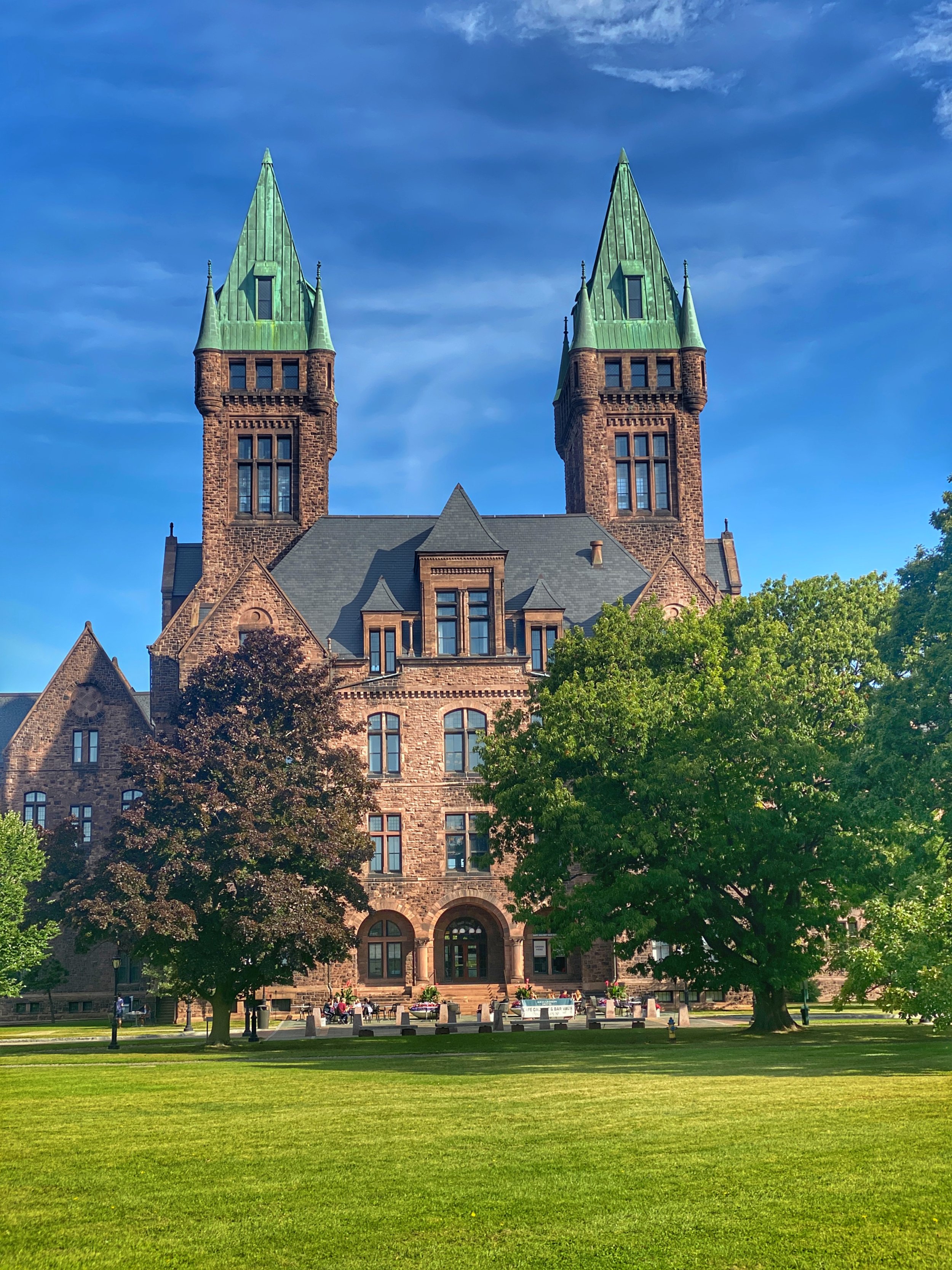
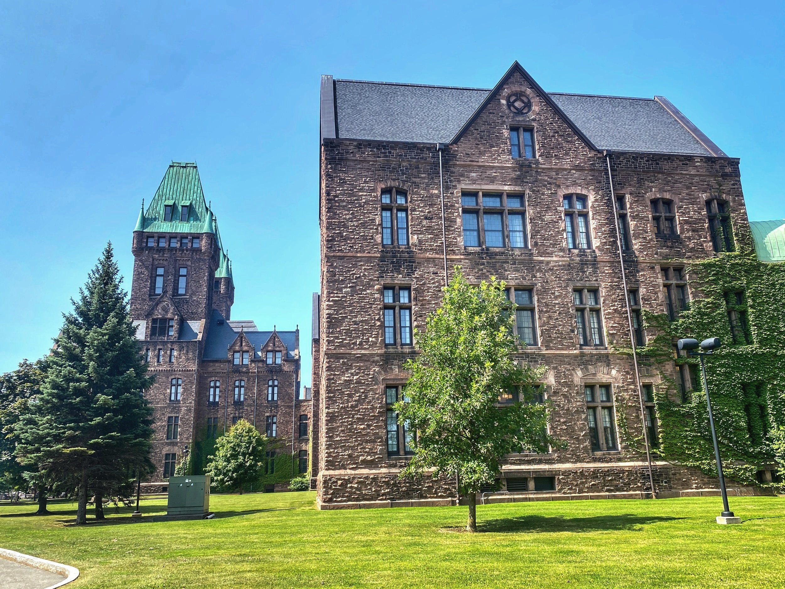
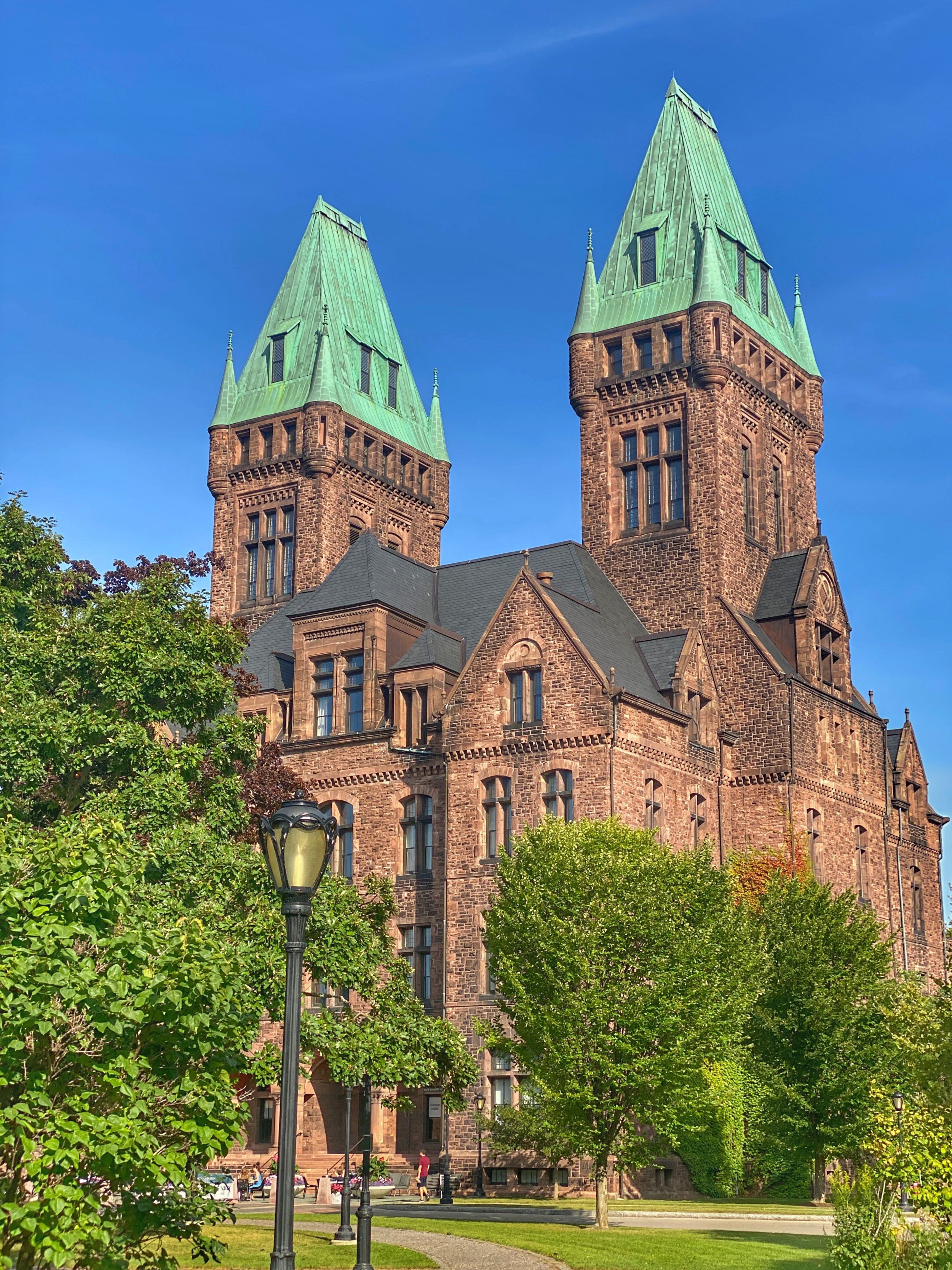
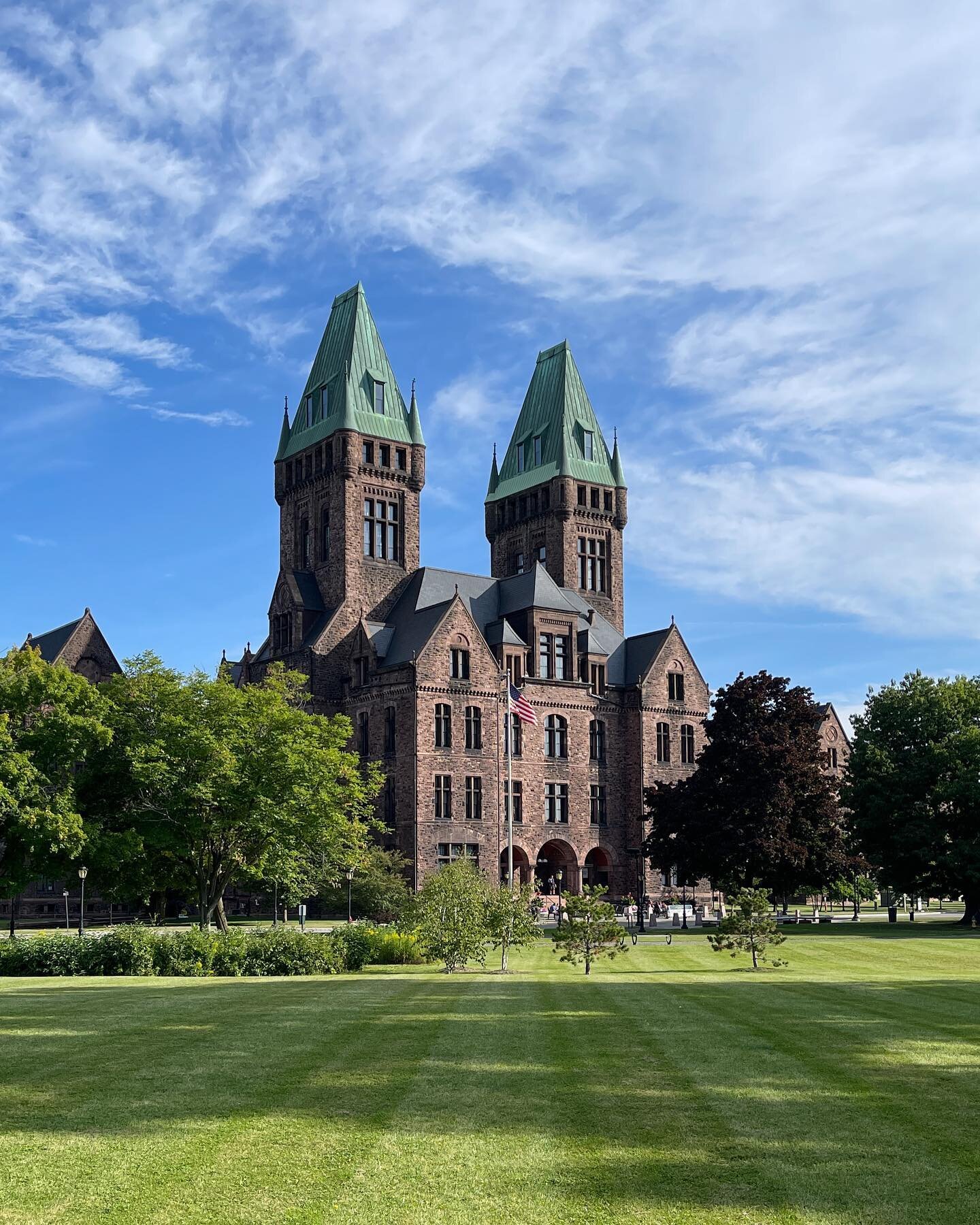
The 88-room hotel occupies the central administration building and two adjacent wards, which are dwarfed by a pair of twin, verdigris roofed towers, a hue somewhere between green and blue. Additionally, it’s within walking distance of Elmwood Avenue and three world-class museums: the Buffalo AKG Art Museum, the Burchfield Penney Art Center and the Buffalo History Museum, the only remaining building from Buffalo’s 1901 Pan-American Exposition.
The original campus was 203 acres but is now 42. The largest reduction in size occurred in 1927, when half of the land was used to develop Buffalo State College, Duke’s alma mater.
The Architecture of Madness
But first, here’s a bit about the landmark’s backstory. In June 1871, construction began on a grand new civic project: the Buffalo State Asylum for the Insane. Architect Henry Hobson Richardson designed the innovative facility away from the city center, on 203 acres of farmland, which eventually grew to include 11 buildings. Its parklike grounds were planned by the foremost landscape architects of the nation, Frederick Law Olmsted and Calvert Vaux, whose Greensward Plan won them the commission to design New York City’s Central Park.
The monumental Richardsonian Romanesque asylum looked more like a stately manor than a state hospital. It’s anchored by a large central administrative building with two symmetrical sets of wards extending horizontally in an orderly V-shaped formation, like a flock of geese in flight. Its general layout was determined by Joseph Gray, head of the existing State Lunatic Asylum in Utica, New York, and based on the Kirkbride Plan, a geometric system of asylum architecture developed by 19th century American psychiatrist Thomas Story Kirkbride.
Patients were segregated by gender and condition: one ward for male patients and the other for females. Those who required the most care were placed at the farthest ends of the institution’s wards. This was done to ensure that patients received the most appropriate care based upon the nature and seriousness of their illness.
Olmsted applied his skills as a landscape architect to establish a buffer between the asylum and the outside world, aligning with Kirkbride’s philosophy of “moral treatment,” which advocated for a more humane approach to mental health care. He suggested to Richardson that the buildings should be oriented to face southeast, which would enable the spacious corridors to be filled with natural light. You see, the asylum opened on November 15, 1880 — two years before the commercial introduction of electricity.
Additionally, Olmsted surrounded the buildings with expansive lawns and trees, fostering a connection between the facility’s interior and its surrounding landscape, both of which were considered crucial for patients’ recovery.
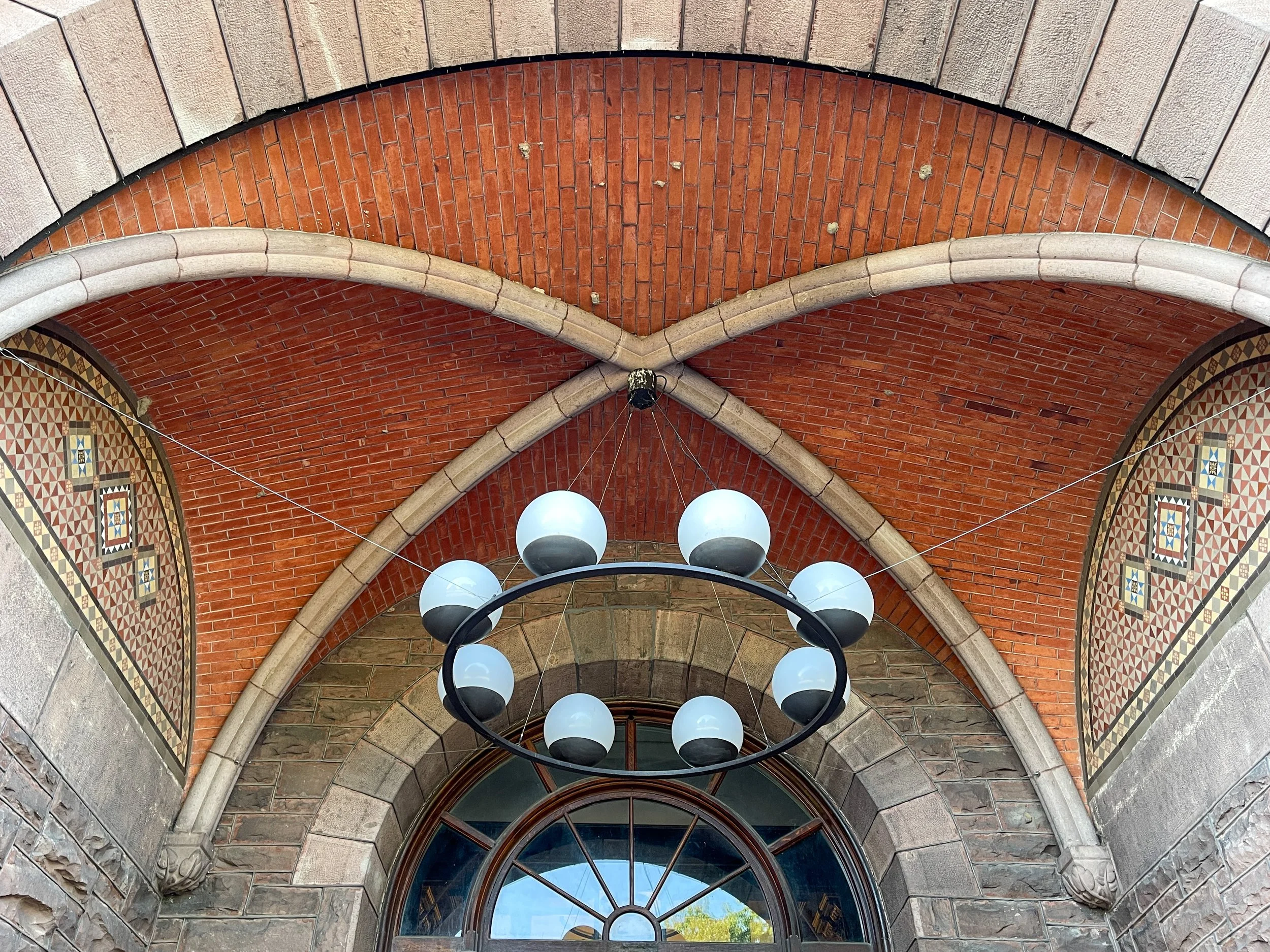
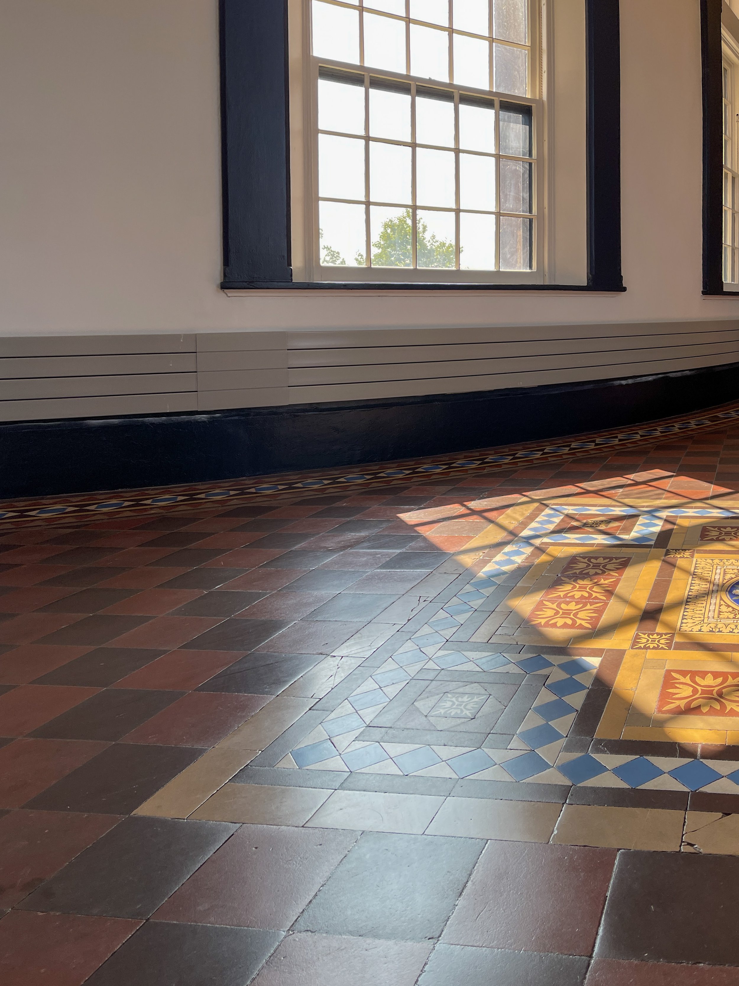
Duke loves his detail shots — and this one is of the Minton tile inside the south entrance portico, the original entrance to the central building.
A New Legacy
Although the building was designated a National Historic Landmark in 1986, it wasn’t until two decades later that the nonprofit Richardson Center Corporation (RCC) was formed and subsequently intervened. Their objective was to own and redevelop the architectural treasure. The RCC raised funds to adapt a portion of the site, and the state of New York contributed $76 million to help jumpstart the ambitious project.
Following a seven-year conservation process, the public-private partnership focused on phase one, to reimagine the centuries-old complex by regreening the nine-acre South Lawn and adaptively reusing the central pavilion and two adjoining wings of the Medina sandstone building. TenBerke of NYC, Flynn Battaglia Architects of Buffalo, and Goody Clancy of Boston teamed up to undertake the overhaul, resulting in a boutique hotel, conference center and permanent home for the Lipsey Architecture Center, named for the late Stanford Lipsey, the former publisher of the Buffalo News and a champion for the city’s architectural revival.
A key aspect of the redesign involved moving the main entrance to the north side of the four-story central administrative building, and enclosing it within a contemporary transparent steel and glass box.
Fun fact: During renovation, the addition attached to the north side of the central building was demolished, revealing the original terracotta-colored grout between the blocks of muddy pink Medina sandstone. Don’t forget to pause and admire this before entering the hotel.
When I shared my excitement about staying at the Richardson with my friends, they quipped, “Aren’t you worried it’s haunted?” In reality, the only apparitions I found were some of the aesthetic “improvements” made by the hotel’s new owners.
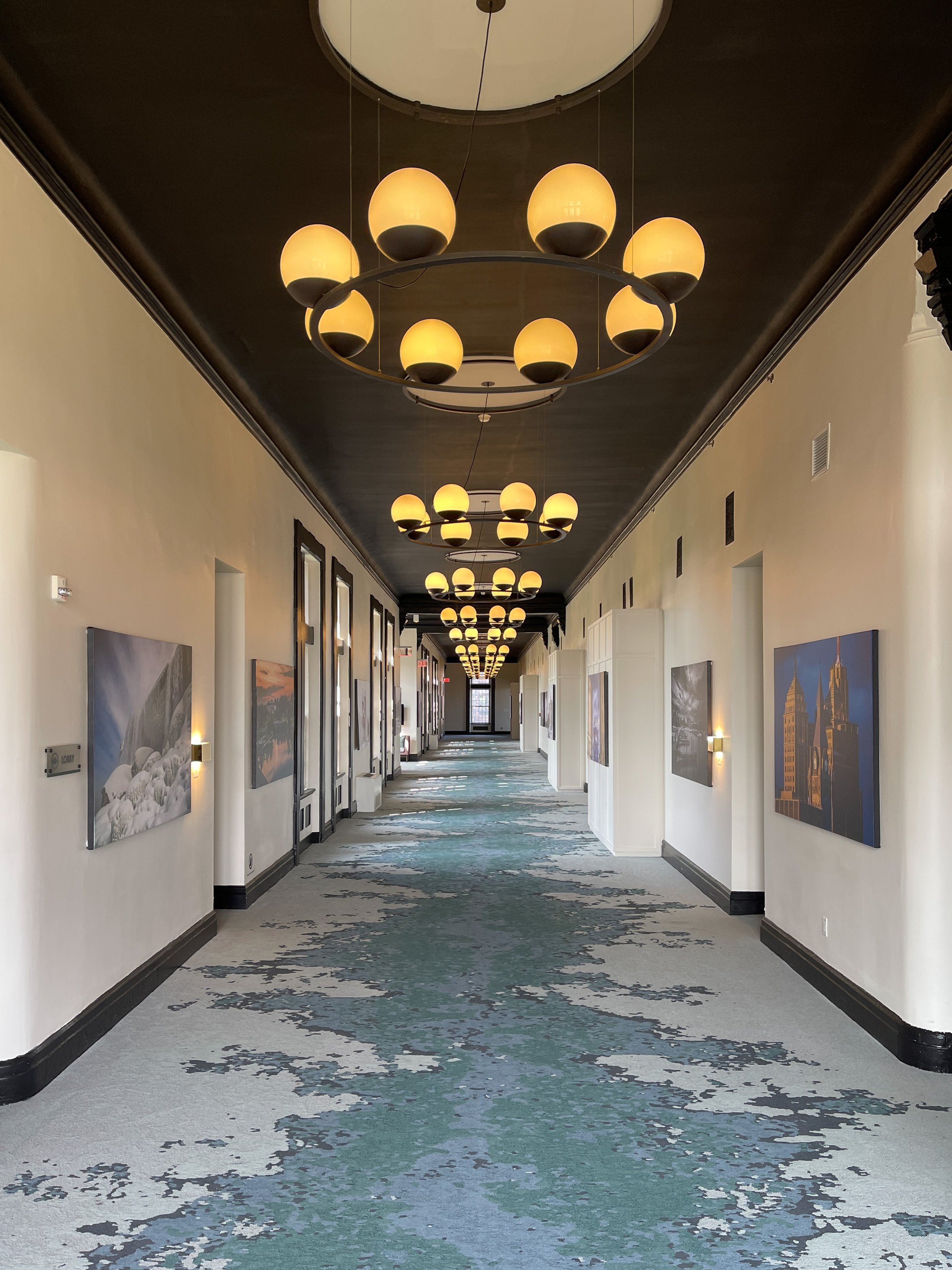
The hallways at the Richardson feature warm globe lights and distinctive carpeting that evokes the decay of the abandoned wards.
Staying at the Richardson
After the closure of Hotel Henry, Douglas Development purchased the property and rebranded it as the Richardson Hotel (which reopened on March 3, 2023). While I can appreciate the new owners’ intentions to establish their own identity, they had acquired a timeless and restrained turnkey property. Why junk it up?
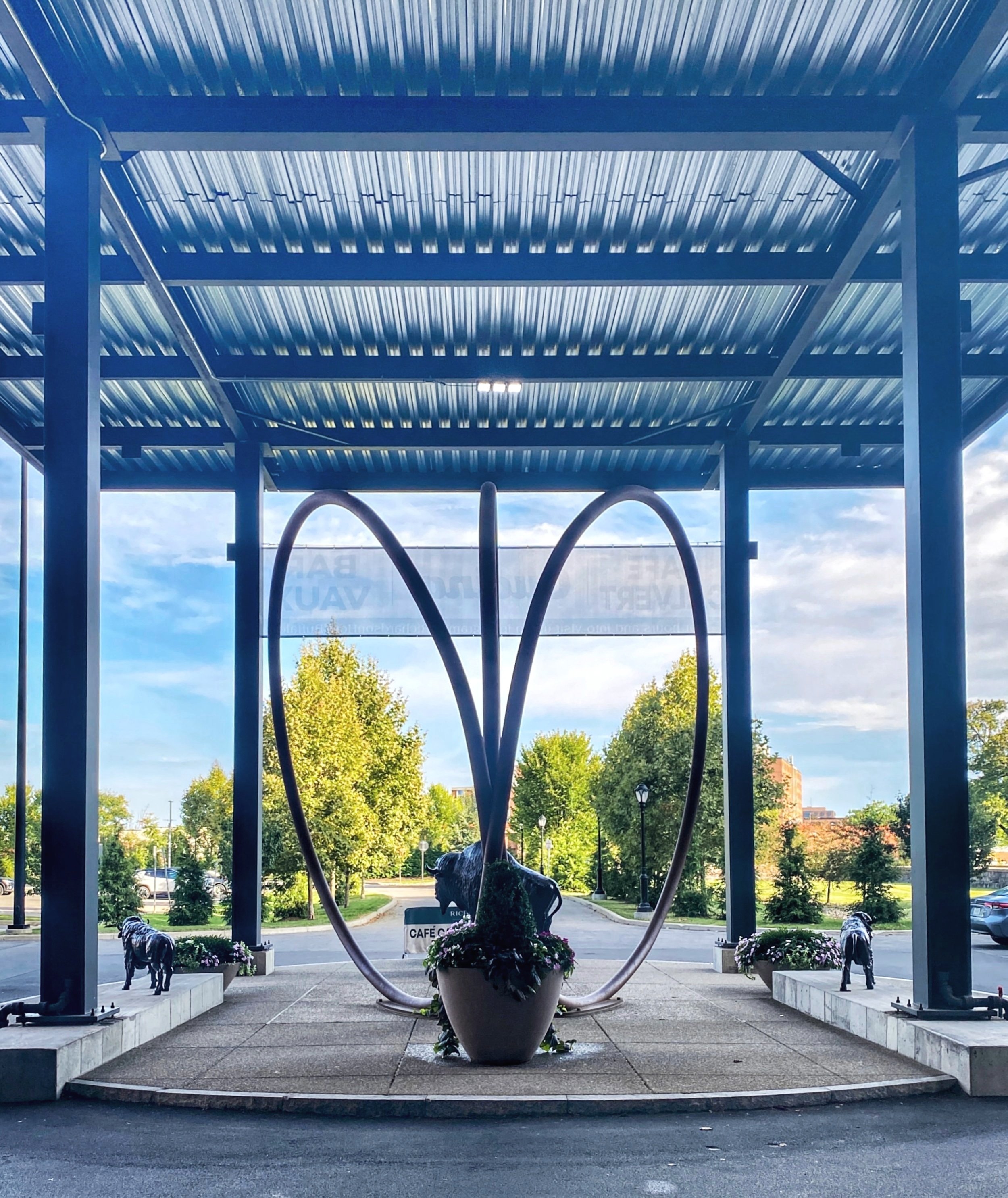
For me, the addition of the porte-cochère was disappointing and feels out of place. It detracts from the commanding lines of the sandstone façade and obstructs artist Dániel Shafer’s graceful, rounded Spirit of Community sculpture. Incidentally, the addition of a herd of Buffalo statues doesn’t help. It’s not surprising, then, that the outdoor terrace that used to be above the atrium was dismantled — after all, who would want to overlook a canopy covered in corrugated steel?
I’ll say it: I’m not a fan of the porte-cochère, which feels more appropriate for a gas station than a boutique hotel.
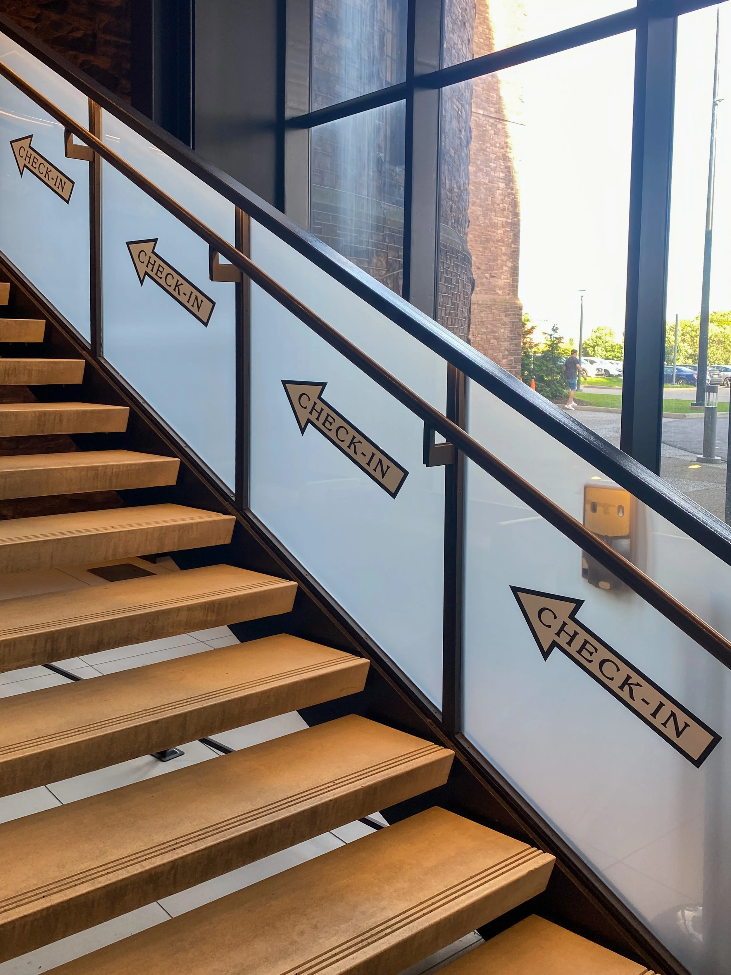
As we entered the atrium, I noticed that the elegant, low-slung seating areas outside of the Lipsey Architecture Center were strangely cordoned, as if to say, “Keep off.” And when I looked up at the modern double glass and metal staircases leading to reception, I was overwhelmed by the number of vinyl decals indicating the check-in location. (Note: This abundance of signage was a recurring theme throughout the hotel).
I saw the sign…and then some! The overabundance of wayfinding signage at the Richardson made it feel cheap.
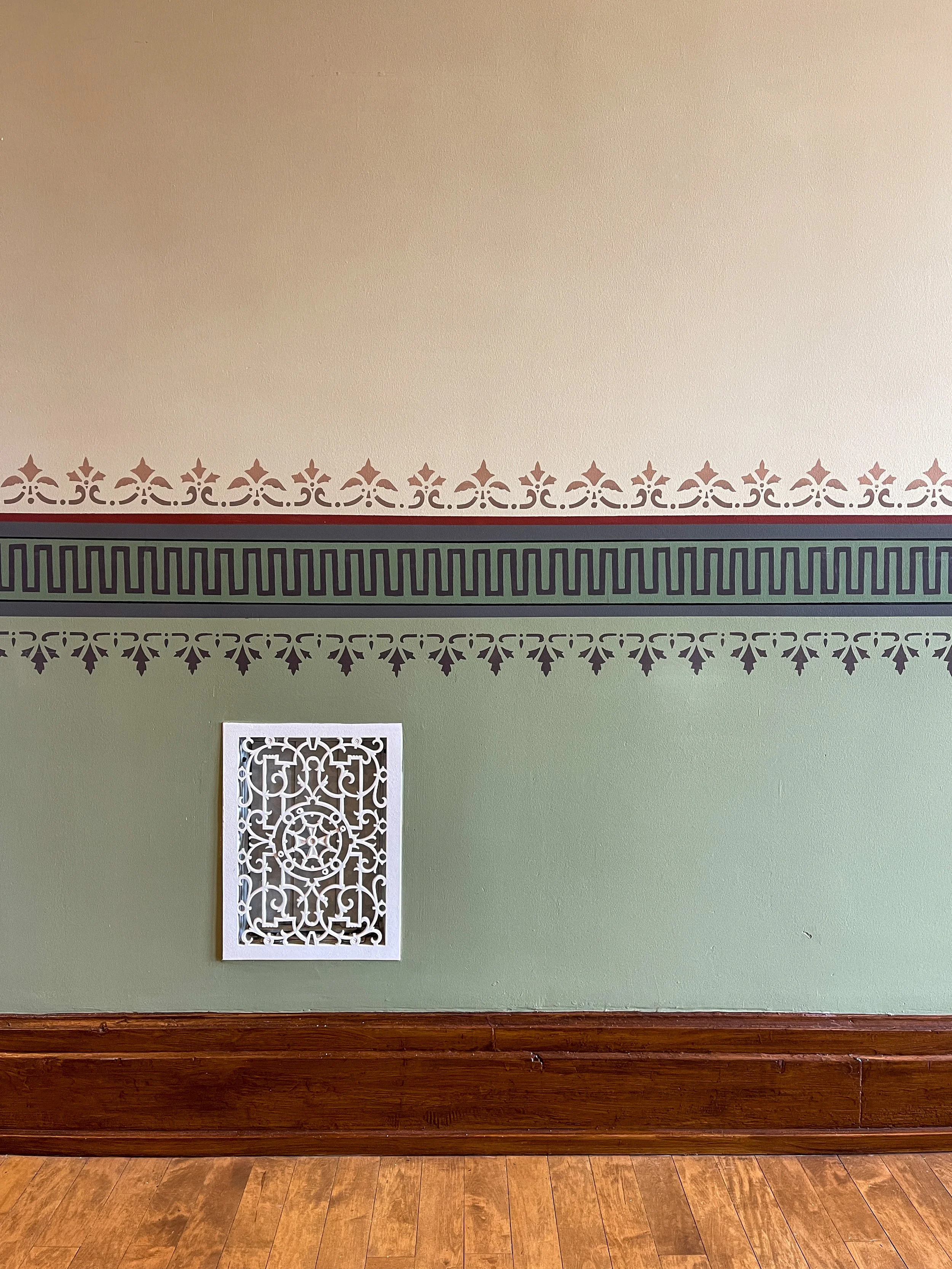
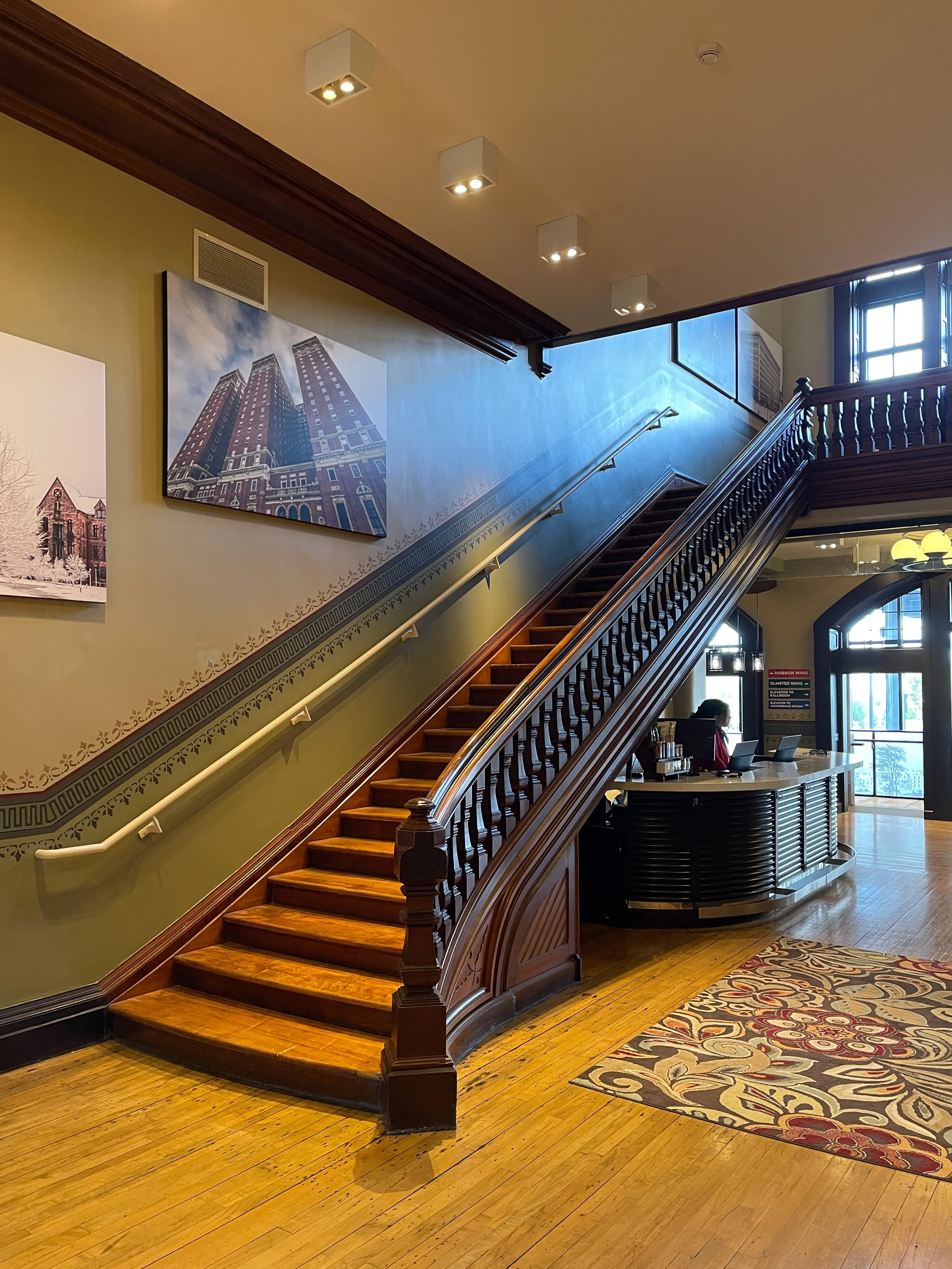
I was eager to appreciate the scale and volume of Richardson’s design, but what I discovered were walls covered with oversized canvas photo prints of Buffalo landmarks. There were so many that my eyes didn’t know where to focus. The refurbished grand staircase should have been the centerpiece of the lobby, but instead, had to contend with the decorative stencil work uncovered during renovation and the aforementioned wall art.
During renovation, Douglas Development uncovered decorative stencil work and replicated it throughout the hotel.
The reception desk is tucked under this impressive staircase.
I can get behind the idea of celebrating Buffalo and its architectural legacy, and I have no issue with historically accurate stenciling — but perhaps they should have considered choosing one or the other, not both. If the goal is to pay homage to the city’s landmarks, condensing it into a gallery wall could serve as a more fitting approach.
The richly patterned and colored tile flooring in this curved connector passage was made by Minton, Hollins & Co. in Staffordshire, England.
Considering the national reputation of nearby art galleries, such as the Burchfield Penney and AKG, I found myself wishing Douglas Development continued the rotating art program that Hotel Henry established with Resource:Art. This would encourage visitors to explore the hotel’s public spaces, serve as an additional draw and solidify the hotel’s presence within the city’s museum corridor.
At least the former asylum’s lofty corridors retain their grand scale. The palatial hallways are anchored with wall-to-wall carpeting in a palette of blues and greens. This color scheme could be a nod to Buffalo’s heyday as a Great Lakes port or the peeling paint of the wards that have yet to be restored. I particularly liked the elegant yet simple circular pendants with milk glass globes suspended from the ceiling.
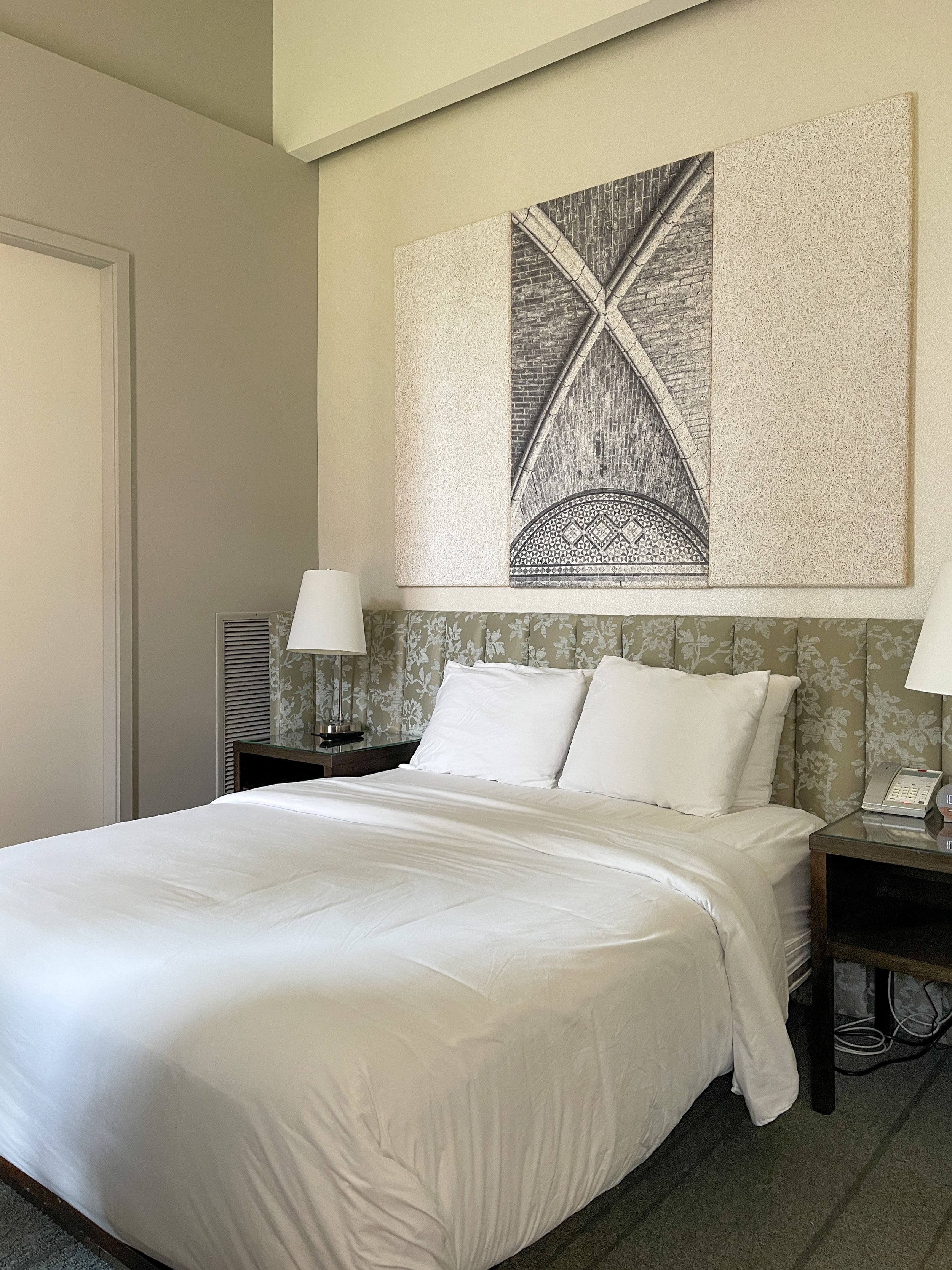
Just what the doctor ordered: Our room was cozy, uncluttered and bright.
Our Room: A Cozy Queen for a Couple of Queens
We stayed in a Cozy Queen room on the second floor. I had read that most of the hotel's guest rooms were created by merging three single-occupancy rooms, which were only 11 x 9 feet wide. And staying true to its name, our room was compact and uncluttered, with a queen-size bed, two nightstands, a desk and en-suite bathroom. Given the limited space, a built-in stainless steel rack and cheerful bright yellow ball coat hooks efficiently served in lieu of a full-size dresser.
The wall art above the upholstered headboard was the focal point of the room, featuring a striking black and white architectural detail of the landmark. Not only was it cool but it also served a practical purpose. The panels are constructed from an eco-friendly noise-reducing wool and wood fiber material.
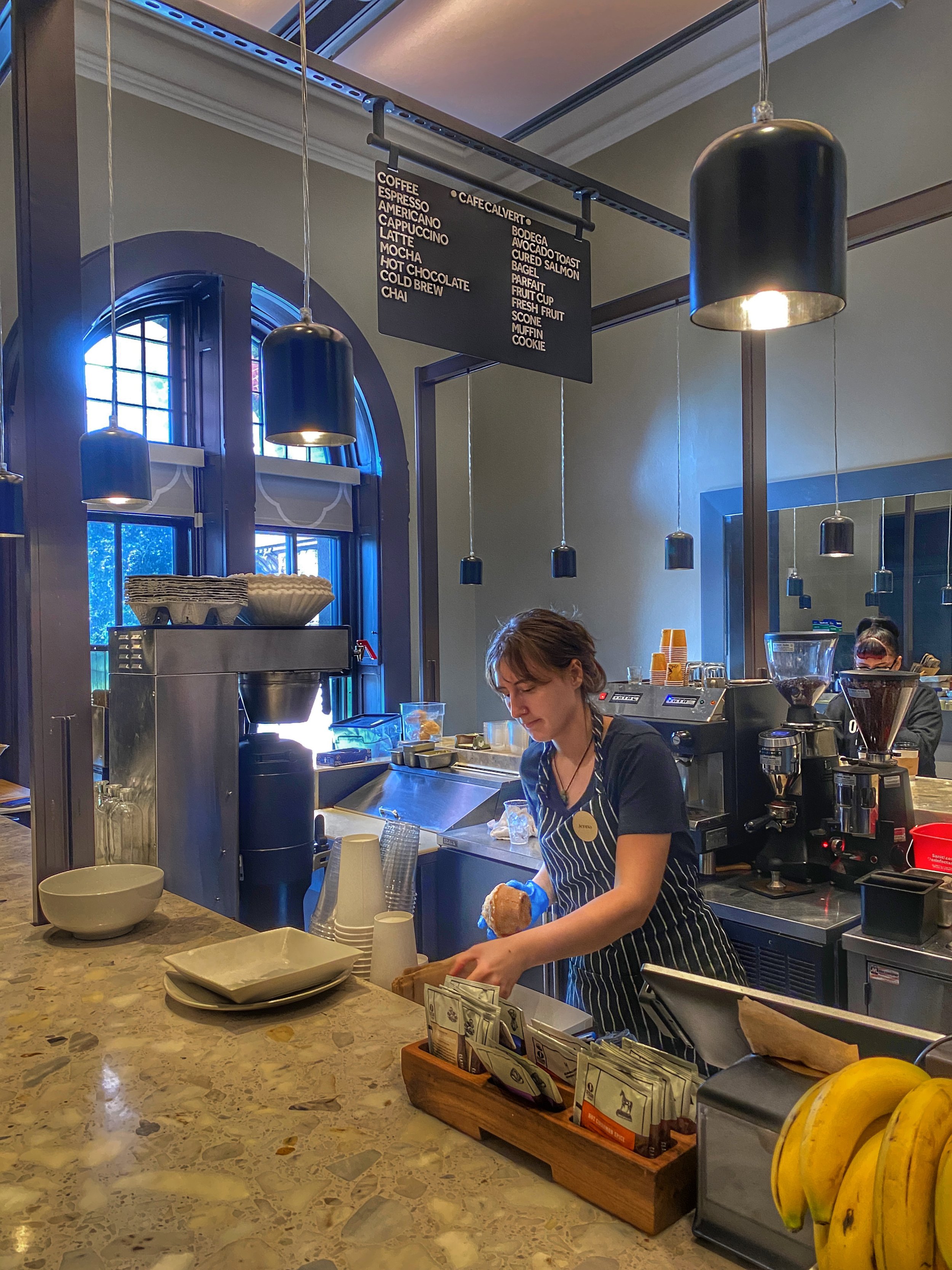
Café Calvert was the perfect place to start our day. They offer caffeinated and non-caffeinated beverages, as well as an assortment of delicious sweet and savory baked goods. Tell Jenna we say hi!
Onsite Dining at the Richardson Hotel
Visitors can get their caffeine fix and a bite at Café Calvert, which is exactly what Wally and I did after we dropped our bags off in our room. The café sources its beans from local roaster Overwinter Coffee. In addition to an iced latte, Wally and I shared a peach and blueberry muffin and a cheddar and bacon scone, both of which were delicious. Jenna, the barista who served us, was friendly and helpful. When I asked her for a local lunch spot to go the following afternoon, she suggested Remedy House in the hip Five Corners neighborhood, a highlight of our trip.
We also checked out Bar Vaux, the cocktail lounge located next to Café Calvert. I had the Across the Pacific and Wally, the Hobson Sour. We also shared a tasty thin-crust mushroom pizza. Despite its high ceilings, the space feels intimate.
Get a pizza (and great cocktails) at Bar Vaux.
Overall, our stay was pleasant but fell short of my expectations for a luxury boutique hotel. There was no welcome book, TV guide or menus for the hotel restaurants in our room. Additionally, only one of us could use the hotel WiFi; if both of us had wanted to, we would have incurred an additional fee.
The building features rounded passages between buildings — originally designed to deter putting beds in the hallways.
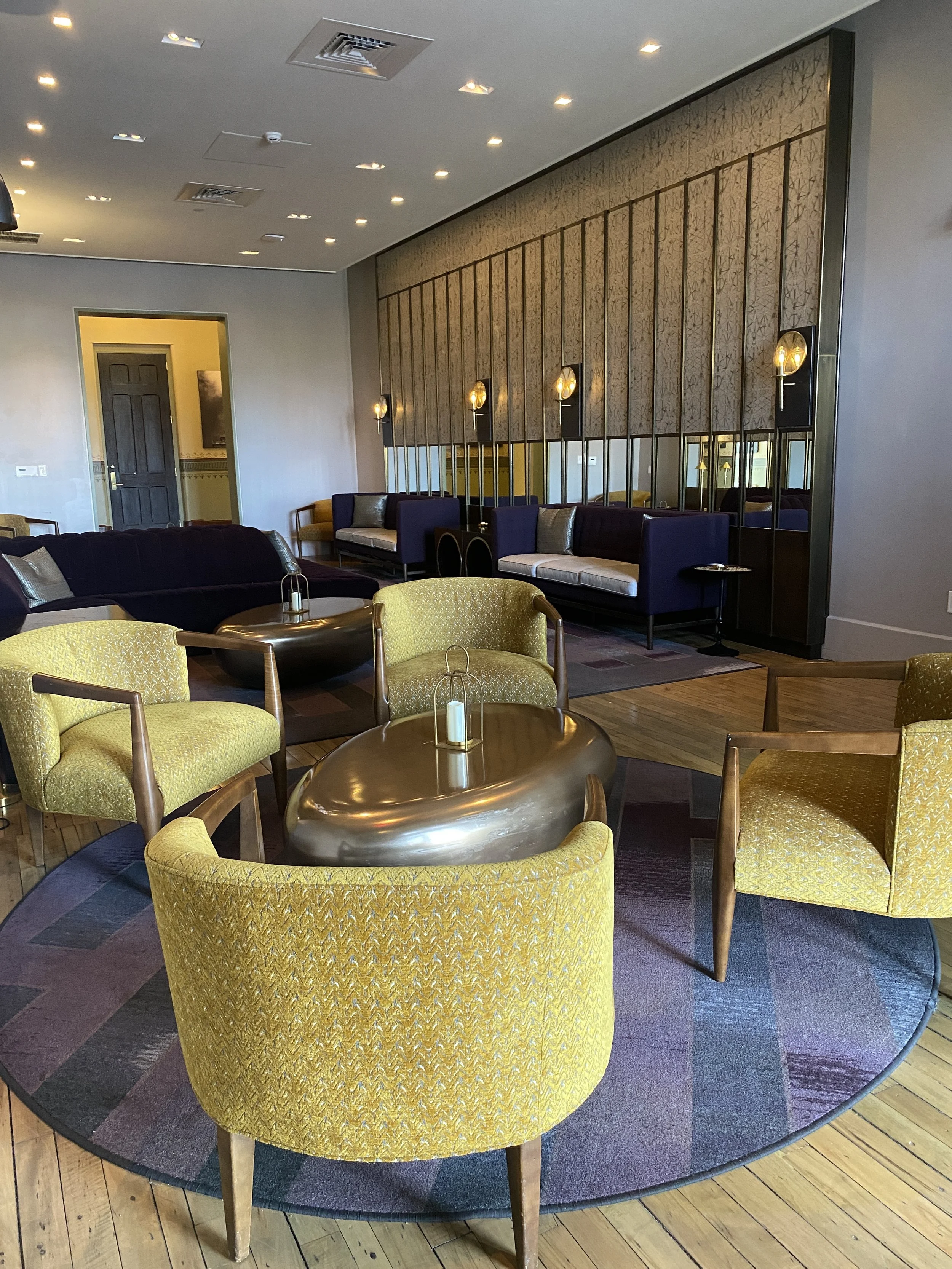
The upstairs lounge is a nice spot to hang out.
With that said, the hotel has been open for six months and celebrated its grand opening on September 19. It’s my hope that Douglas Development has plans to address cosmetic changes using a more discerning eye and introduce in-room amenities in the future, to fully meet the expectations of a four-star hotel experience.
Buildings aren’t made like this anymore — let alone converted into hotels. So it’s well worth a stop for food and drinks at Bar Vaux or a visit to the Buffalo Architecture Center to see this gem up close, even if you can’t experience an overnight stay. –Duke
The Richardson Hotel
444 Forest Avenue
Buffalo, New York 14213
USA

