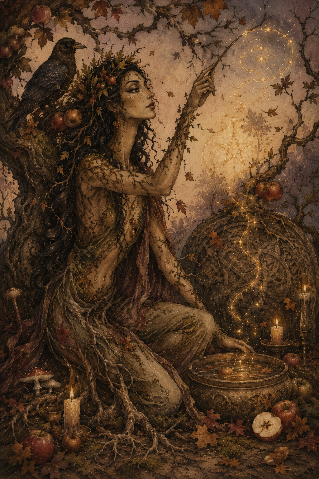
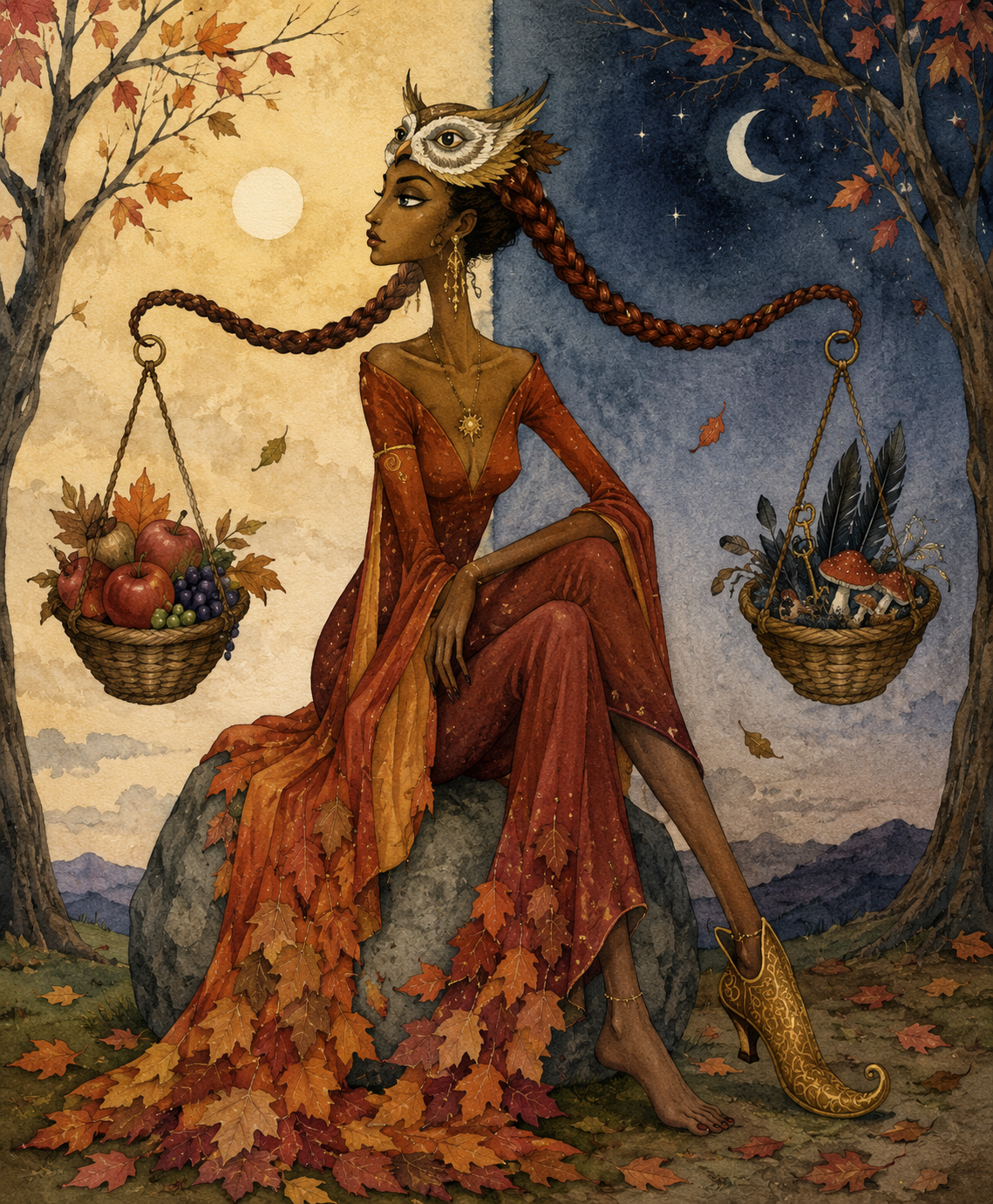
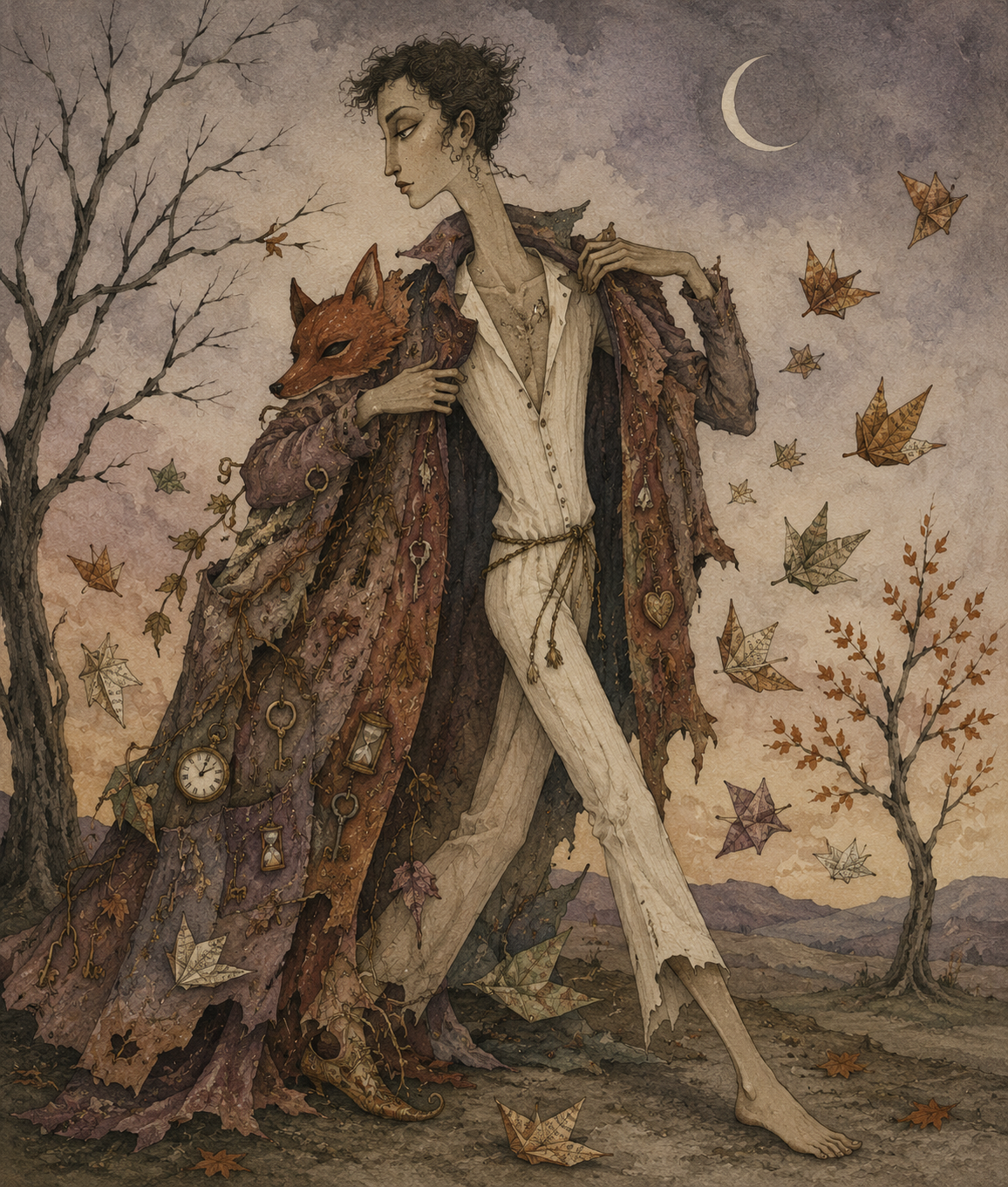
Celebrate Samhain with Wiccan spells for talking to the dead, divination, psychic protection, shadow work, honoring loved ones and embracing the witch’s new year.
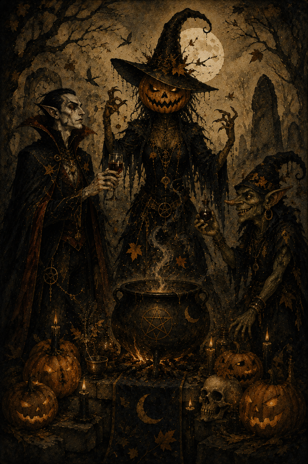
The fields have been harvested. The leaves have fallen. The last warmth of autumn lingers in the air, but winter is waiting just beyond the horizon.
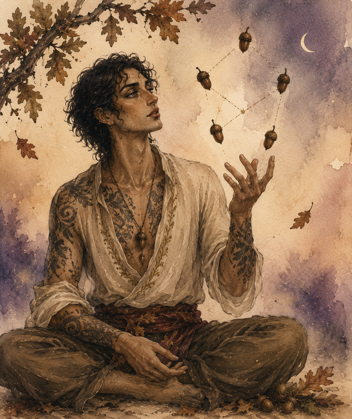
Samhain marks the final turn of the Wheel of the Year and, for many Wiccans and modern witches, the beginning of a new one. It’s the night when the veil between the living and the dead is said to be at its thinnest. Candles flicker in dark windows. Empty chairs are set at the table for those who are gone. Familiar places seem just a little quieter, as though the world itself is listening.
Unlike the bright confidence of Litha or the harvest gratitude of Lammas and Mabon, Samhain magic embraces mystery. This is one of the most powerful nights of the year for divination, spirit communication, psychic protection, dream work and releasing what has reached its natural end. It’s a time to honor loved ones who have died, trust your intuition and remember that endings are often the first step toward new beginnings.
Whether you’re hoping to receive a message from someone you’ve lost, strengthen your intuition or simply spend an evening reflecting on the cycle of life and death, these Samhain spells will help you work with the quiet, liminal energy of the season.
The veil is thin.
Listen carefully.
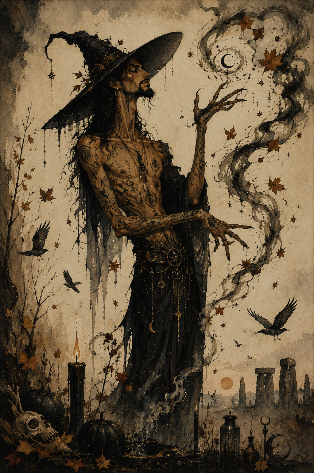
Samhain Grimoire
Spell to Receive a Message From Someone Who Has Died
Spell to Strengthen Your Intuition
Spell to Discover What Is Hidden
Spell to Honor Your Ancestors
Spell to Release a Lingering Spirit or Negative Energy
Spell for Psychic Protection
Spell to Break a Generational Pattern
Spell to Walk Between Worlds
Spell to Receive a Prophetic Dream
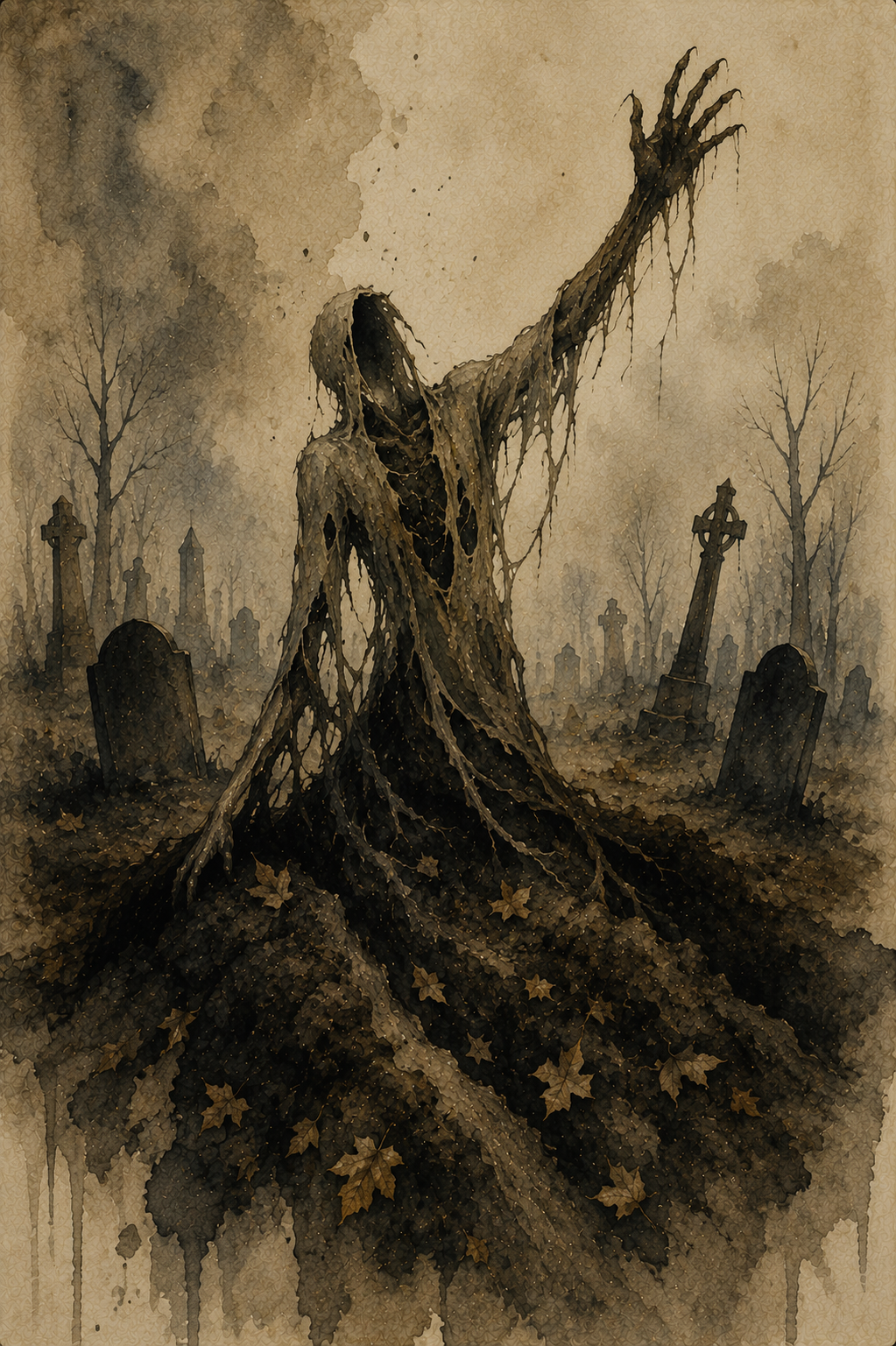
Spell to Bury Your Old Self

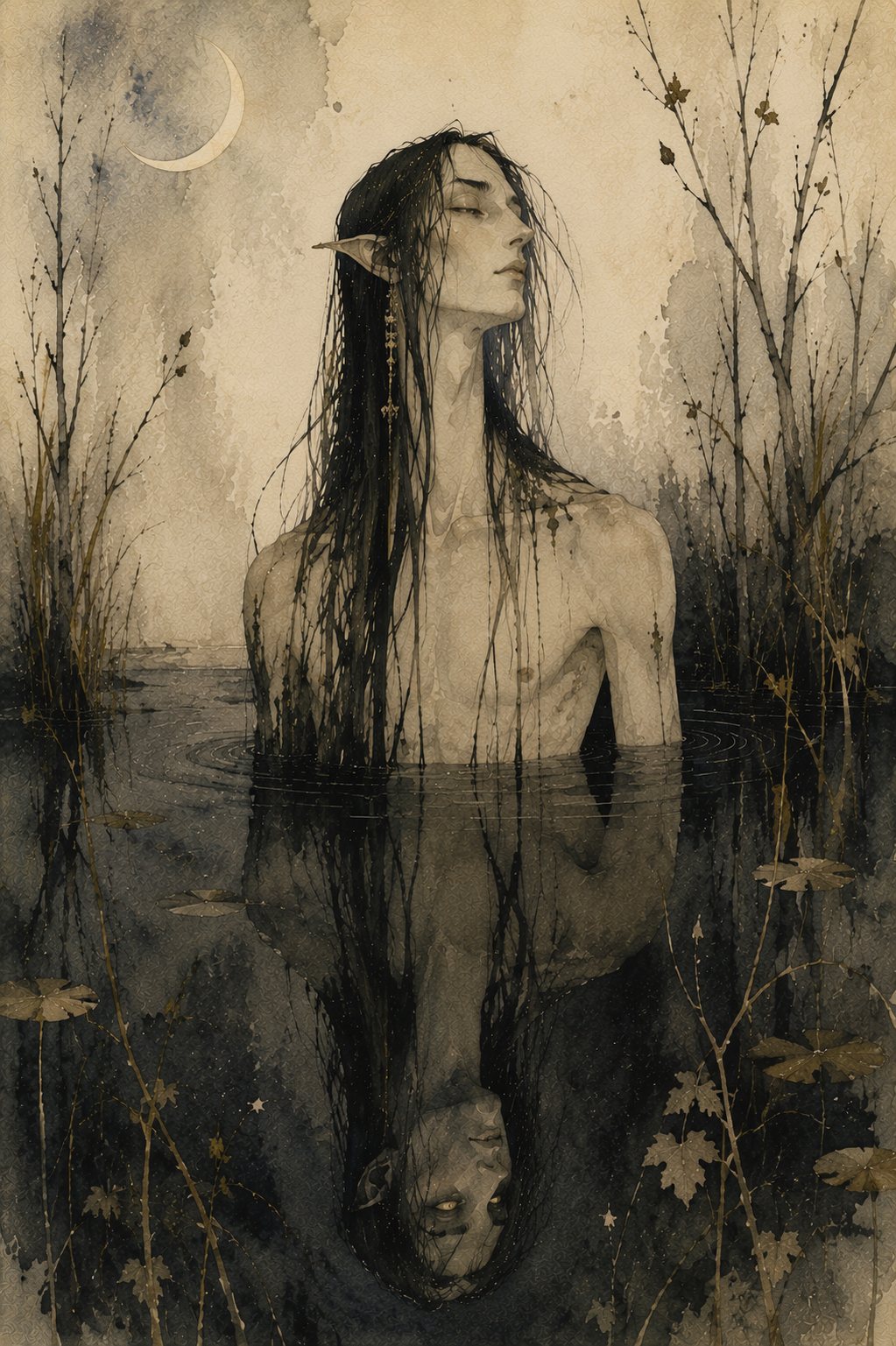
1. Spell to Receive a Message From Someone Who Has Died
For inviting a quiet sign from someone you miss
Samhain is not a night to summon spirits.
It is a night to listen.
Folklore says the veil is at its thinnest, making this one of the few times of year when messages may come more easily—through dreams, symbols, memories or moments that feel impossible to explain. This spell is an invitation, not a demand. If no message comes, accept the silence with the same respect you would offer a guest who chose not to visit.
You’ll need:
a white candle
a small mirror
a piece of bread
a cup of cider, wine or water
a sterile lancet or pin
a tissue or bandage
Set the bread and drink beside the candle as a simple offering.
Place the mirror behind them so it reflects the candlelight, but not your face.
Light the candle.
Think of the person you hope to hear from.
Speak their name once.
Take the sterile lancet or pin and prick the tip of one finger. Place one single drop of blood onto the bread.
No more.
Blood has long been viewed as the living thread that connects memory, family and the body. Here it is not an offering of sacrifice, but a sign that the living still remember.
Say:
“If love remains and paths allow,
Walk beside this candle now.
Not in fear, nor bound to stay,
Only if you choose this way.”
Repeat the chant three times.
Sit quietly for ten minutes.
Do not ask questions.
Do not search the mirror.
Simply notice.
A sudden memory. A familiar scent. A song outside. A flicker of the candle. A feeling that arrives without explanation.
When you’re ready, extinguish the candle.
Leave the bread and drink outside overnight, or beneath a tree, as a final gift to the unseen.
2. Spell to Strengthen Your Intuition
For quieting the mind so your inner voice can finally be heard
Samhain has long been associated with divination because the veil isn’t the only thing that grows thinner. The noise of everyday life seems to fade, making it easier to notice the quiet nudges, gut feelings and sudden knowing that intuition often speaks through.
This spell uses a black mirror—not to summon spirits, but to see yourself more clearly.
You’ll need:
a black mirror (or a dark bowl filled with still water)
one black candle
a pinch of mugwort
a small key
Place the key in front of the mirror.
Sprinkle the mugwort around it in a loose circle.
Light the candle and place it beside the mirror so its flame reflects in the dark surface.
Hold the key in your hand.
Say:
“Open what is closed to me.
Show what only I can see.”
Repeat the chant three times.
Now place the key on the mirror—or beside the bowl if you’re using water.
Look at the reflection, not at yourself.
Don’t search for faces.
Don’t try to force visions.
Instead, soften your focus until your thoughts become quiet.
When a word, image or feeling arises, accept the first one that comes.
Don’t question it.
After several minutes, pick up the key and carry it with you for the next three days.
If you receive a strong feeling, dream or coincidence during that time, pause before dismissing it.
Your intuition rarely shouts.
It usually whispers.
The strongest intuition isn’t about seeing the future.
It’s about recognizing the truth the moment it arrives.
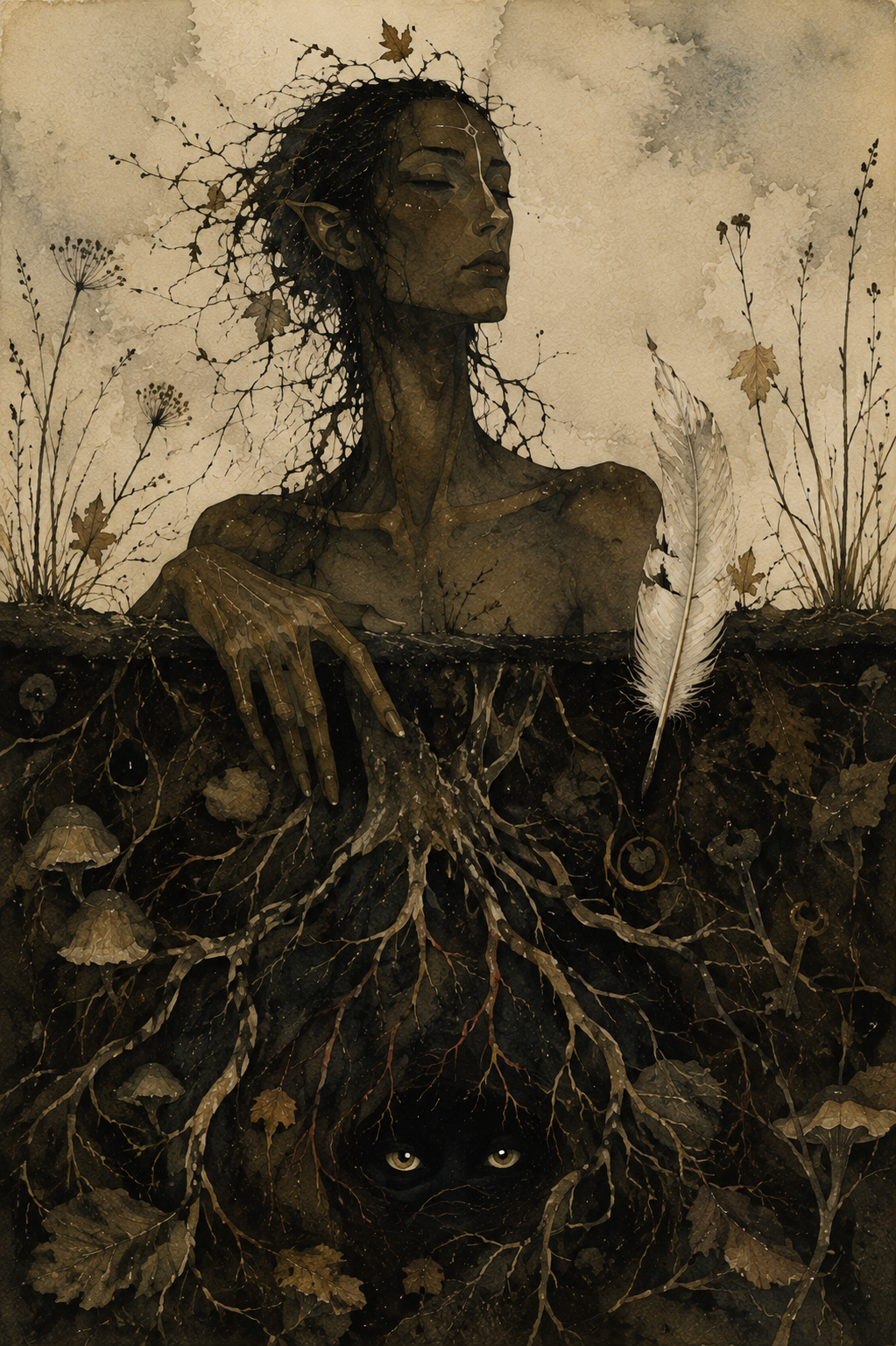
3. Spell to Discover What Is Hidden
For revealing a truth that has remained just beyond your reach
There are times when something feels… off.
A conversation doesn’t sit right. A decision feels clouded. You can’t explain it, but your instincts keep tugging at the same loose thread.
Samhain has long been considered one of the best nights of the year to uncover what has been concealed. This spell doesn’t force the truth into the open—it simply asks that whatever needs to be revealed finds its way into the light.
You’ll need:
one black candle
a key
a small bowl of dark soil
a white feather
Light the candle.
Push the key halfway into the soil so it stands upright.
Lay the feather gently across the top of the bowl.
For a few moments, think about the situation—but don’t search for answers. Simply hold the question in your mind.
Then say:
“Hidden paths and hidden door,
Keep your silence now no more.
If truth is waiting, let me see
Only what is meant for me.”
Repeat the chant three times.
Lift the feather.
If grains of soil cling to it, leave them there.
Without brushing them away, place the feather somewhere you’ll notice over the next few days—a bookshelf, bedside table or altar.
Leave the key where it is until the candle has completely burned out.
Over the coming week, pay close attention to unexpected conversations, strange coincidences, vivid dreams or moments when someone reveals more than they intended.
Truth often arrives quietly.
Samhain simply helps you recognize it when it does.
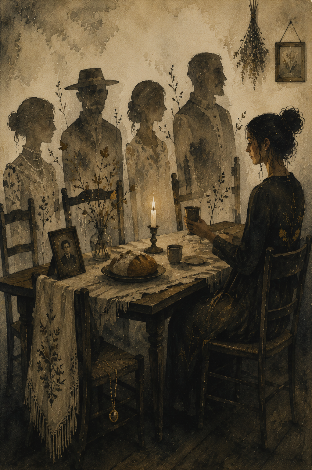
4. Spell to Honor Your Ancestors
For expressing gratitude to those whose lives shaped your own
Samhain is a time to remember that none of us arrived here alone.
Whether your ancestors were loving, complicated or people you’ll never know by name, their choices echo through generations. This spell isn’t about asking them for favors or seeking messages. It’s simply an act of remembrance and respect—a chance to acknowledge the lives that made yours possible.
You’ll need:
one white candle
a small plate
a piece of bread
a cup of cider, wine or tea
a family photograph, heirloom or an object that reminds you of someone who has passed
Set an extra place at your table or altar.
Arrange the bread, drink and keepsake as though you are expecting an honored guest.
Light the candle.
Speak aloud the names of those you wish to remember.
If you don’t know their names, that’s okay.
Instead say:
“To the hands I never held,
To the voices time has stilled,
To the lives that made my own,
Tonight, you are remembered.”
Sit quietly for several minutes.
Tell them something.
Share a story from your year.
Thank them.
Laugh if a memory makes you smile.
Cry if one asks to be shed.
When you feel finished, raise your cup.
Say:
“Though worlds divide us,
Memory binds us.
May love endure.”
Leave the food and drink overnight.
The following morning, return them to the earth beneath a tree, placing them back into the cycle from which all life grows.
The greatest offering we can give the dead isn’t perfection.
It’s remembering they were here.
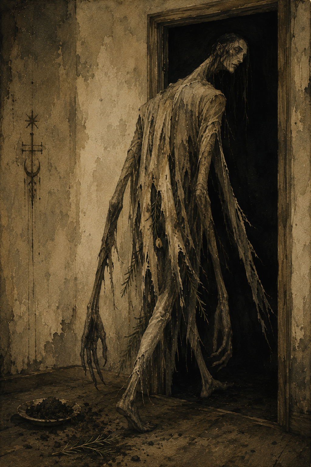
5. Spell to Release a Lingering Spirit or Negative Energy
For helping heavy energy finally find its way out the door
Sometimes a room feels different after an argument. A house carries a strange weight after a loss. Even without believing a literal spirit is present, many traditions recognize that places—and people—can hold onto energy long after it should have faded.
This Samhain spell is meant to release what lingers, whether that’s an unwelcome presence, an old memory or a heaviness you can no longer explain.
You’ll need:
a small pinch of graveyard dirt
a sprig of rosemary
a bell
one black candle
Place the graveyard dirt in a small dish beside the candle.
Lay the rosemary across it.
Light the candle.
Walk slowly through your home, ringing the bell once in each room.
Don’t rush.
Pause in places that feel especially heavy.
Return to the candle.
Pick up the rosemary and gently sweep it through the graveyard dirt.
Then carry it to your front door.
Open the door.
Brush the rosemary across the threshold three times.
Say:
“What has ended, now be still.
Leave this home by your own will.
Past to earth and night to sky,
Go in peace, and pass me by.”
Place the rosemary and the graveyard dirt together beneath a tree or at a crossroads the following day.
Extinguish the candle only after the front door has remained open for a full minute.
6. Spell for Psychic Protection
For shielding yourself before divination, spirit work or a walk between worlds
Before opening a door, it’s wise to know how to close it.
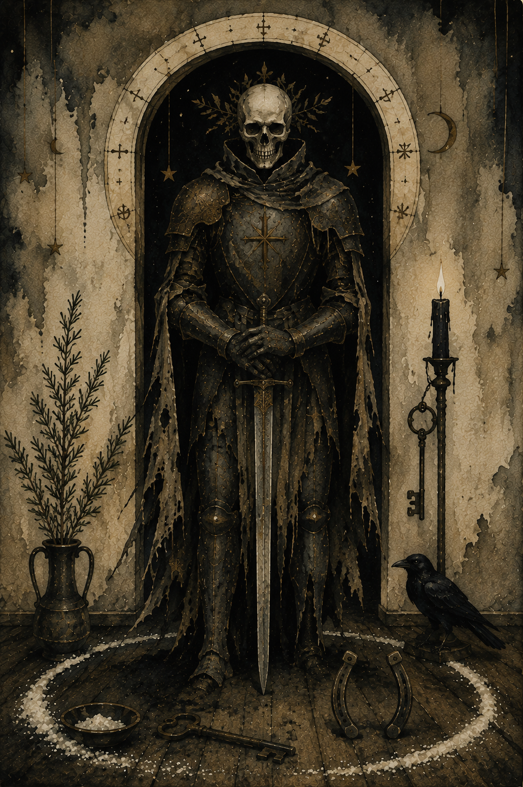
For centuries, witches and folk practitioners carried iron, scattered salt across thresholds or hung protective herbs above their doors before nights believed to be filled with restless spirits. Whether you view these as literal protections or powerful symbols, the intention is the same: to welcome only what serves your highest good.
You’ll need:
an iron key, nail or small horseshoe
a sprig of rosemary
a pinch of salt
one black candle
Light the candle.
Place the iron object in your dominant hand and the rosemary in the other.
Sprinkle the salt in a small line across your doorway or across the entrance to your ritual space.
Touch the iron to your forehead, then your heart.
Say:
“Only wisdom may cross this line.
Only truth may enter here.
All that comes with harmful intent
Turns away and disappears.”
Walk the perimeter of your room once, carrying the candle.
When you return to the doorway, place the iron object above the door, beside it or carry it in your pocket for the rest of the evening.
Extinguish the candle before you begin any divination or spirit work.
The boundary has already been made.
7. Spell to Break a Generational Pattern
For ending a cycle that has echoed through your family for far too long
Not everything we inherit is meant to be kept.
Alongside treasured stories, family recipes and beloved traditions, we sometimes inherit old fears, old griefs or old wounds that seem to pass from one generation to the next. Samhain, when the veil is thin and the past feels especially close, is a powerful time to acknowledge those patterns—and choose a different future.
You’ll need:
one black candle
a length of black thread
a pair of scissors
a small bowl of salt
a small stone
Light the candle.
Wrap the black thread loosely around your wrist seven times.
Hold the stone in your hand and think about the pattern you wish to leave behind.
Don’t think about who began it.
Think only about where it ends.
Place the stone in the bowl of salt.
Say:
“What was carried comes to rest.
What was learned need not remain.
With steady hands and open heart,
I end this path and walk again.”
Repeat the chant three times.
Take the scissors and cut the thread from your wrist.
Let it fall naturally into the bowl beside the stone.
Leave both there until the candle burns out.
The following morning, bury the thread beneath a tree or discard it away from your home.
Keep the stone.
Whenever you hold it, remember that every family story eventually reaches someone brave enough to write a different ending.
8. Spell to Walk Between Worlds
For entering the liminal space where intuition, dreams and the unseen feel closest
Samhain has long been called the night when the veil grows thin. Across Europe, people spoke of crossroads, doorways and forest paths where the ordinary world seemed to blur with the Otherworld. This spell isn’t about physically crossing that threshold. Instead, it invites you to step outside ordinary awareness for a little while, quieting the mind so you can listen more deeply to yourself and the mysteries of the season.
You’ll need:
two black candles
a skeleton key
a small bell
a black ribbon
mugwort incense (or loose mugwort on a charcoal disc)
Place the two candles about three feet apart to create a symbolic doorway.
Lay the black ribbon between them and place the skeleton key at its center.
Light the mugwort incense first.
As the smoke begins to curl through the air, close your eyes and breathe slowly. Follow the smoke with your attention as it rises and fades. Continue for several minutes, allowing your thoughts to drift without holding onto them.
When you feel calm and centered, light the candle on your left, then the one on your right.
Ring the bell once.
Hold the key over your heart and say:
“Between what was and what will be,
A hidden path now opens me.
With steady step and open sight,
I walk the threshold of this night.”
Walk slowly between the candles.
Do not step on the ribbon.
When you reach the other side, sit comfortably with the key resting in your hands. Keep your breathing slow and steady, watching the incense smoke as it twists and disappears. If images, memories or symbols arise, simply observe them. Don’t chase them or judge them.
Remain there for as long as it feels natural.
When you’re ready, ring the bell once more.
Walk back between the candles, extinguishing the left candle first, then the right.
Tie the black ribbon around the key and keep it in a private place until Samhain has passed.
Some thresholds exist only in the mind.
Samhain reminds us that they can be just as powerful as any doorway of stone.
9. Spell to Receive a Prophetic Dream
For inviting guidance through dreams on Samhain night
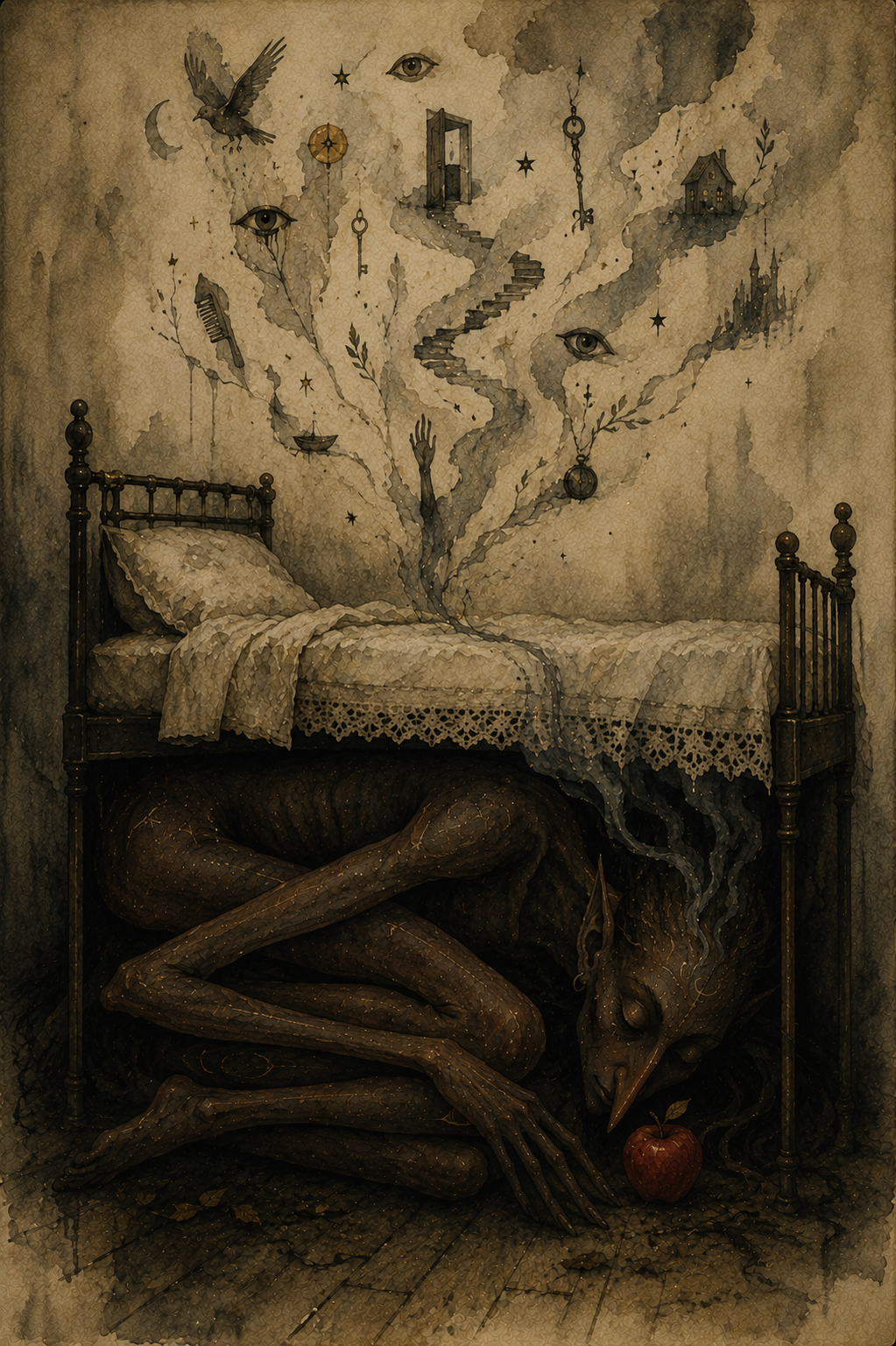
Samhain has long been considered one of the most powerful nights of the year for dreaming. Long before tarot cards and crystal balls, people looked to their dreams for warnings, reassurance and glimpses of what lay ahead. This spell doesn’t ask for the future to be revealed in perfect detail. Instead, it invites the wisdom of your subconscious to speak in the language it knows best: symbols.
You’ll need:
one apple
a sprig of mugwort or rosemary
one white candle
a small notebook and pencil
Light the candle just before bedtime.
Hold the apple in both hands and think of a single question you’d like your dreams to explore.
Place the sprig of mugwort beside the candle.
Say:
“Keeper of twilight, keeper of sleep,
Show what my waking mind can’t keep.
Through hidden symbols, soft and deep,
Send the wisdom dreams may reap.”
Repeat the chant three times.
Blow out the candle.
Place the apple beneath your bed.
Set the notebook and pencil beside your pillow.
Go to sleep without speaking further or looking at your phone.
If you wake during the night, remain still for a few moments before returning to sleep.
As soon as you wake, write down everything you remember—images, colors, fragments of conversation or even a single emotion. Don’t try to interpret the dream immediately.
Retrieve the apple from beneath your bed and return it to the earth beneath a tree, thanking the season for whatever insight it offered.
Not every prophetic dream predicts the future.
Sometimes it simply reveals the truth your heart already knew before your mind was ready to believe it.
10. Spell to Bury Your Old Self
For laying an old chapter to rest before the witch’s new year begins
Samhain reminds us that every ending creates space for something new. Before the wheel turns again, this is a chance to leave behind an old version of yourself—one shaped by fear, regret, self-doubt or habits you’ve outgrown. Like the last harvest returned to the earth, not everything is meant to be carried into another season.
You’ll need:
one small potato
a carving knife
one black candle
a handful of fallen leaves
a small trowel or spoon
Light the candle.
Hold the potato in your hands and think about the part of yourself you’re ready to leave behind. Give it a name if you can: fear, resentment, perfectionism, grief, people-pleasing—whatever has reached the end of its season.
Using the knife, carve a simple symbol into the potato to represent that old self. It doesn’t need to be elaborate. A spiral, broken line or single rune-like mark is enough.
Hold it over the candlelight and say:
“What has served me now is done.
Night has fallen. Day has run.
Back to earth I freely give
So something stronger now may live.”
Repeat the chant three times.
Wrap the potato in the fallen leaves.
Carry it outside and bury it beneath a tree or in your garden, covering it with earth.
As you place the final handful of soil over it, don’t look back immediately.
Instead, stand quietly for a moment and take one slow breath.
Then turn and walk home without looking over your shoulder.
The old self doesn’t disappear.
It becomes part of the soil that nourishes the person you’re still becoming.
Samhain Magic
Samhain reminds us that not every kind of magic is meant to change the world around us. Sometimes its greatest power lies in helping us listen—to memory, to intuition, to those we’ve loved and to the quiet parts of ourselves we too often ignore.
As the Wheel of the Year turns once more, you may find fresh inspiration in Imbolc spells, new beginnings through Ostara magic, passion in Beltane spells, confidence in Litha magic, gratitude in Lammas spells and balance through Mabon magic.
Every sabbat has its own gifts. Samhain simply asks that, before the cycle begins again, you pause long enough to hear what the darkness has been trying to tell you. –Wally